
Pickt
Building a Bold and Modern Food Delivery Brand
Pickt was developed as a next generation food delivery brand designed for speed, quality, and everyday enjoyment. The concept brings together good quality food with a seamless delivery experience, positioning Pickt as the easiest and most enjoyable way to get fresh meals to your door.
The brand was created to feel energetic, friendly, and instantly recognizable, speaking directly to a young, urban audience that values taste, convenience, and visual impact.

Brand Direction
Pickt’s foundation is built on fast access to fresh and satisfying food. The brand tone is confident and playful, reflecting a modern lifestyle driven by digital habits and on demand services. Every element was designed to communicate simplicity, clarity, and momentum.
The brand identity on this page belongs to Pickt, a food delivery brand we worked on at MarkaWorks: a bold, expressive visual language with strong contrast, a modern and distinctive logotype, and a confident, playful tone built for speed, quality, and everyday enjoyment. We made the system for a digital-first product, where the brand has to read instantly on a small screen and stay consistent across the delivery experience.
The delivery system is positioned as effortless, allowing users to move quickly from craving to consumption without friction.
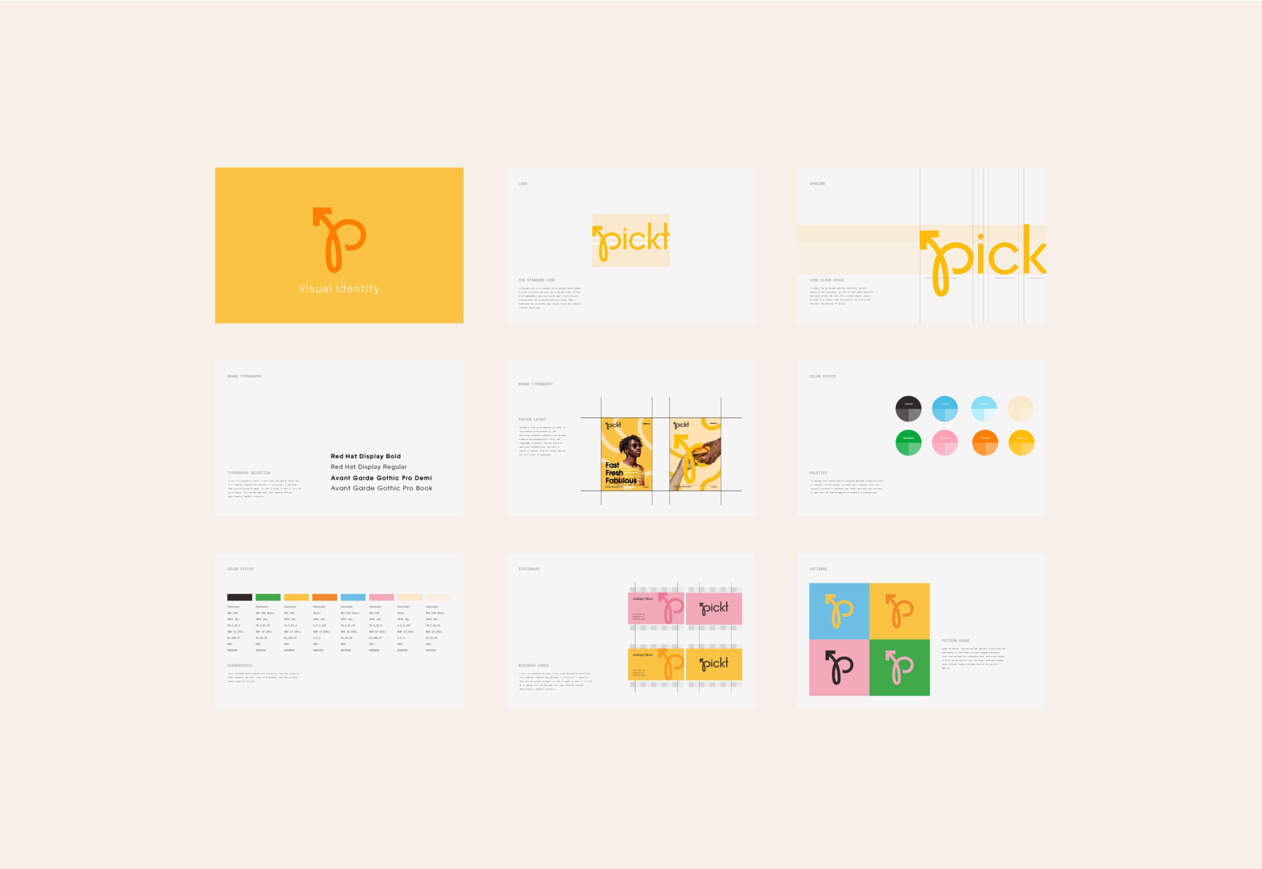
Visual Identity
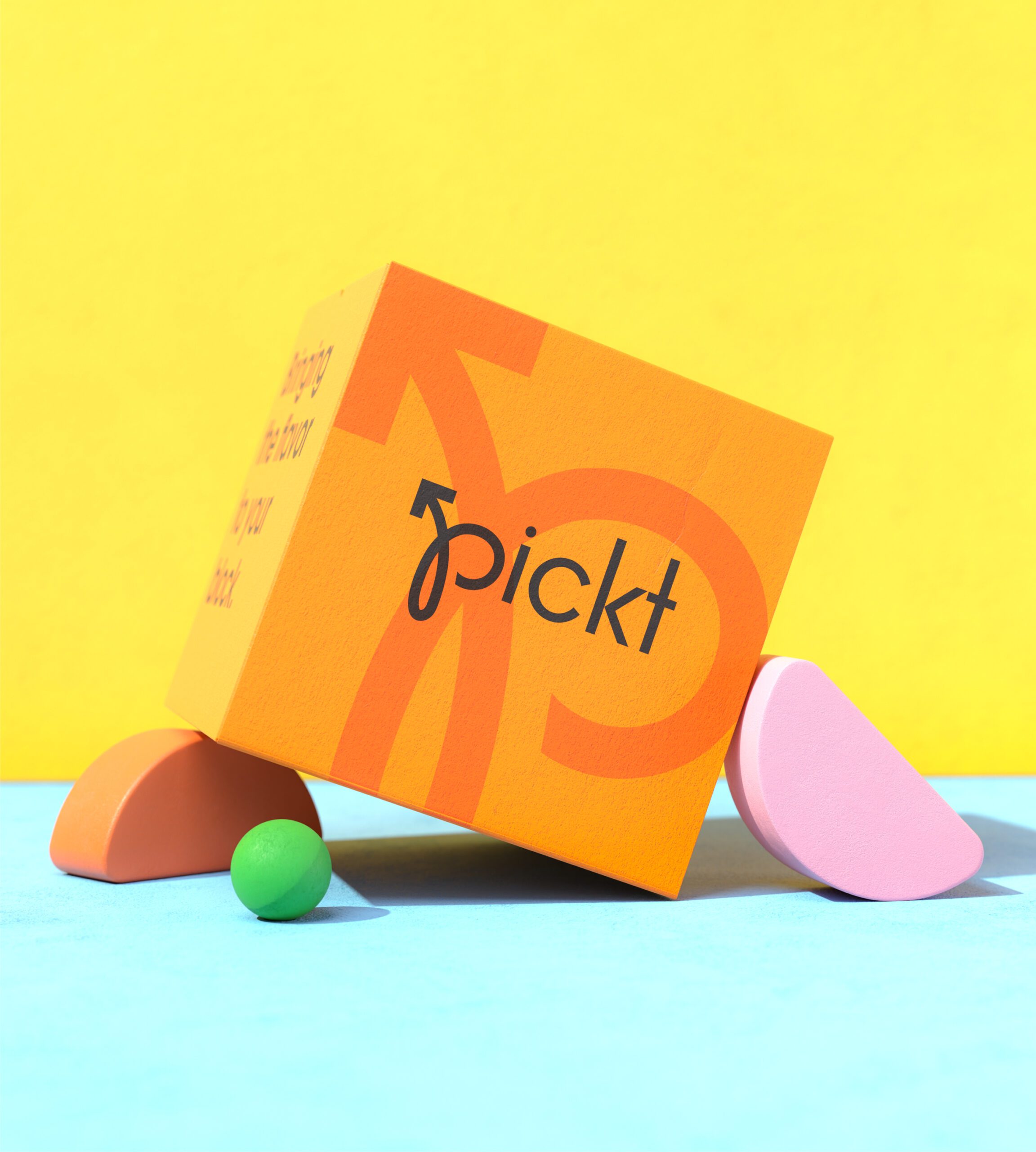
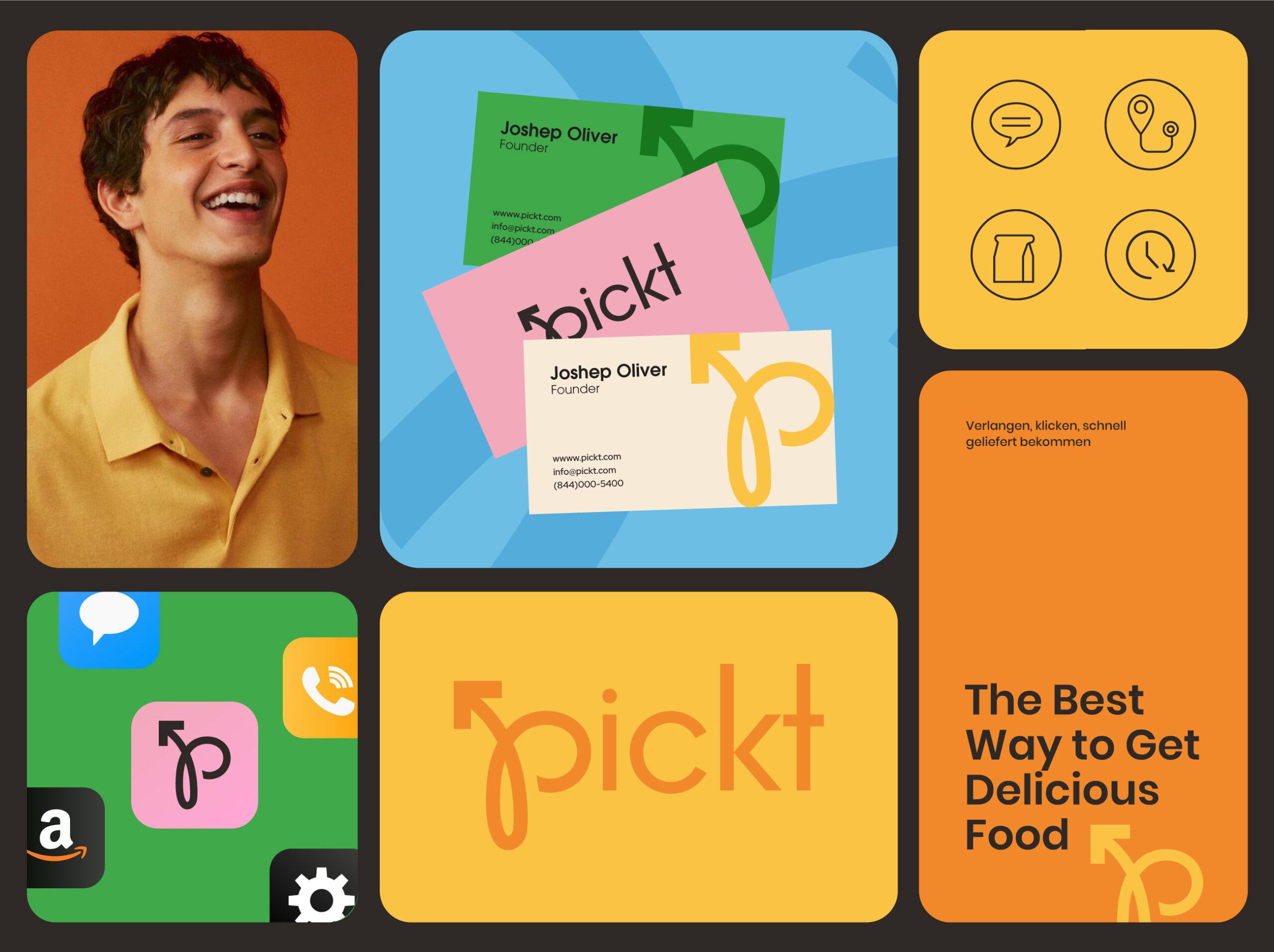
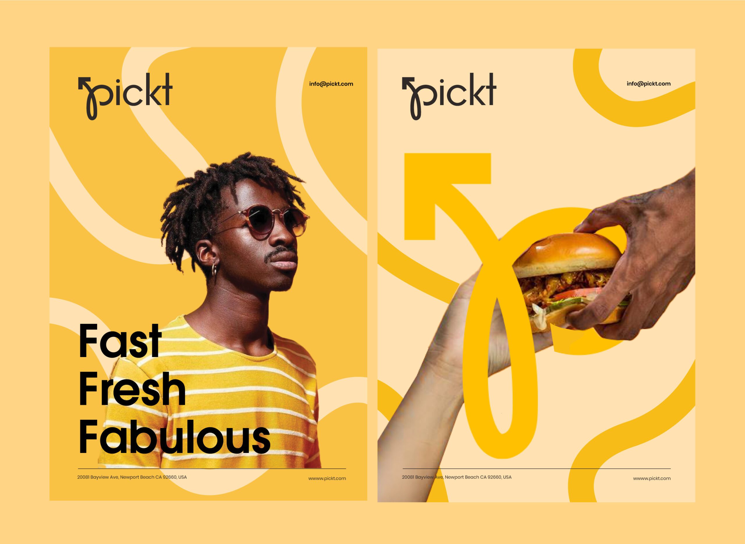
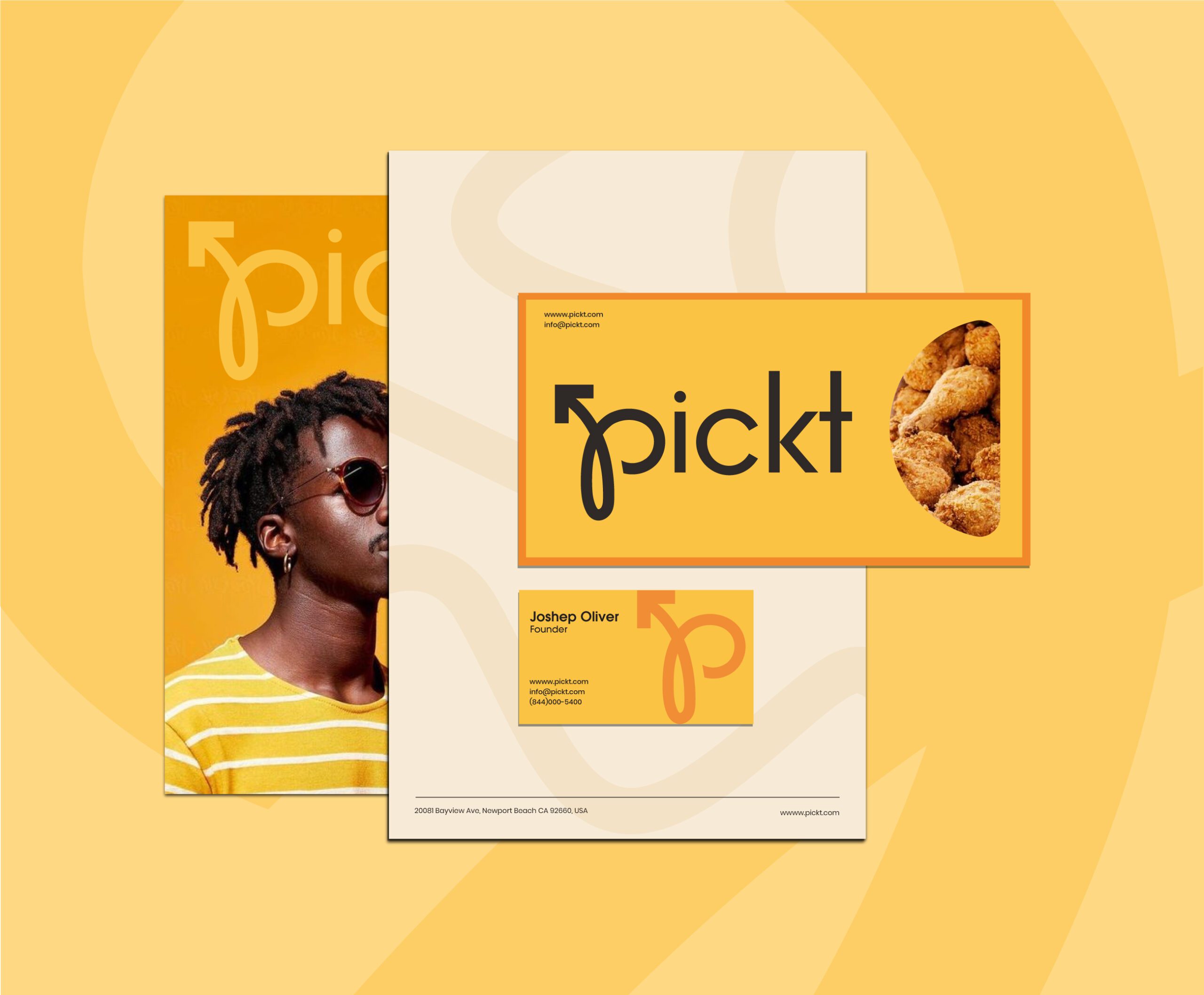
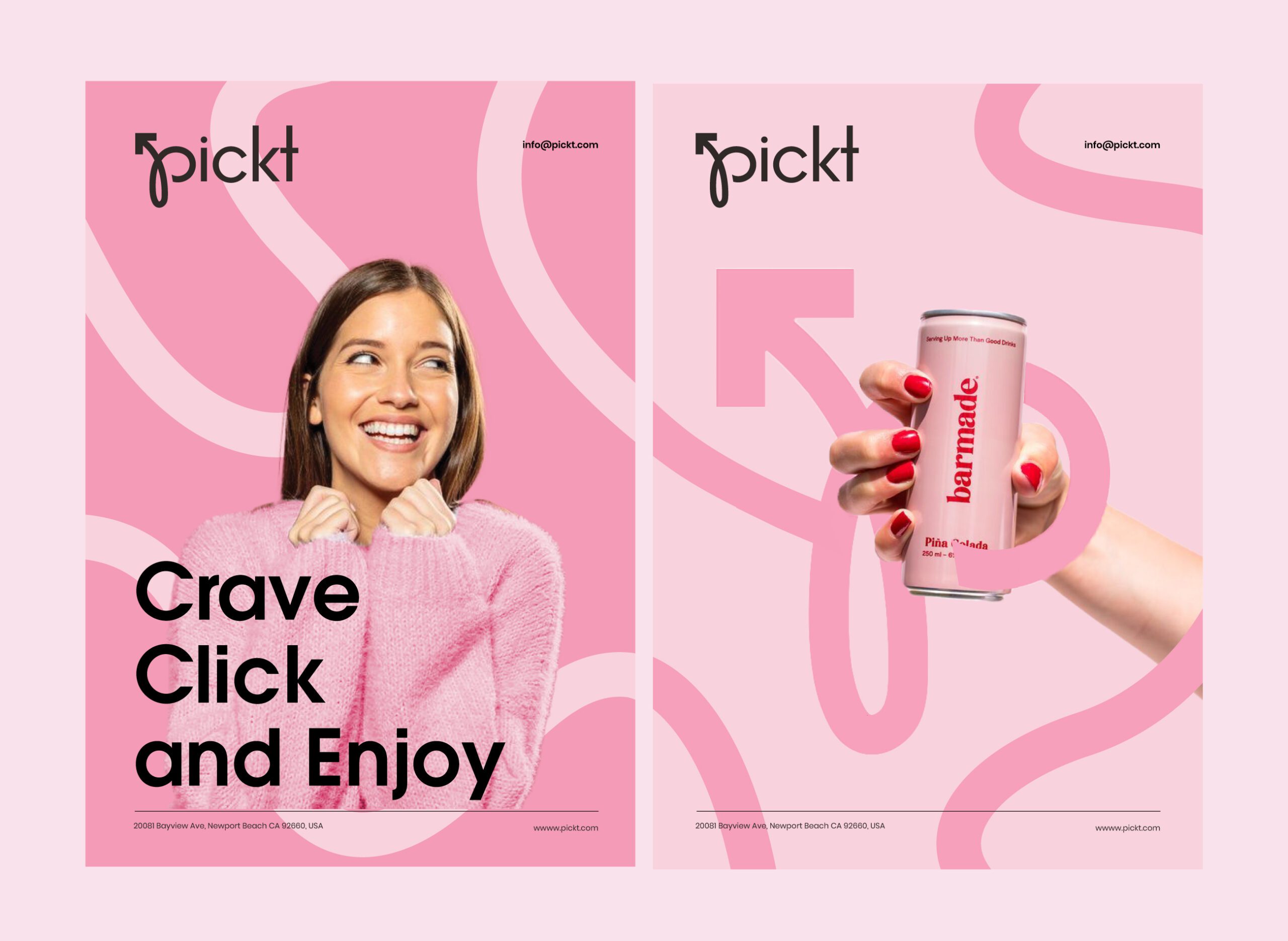
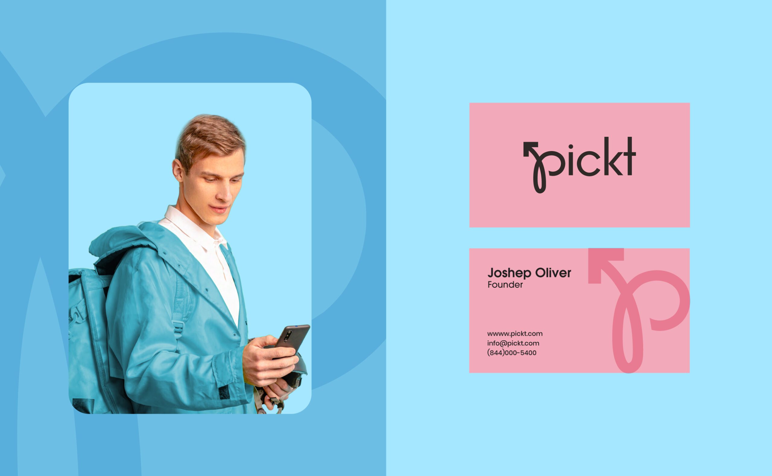
The visual identity is bold and expressive, using vibrant colors and strong contrast to create instant recognition. The logotype is modern and distinctive, supported by a flexible symbol that reinforces motion, direction, and delivery.
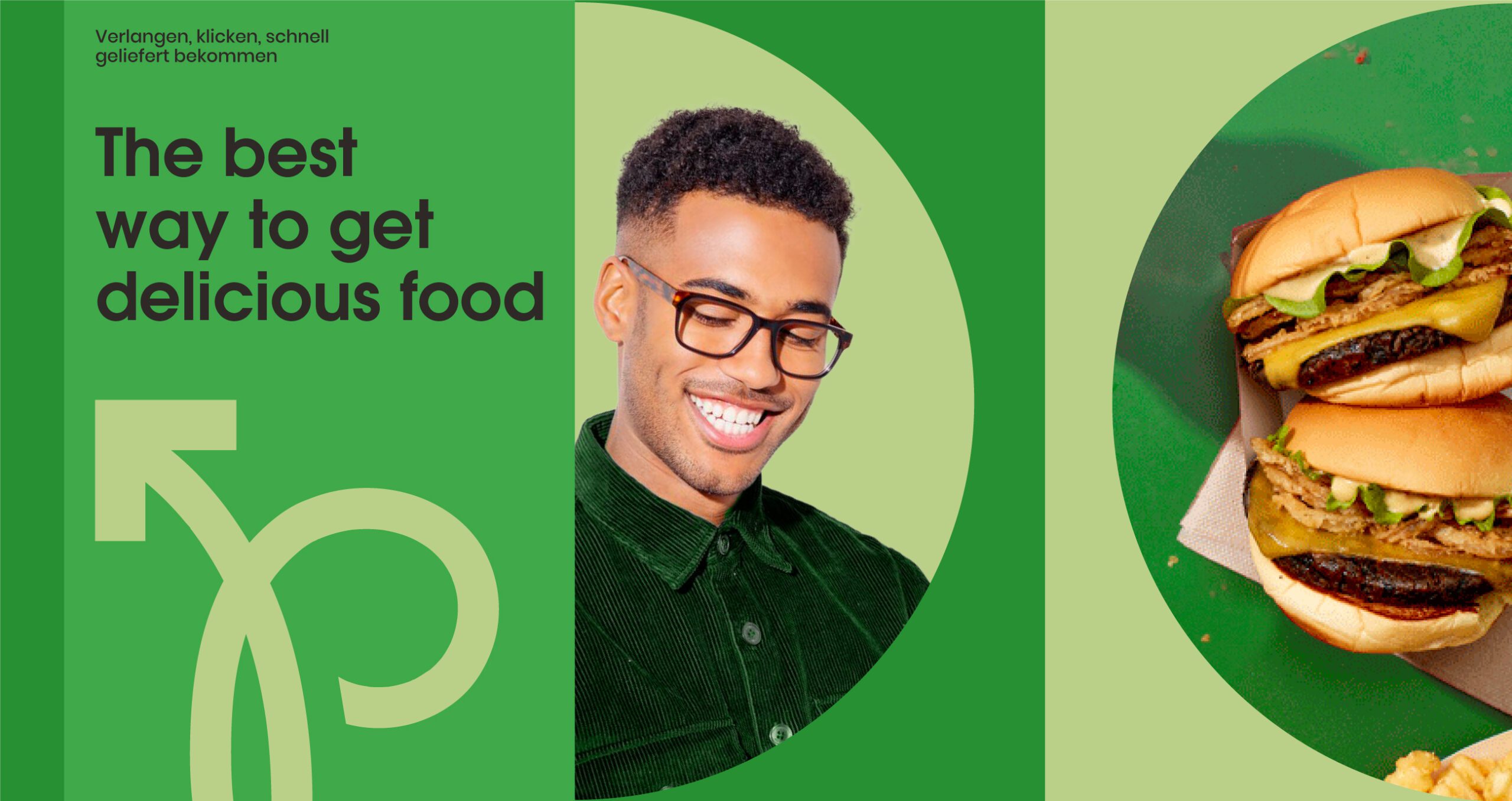
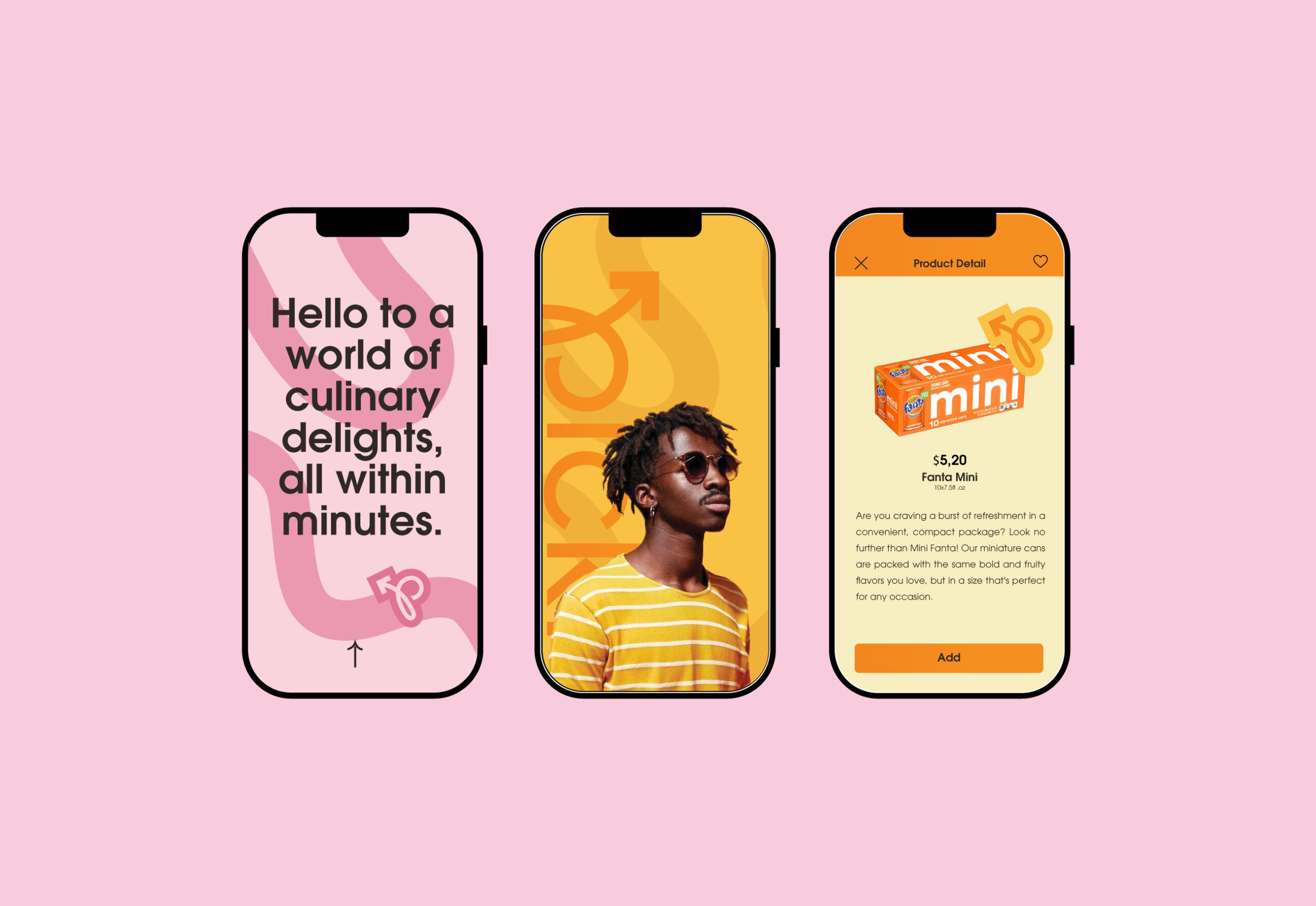
Typography is clean and assertive, designed to perform across digital platforms and marketing materials. Large type, dynamic layouts, and graphic shapes work together to create a visual language that feels contemporary and energetic.
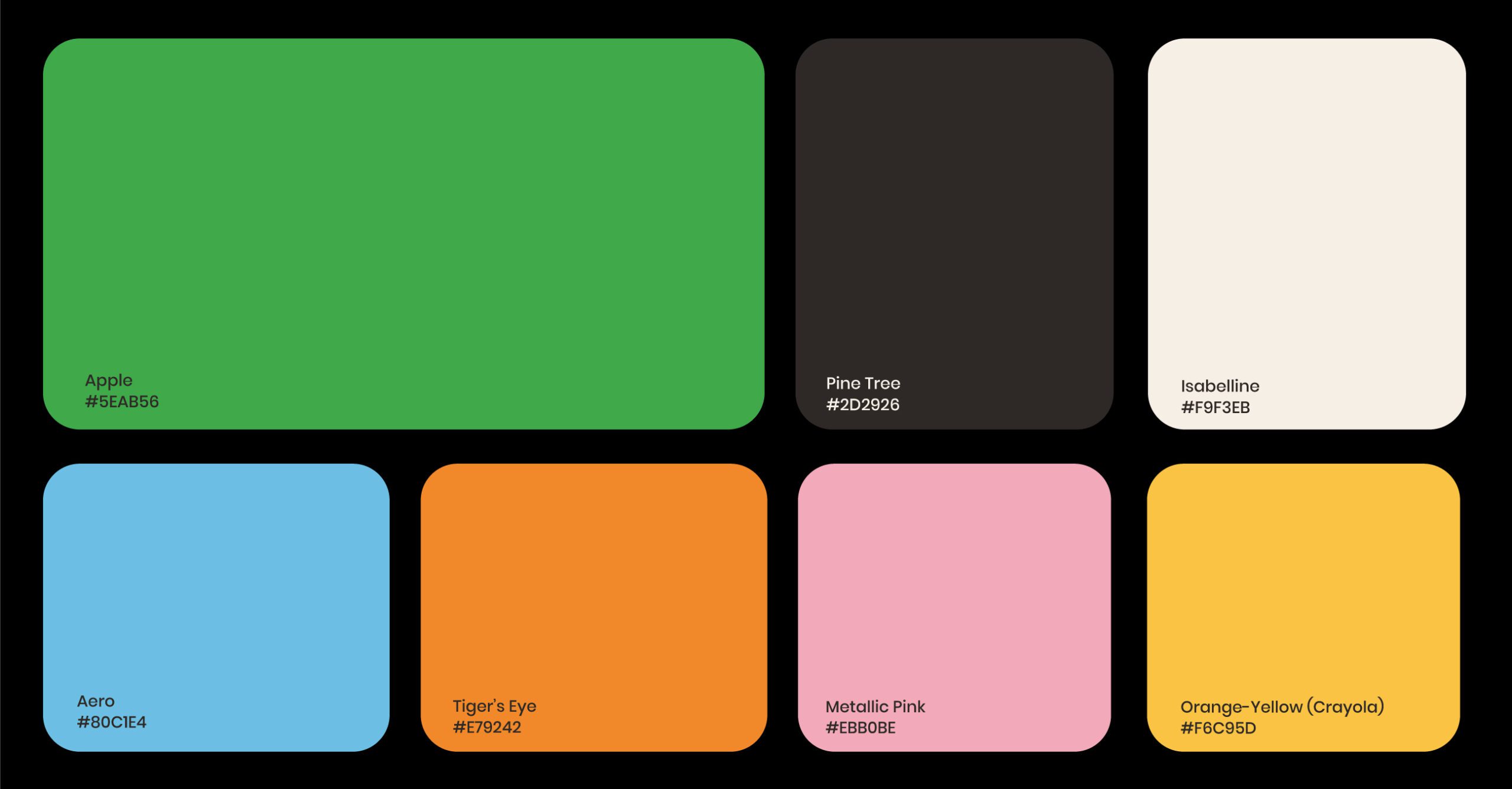
The color palette plays a central role in defining the brand, using bright and confident tones to reflect freshness, appetite appeal, and a new generation food culture.

Packaging and Touchpoints
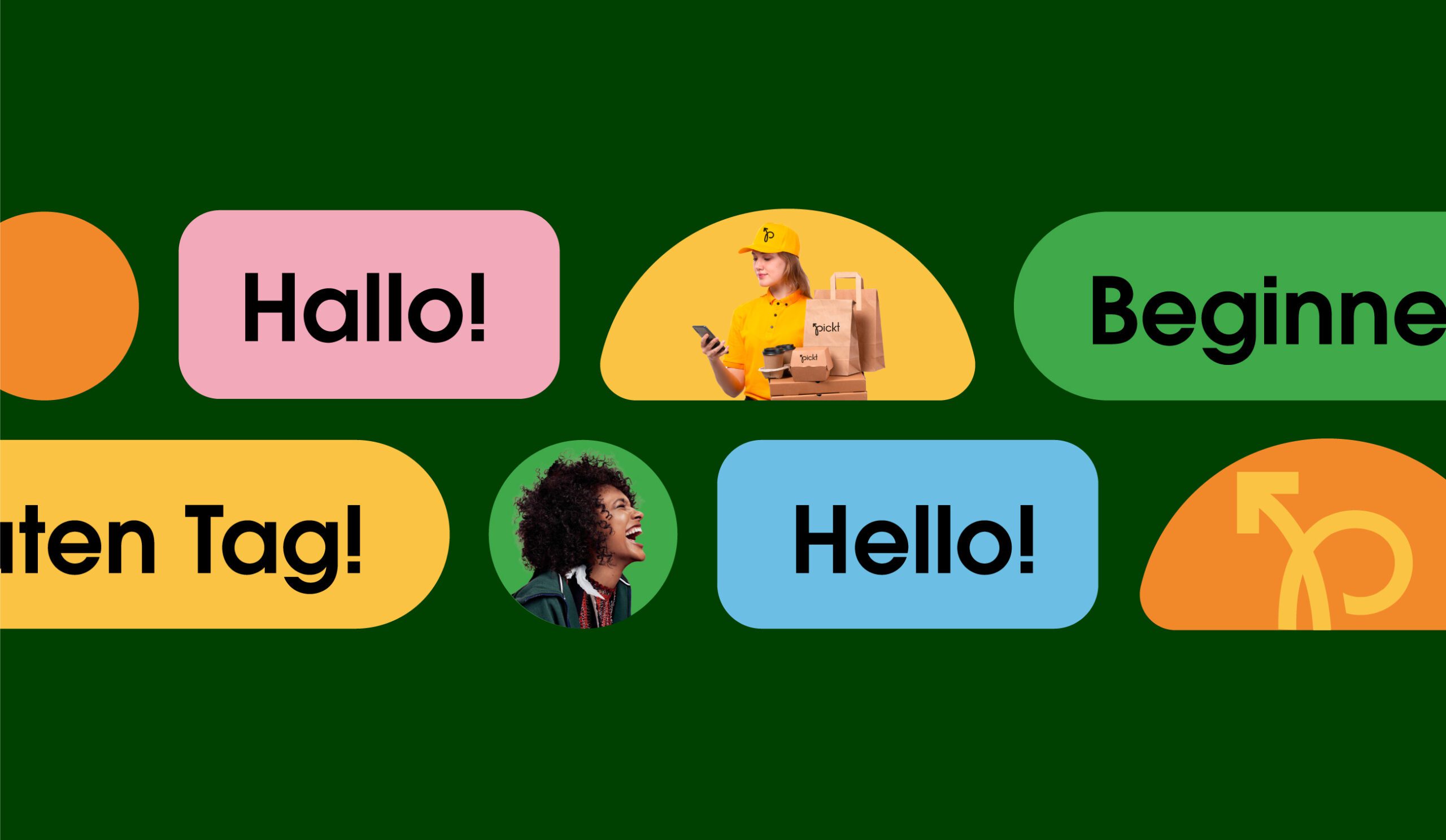
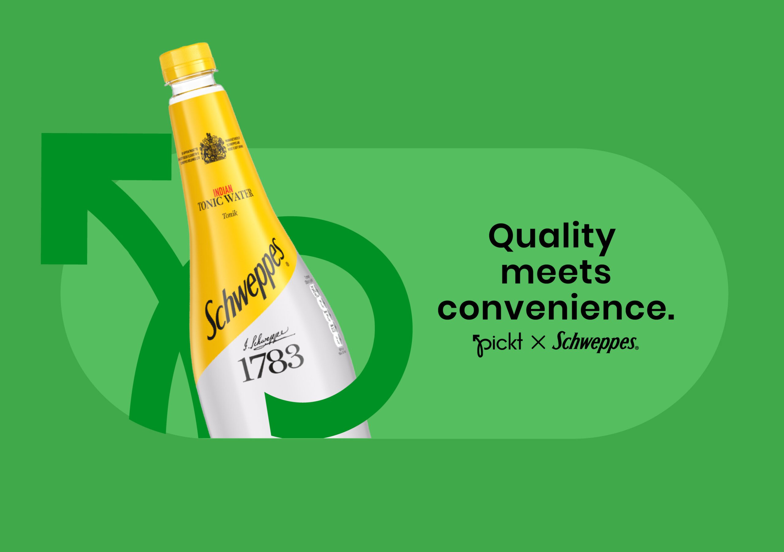
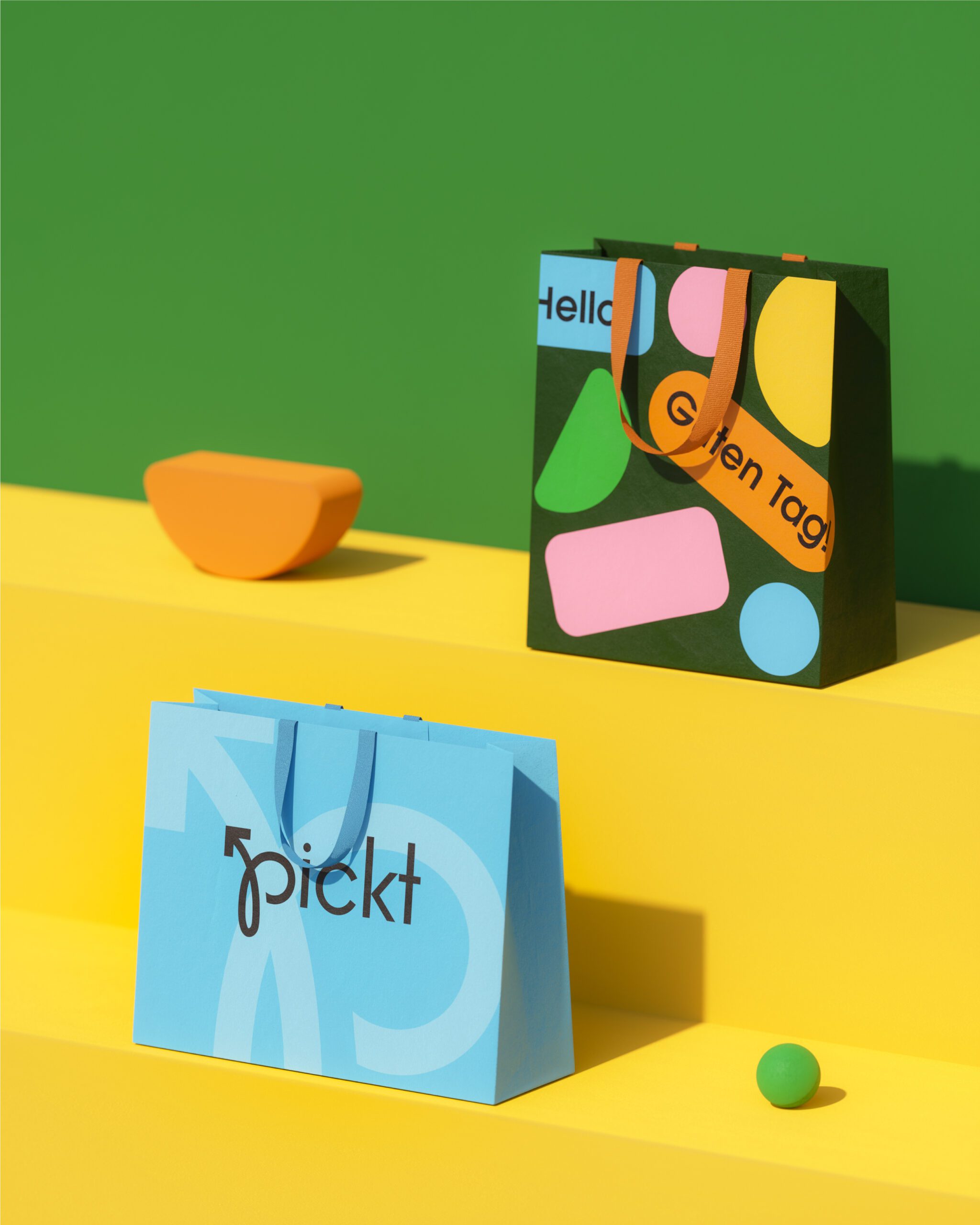
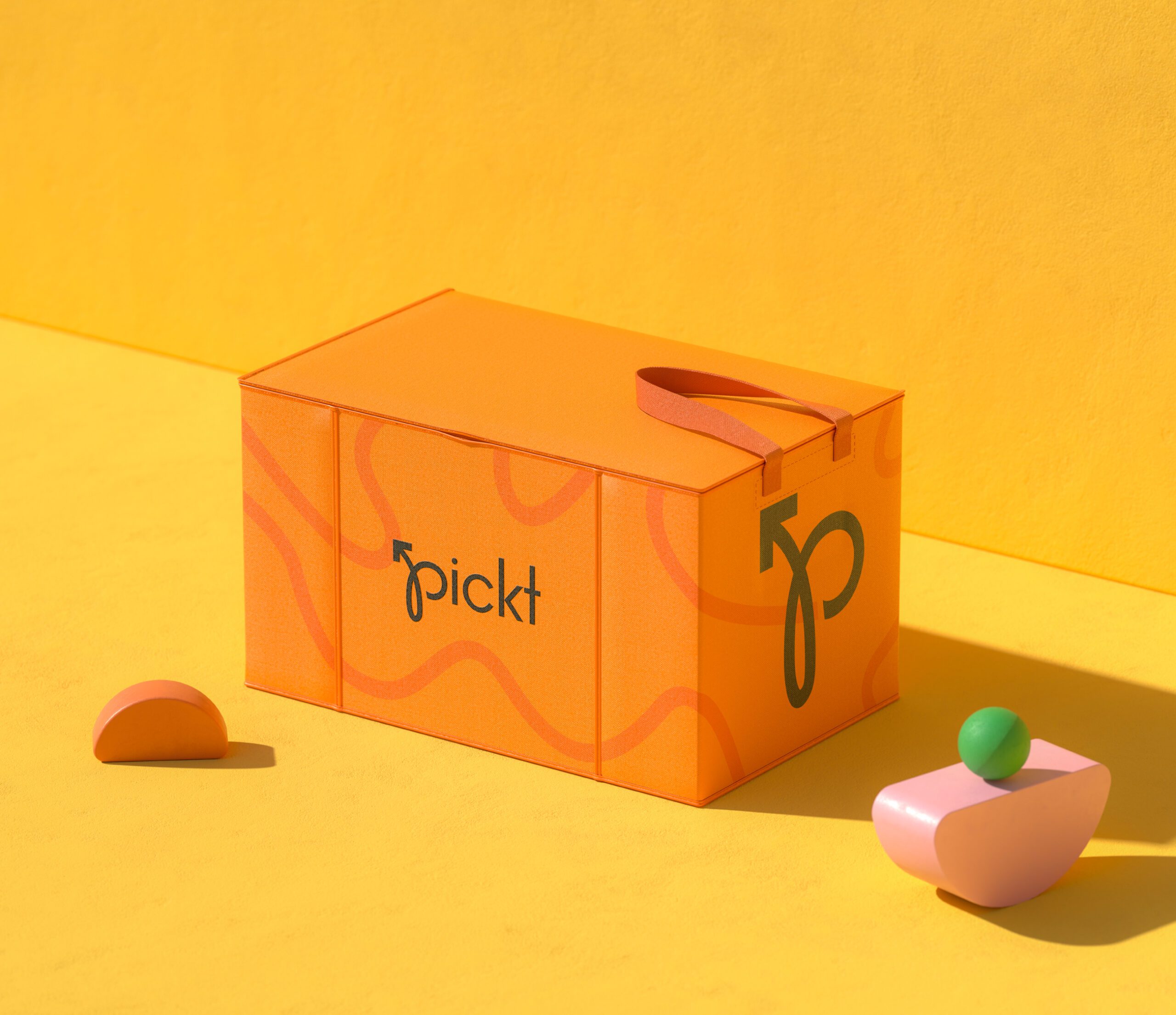
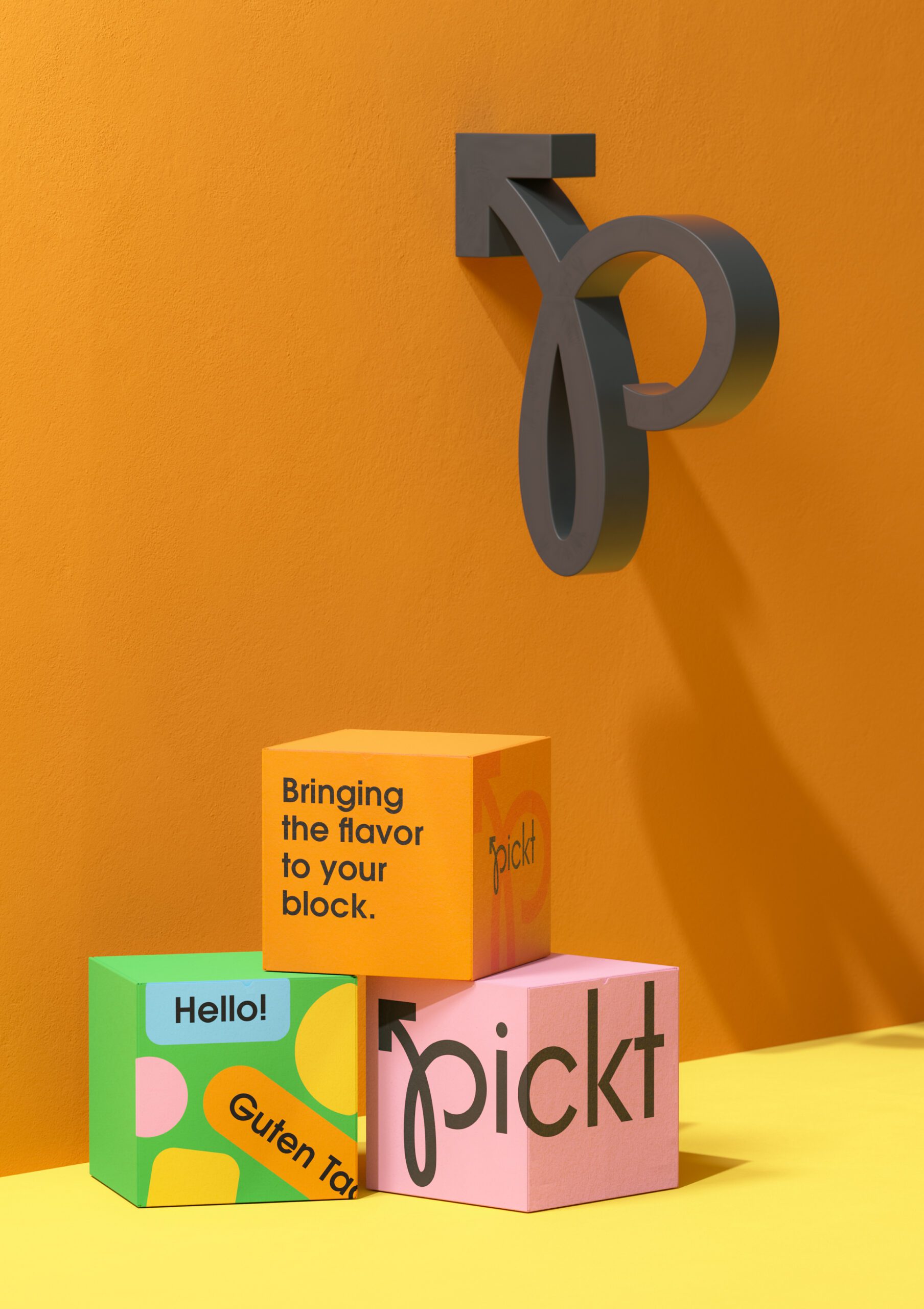
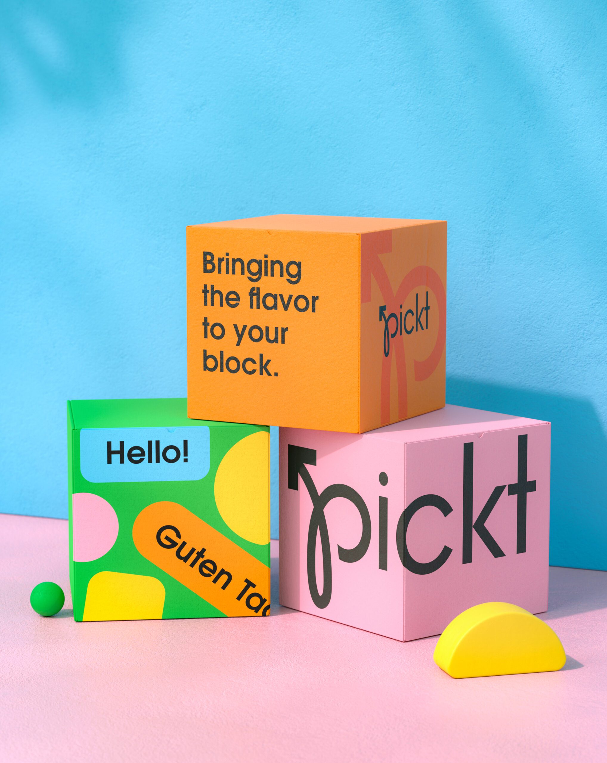
Packaging and brand materials were designed to feel fun, bold, and practical. Clear layouts and strong visual cues ensure brand consistency while remaining adaptable across delivery packaging, promotional assets, and in app visuals.
The system allows Pickt to scale easily while maintaining a cohesive and recognizable presence across all customer touchpoints.
Outcome
Pickt emerges as a confident and modern food delivery brand built for today’s fast paced lifestyle. Through bold visual identity, clear communication, and a strong delivery focused system, the brand stands out in a competitive market.
The result is a scalable and high impact brand experience that connects quality food with effortless delivery, bringing good food straight to your door.


Let’s make the work they’ll copy.
Talk to an expert now
Work with a 38 team of the
industry’s top 1% talent.



