
Odeur Botanical Candles
Designing a Refined and Sensory Botanical Candle Brand
Odeur Botanical Candles is a fragrance led brand created to elevate everyday spaces through scent, atmosphere, and thoughtful design. Each candle is crafted to evoke a specific mood, transforming moments into experiences through carefully composed aromas and a strong visual identity.
The brand was developed to feel confident, tactile, and expressive, allowing scent and storytelling to take center stage.

Brand Direction
Every scent product faces the same design problem, and Odeur Botanical Candles is no exception: the thing being sold cannot be sensed through the pack. Everything the buyer knows before purchase has to be carried by type, color, and material.
Odeur Botanical Candles is a fragrance-led brand, and its direction treats scent as both emotional and architectural. Each collection takes its cue from natural elements, materials, and environments, and at MarkaWorks we translated those references into layered scent profiles rather than into illustrations of them. That distinction kept the identity from becoming a picture of a forest on a jar.

Visual Identity
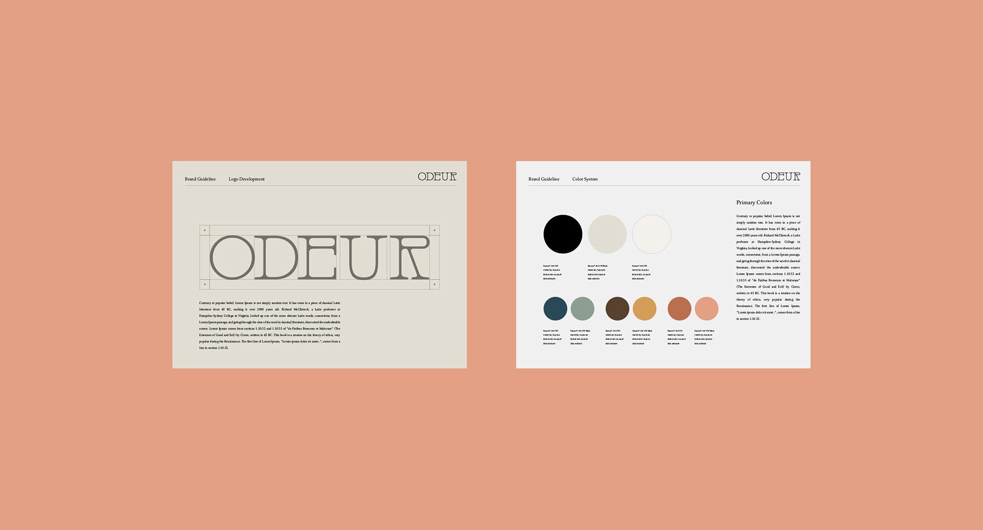
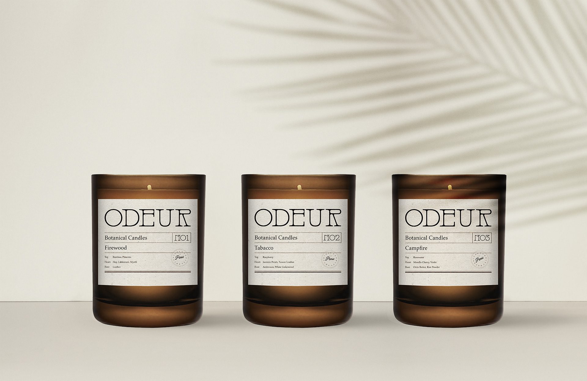
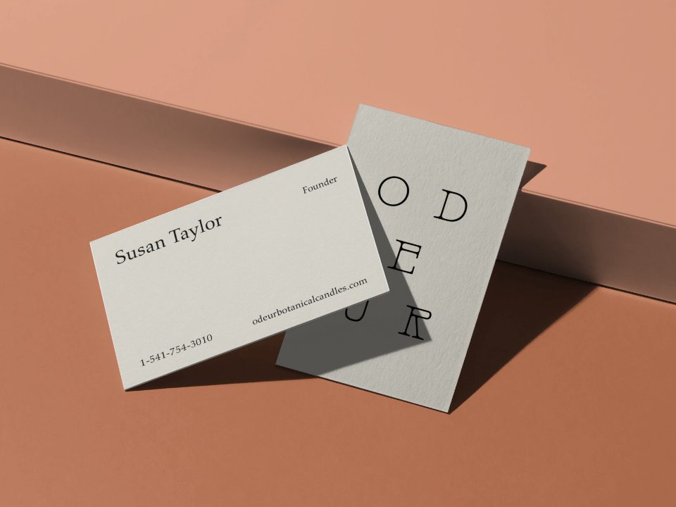
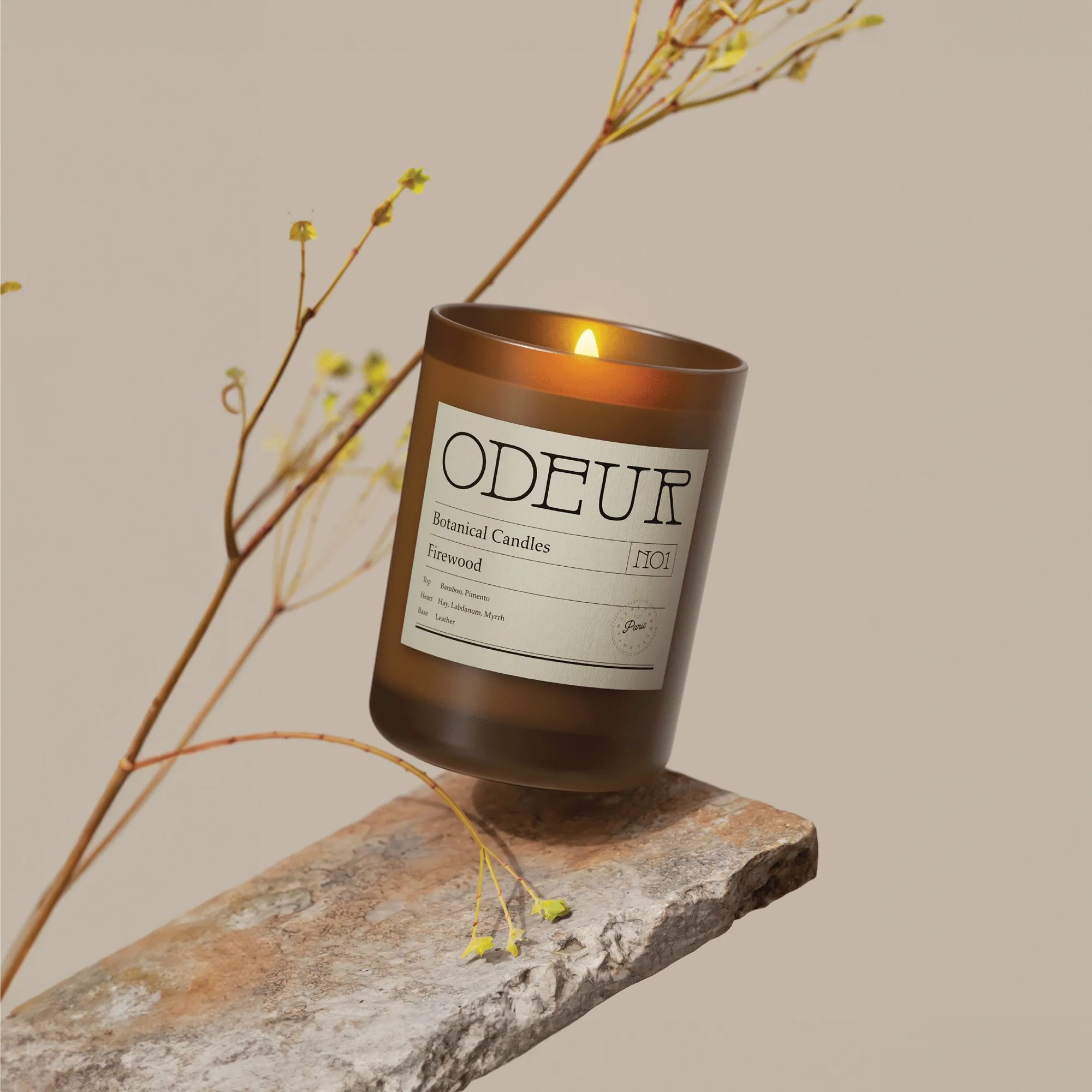
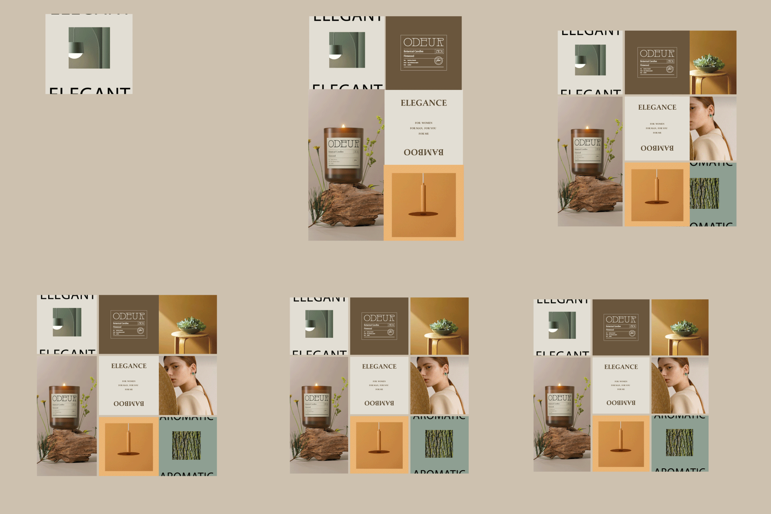
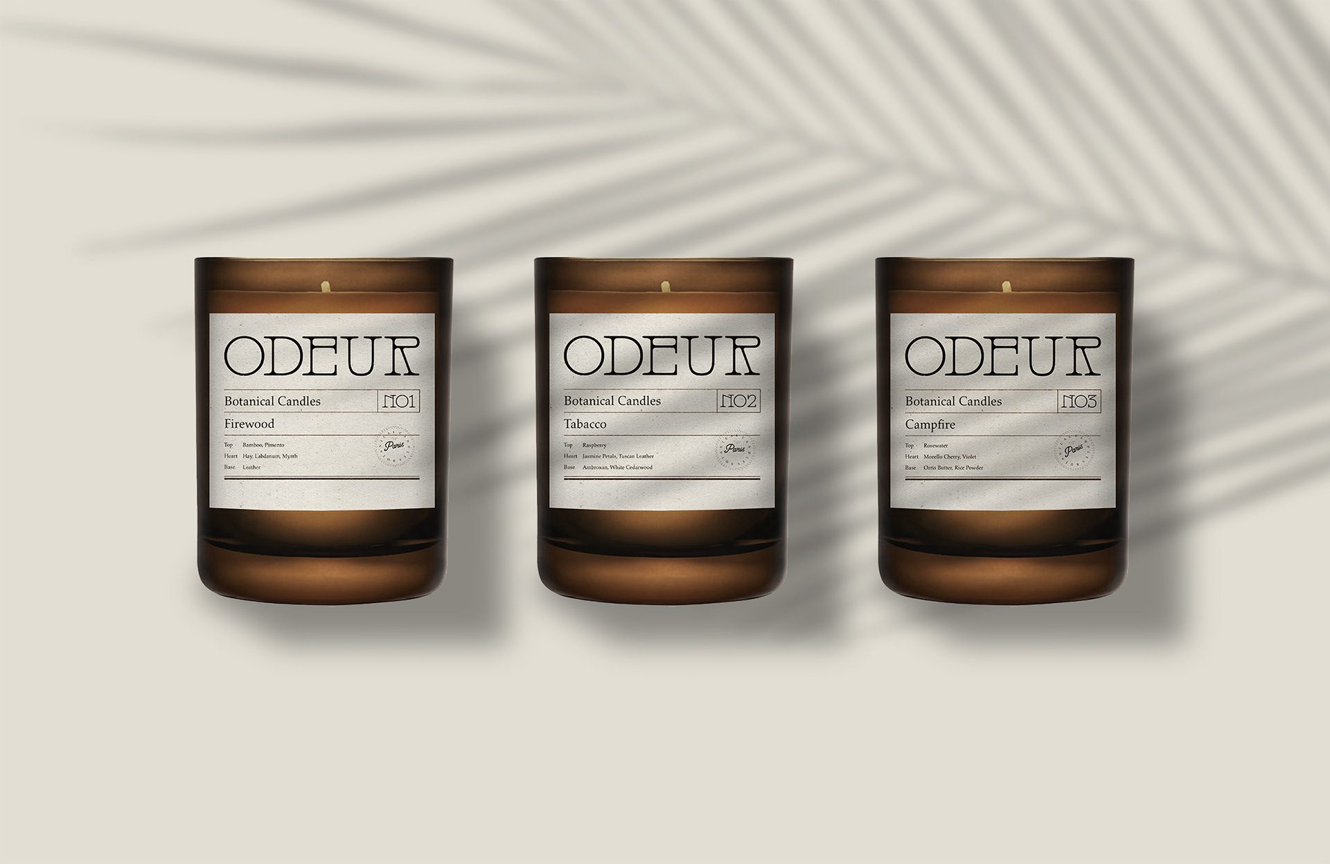
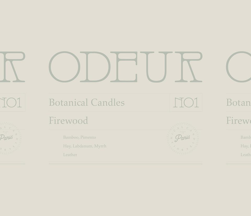
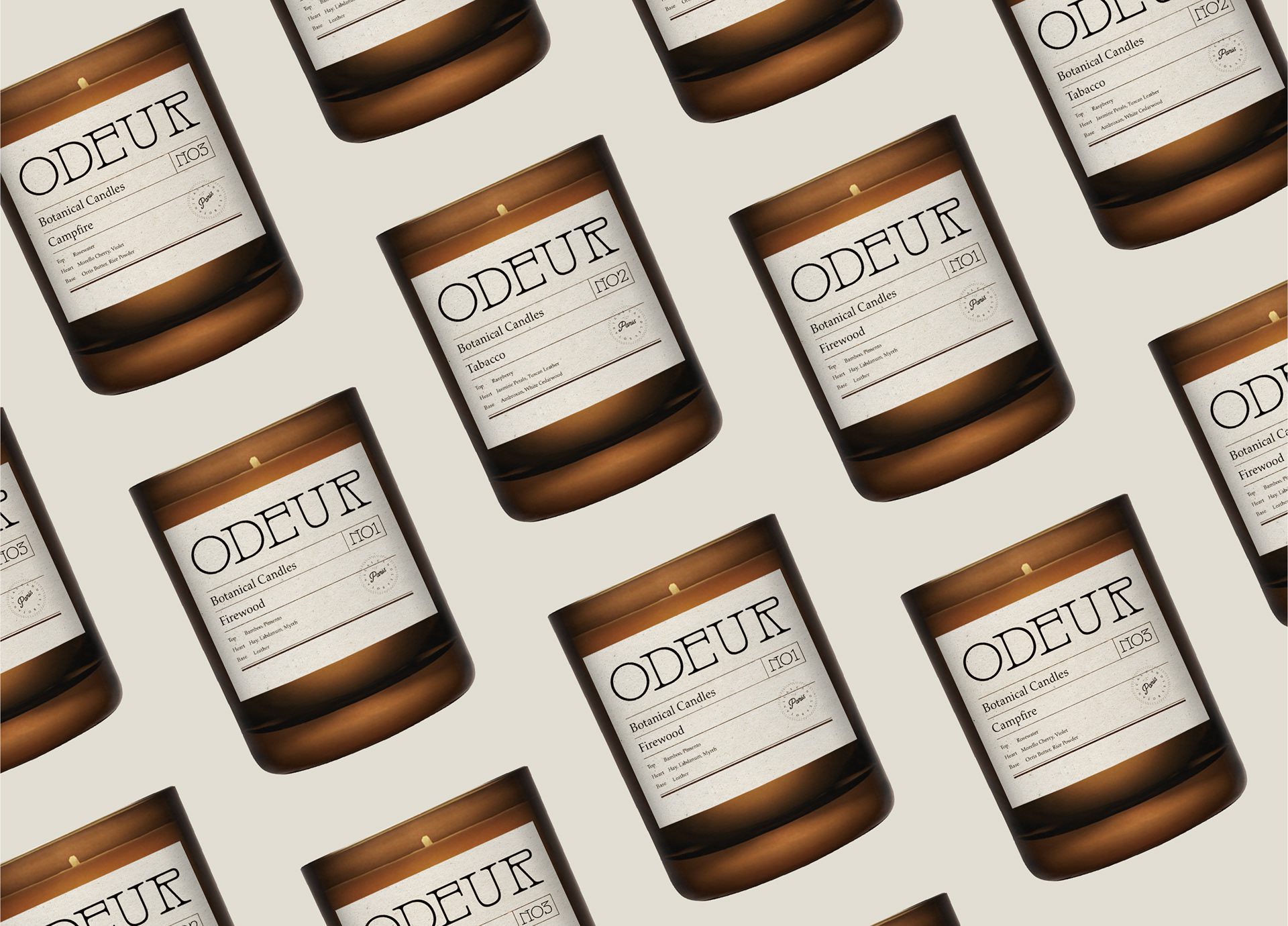
The visual identity is structured and editorial. A strong typographic system anchors it, and disciplined hierarchy keeps the information legible while the pack stays premium. Candles carry more mandatory and practical information than their size suggests, so hierarchy is not a stylistic preference here, it is what makes a small label usable.

Packaging Design
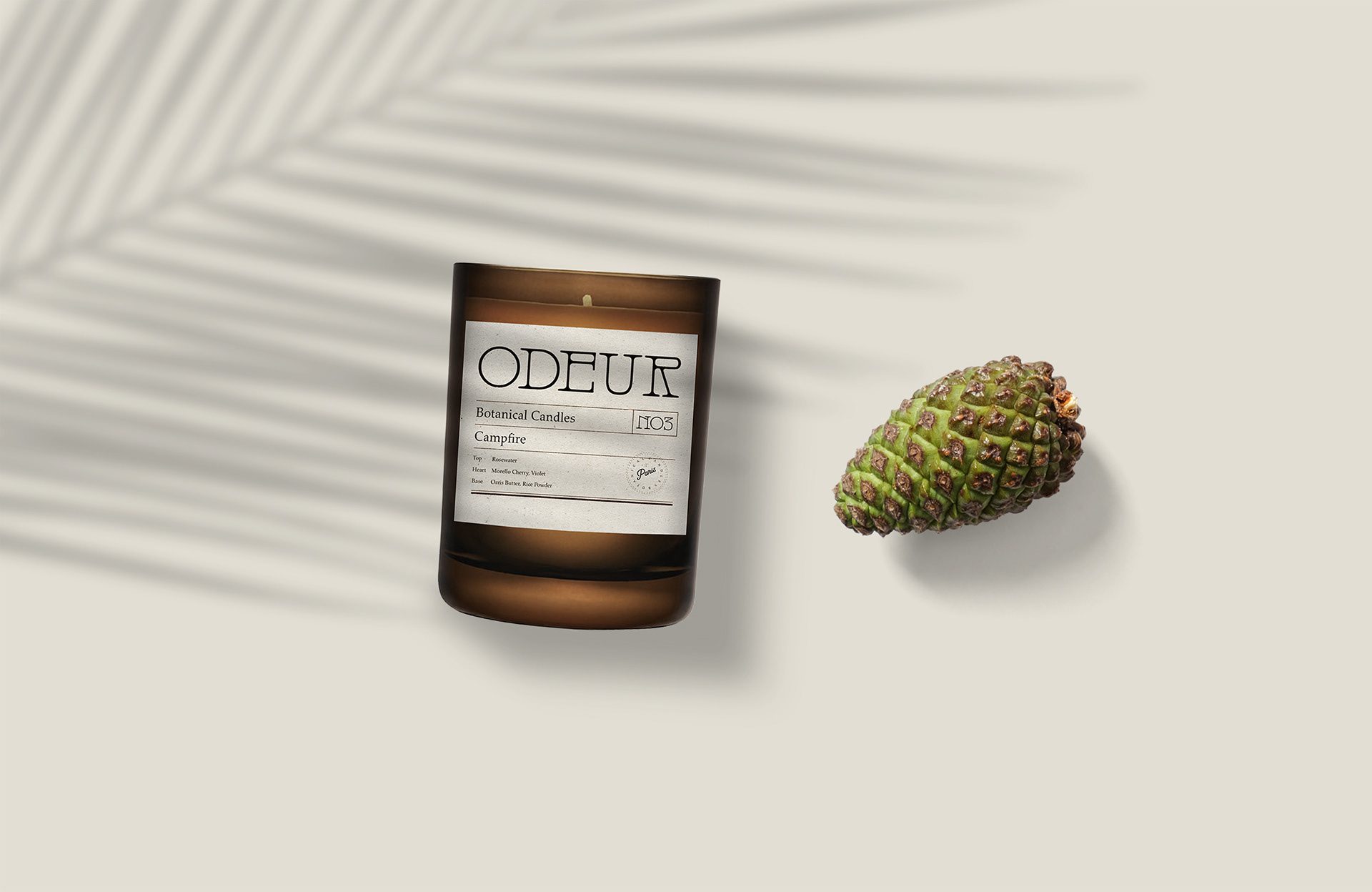
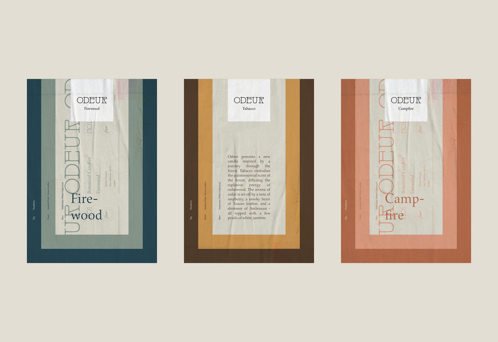
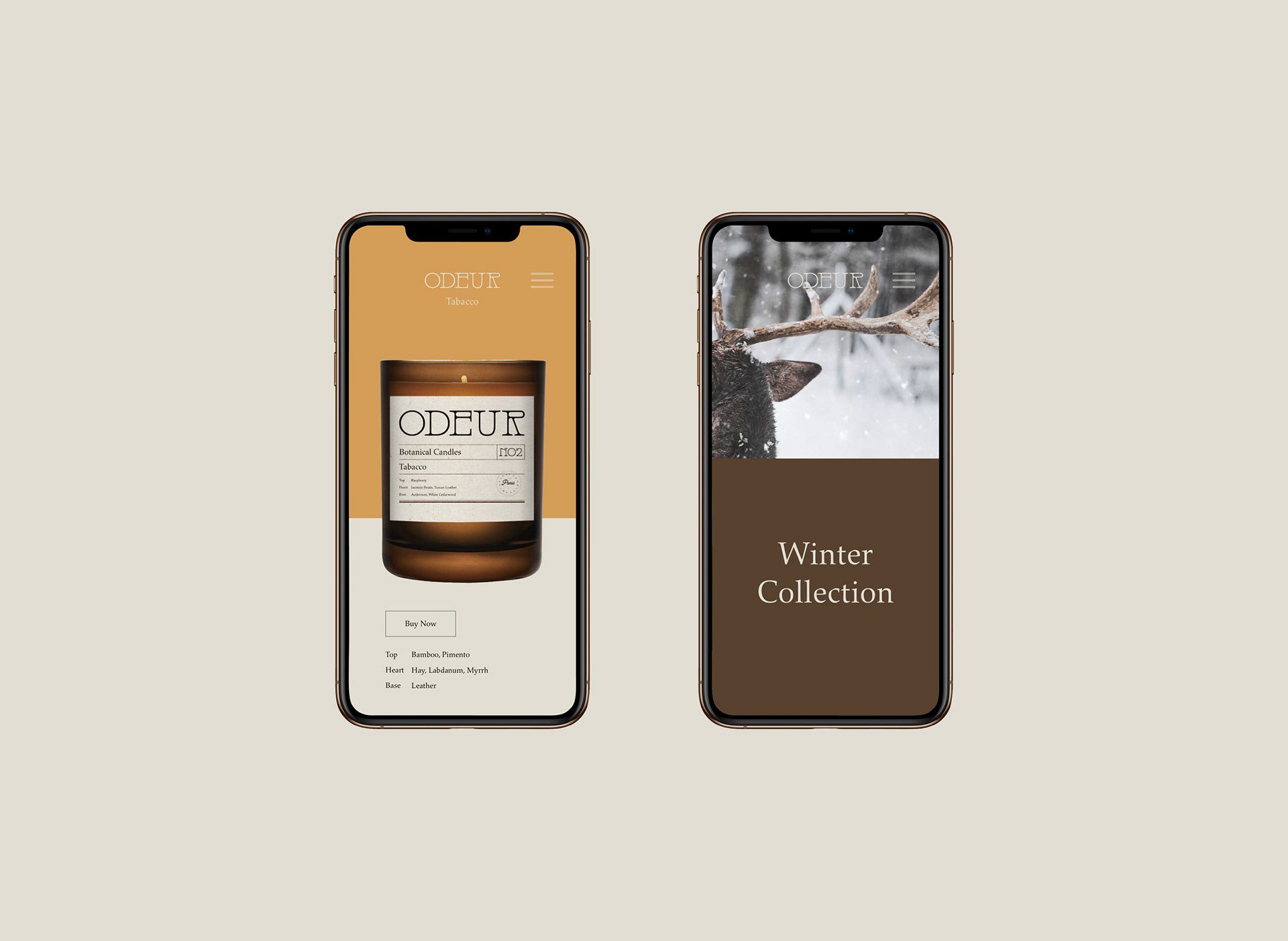
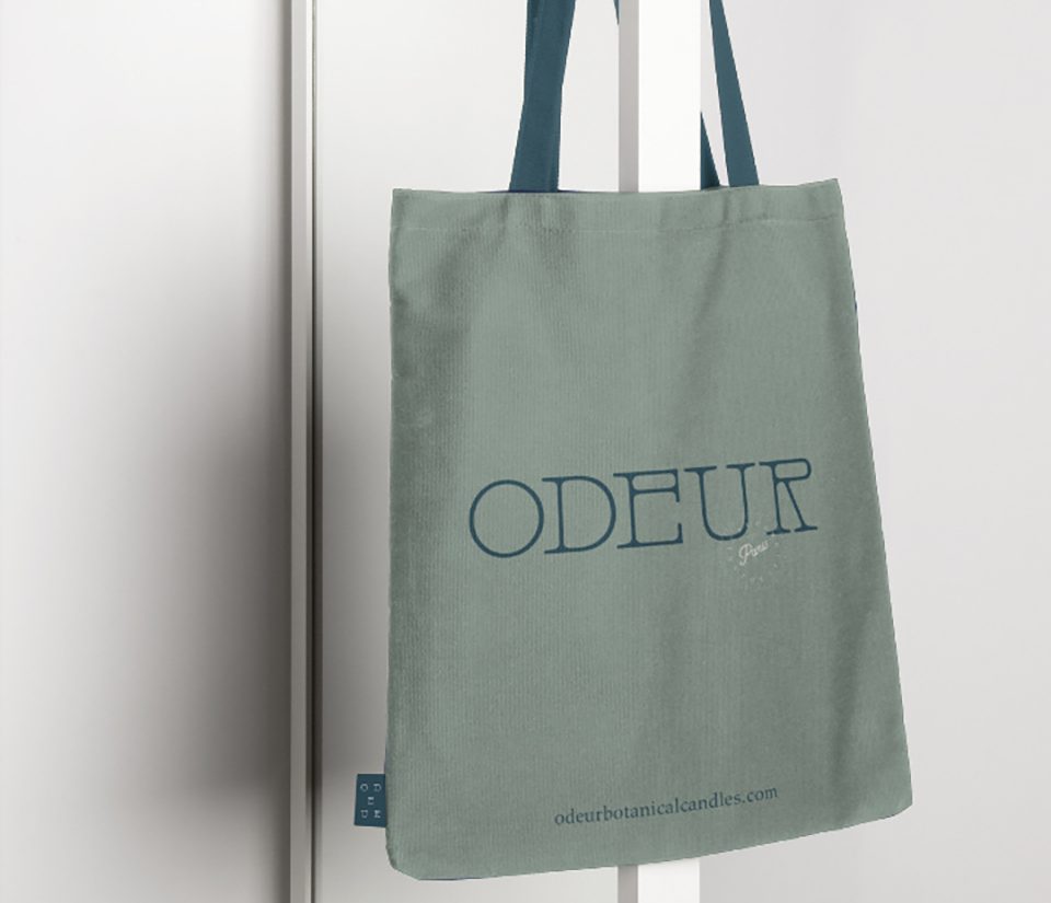
Color defines each Odeur scent. Earthy neutrals, deep blues, warm ambers, and muted terracotta reflect the natural inspirations behind the fragrances and give the range depth without breaking its common language. A buyer returning for a scent they liked finds it by color, which is the only reliable shortcut when the product itself is sealed.
Brand Experience
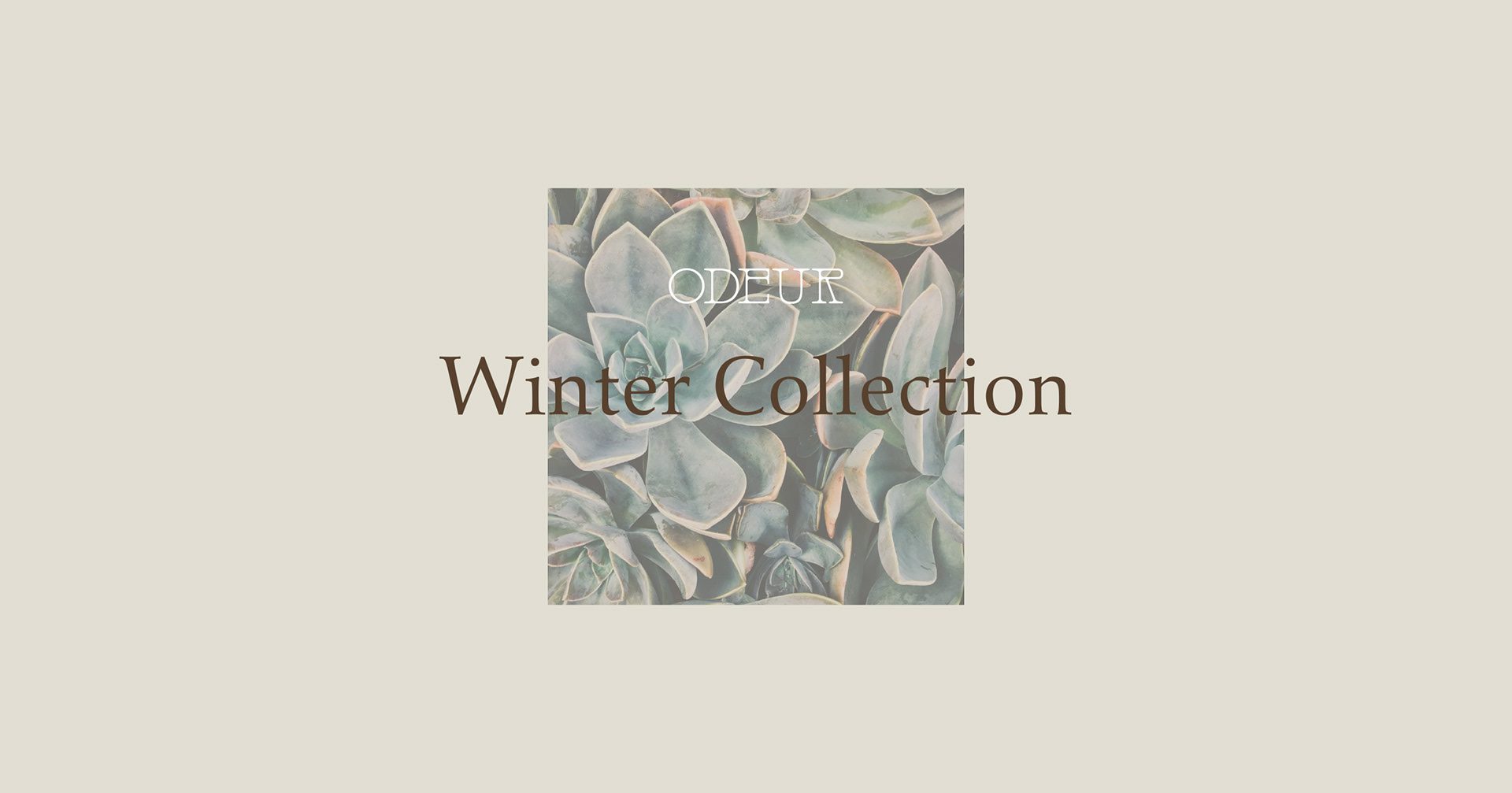
We built the packaging for shelf impact and restraint at once. Candle labels are small and often curved, which limits how much hierarchy a surface can hold before it stops being read at all, so we cut the information to what a buyer actually uses at the shelf and the rest moved to the outer pack. Bold color blocking and clear labeling let each scent stand out inside a unified structure, and amber glass vessels add material warmth that a printed surface cannot imitate.

Let’s make the work they’ll copy.
Talk to an expert now
Work with a 38 team of the
industry’s top 1% talent.



