
Be So Happy
Be So Happy Brand Identity and Packaging Design
Be So Happy is a supplement brand developed to support mental wellbeing and everyday emotional balance. The project focused on creating a brand identity and packaging system that communicates purpose, clarity, and product benefits in a way that resonates with consumers seeking functional wellness solutions.
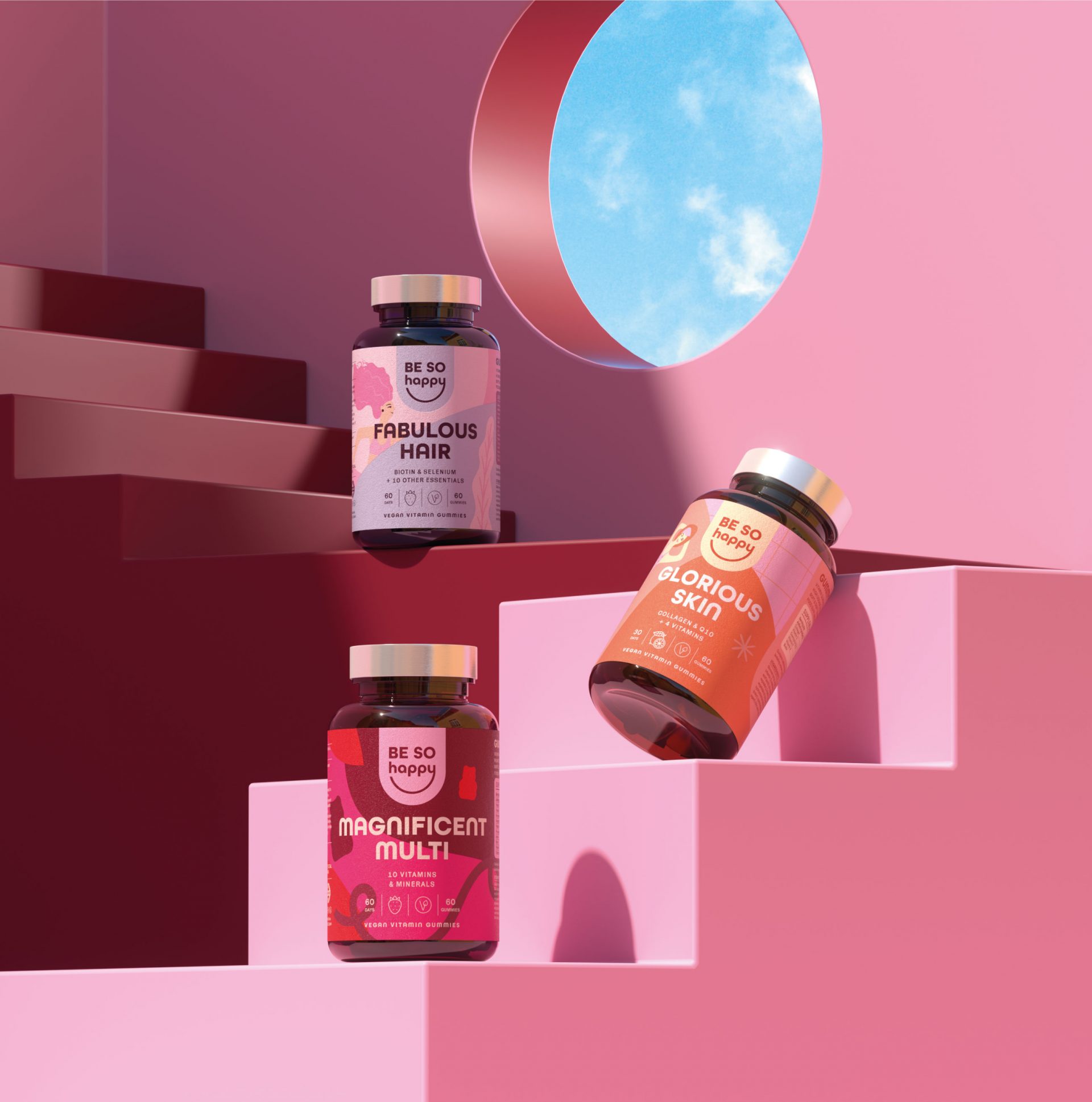
The design approach aimed to build a visual presence that feels confident and reliable while clearly conveying product function and values across physical and digital environments.
Brand Strategy and Visual Identity
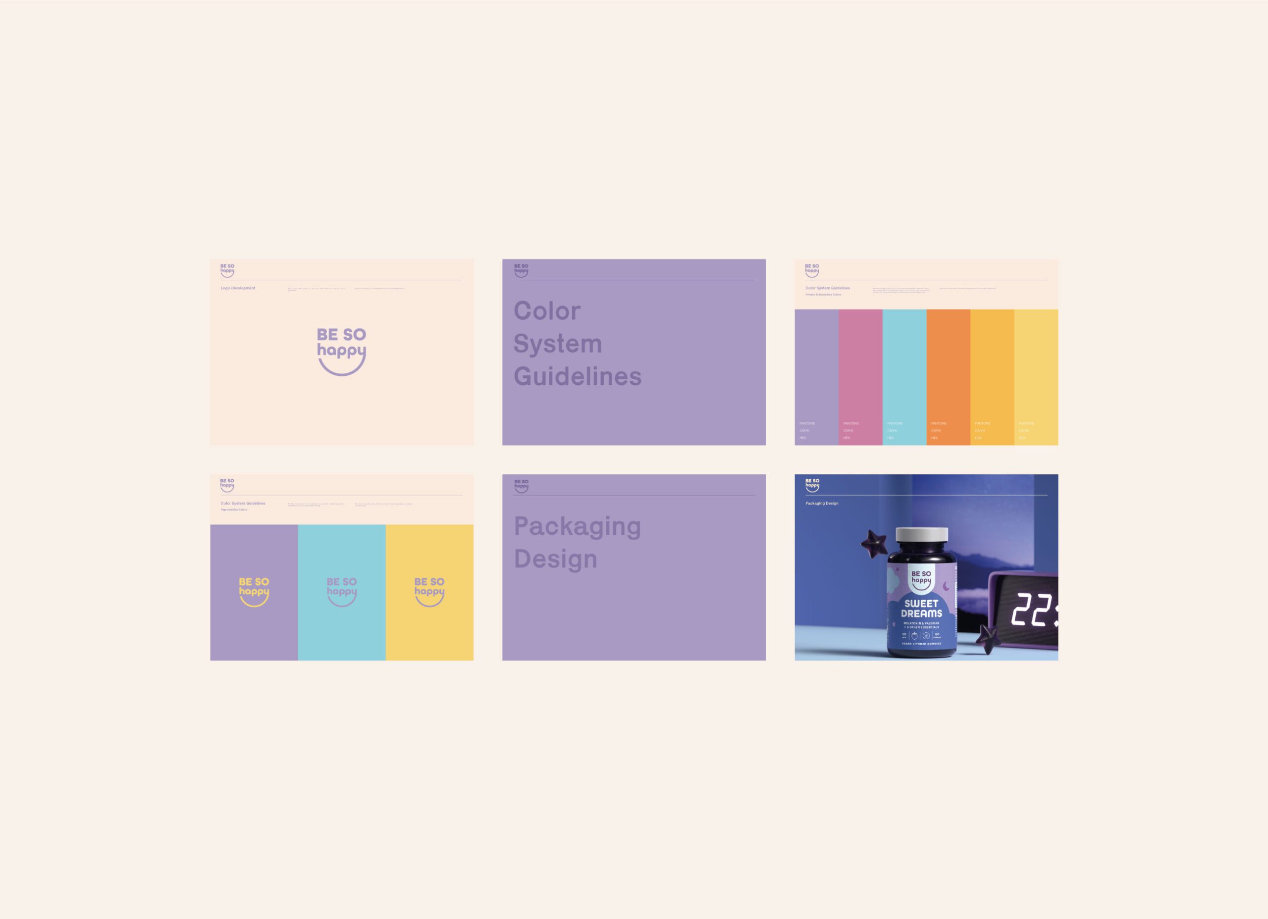
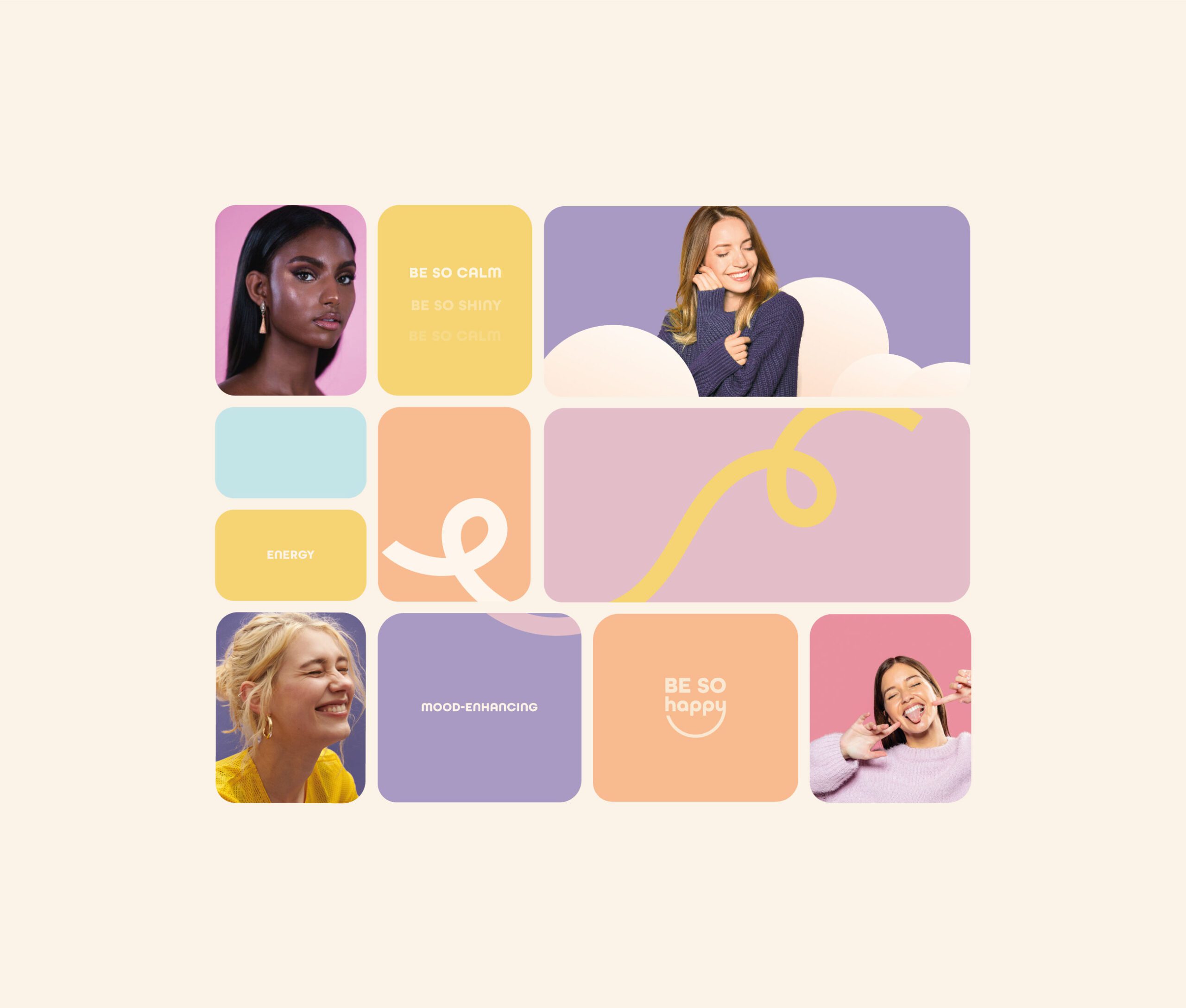
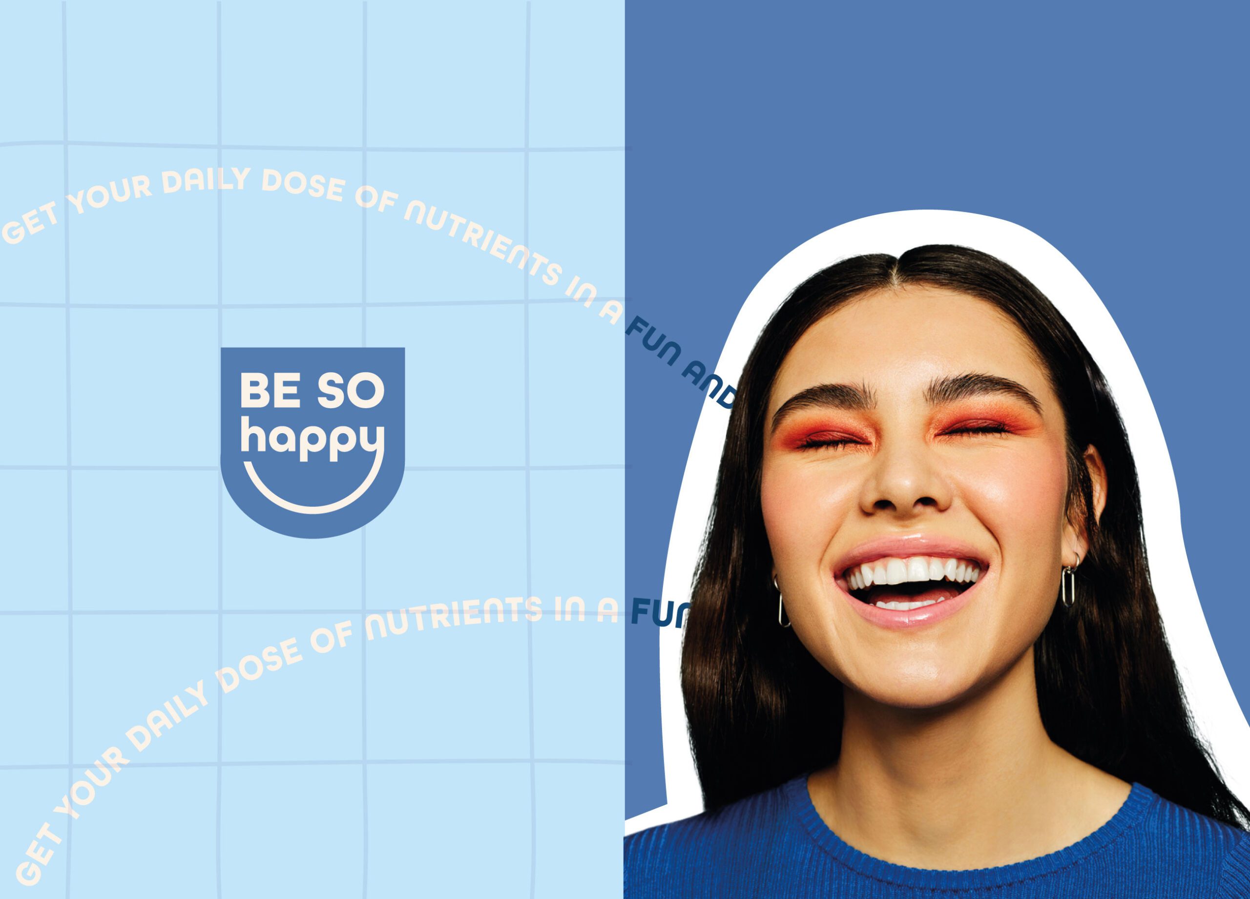
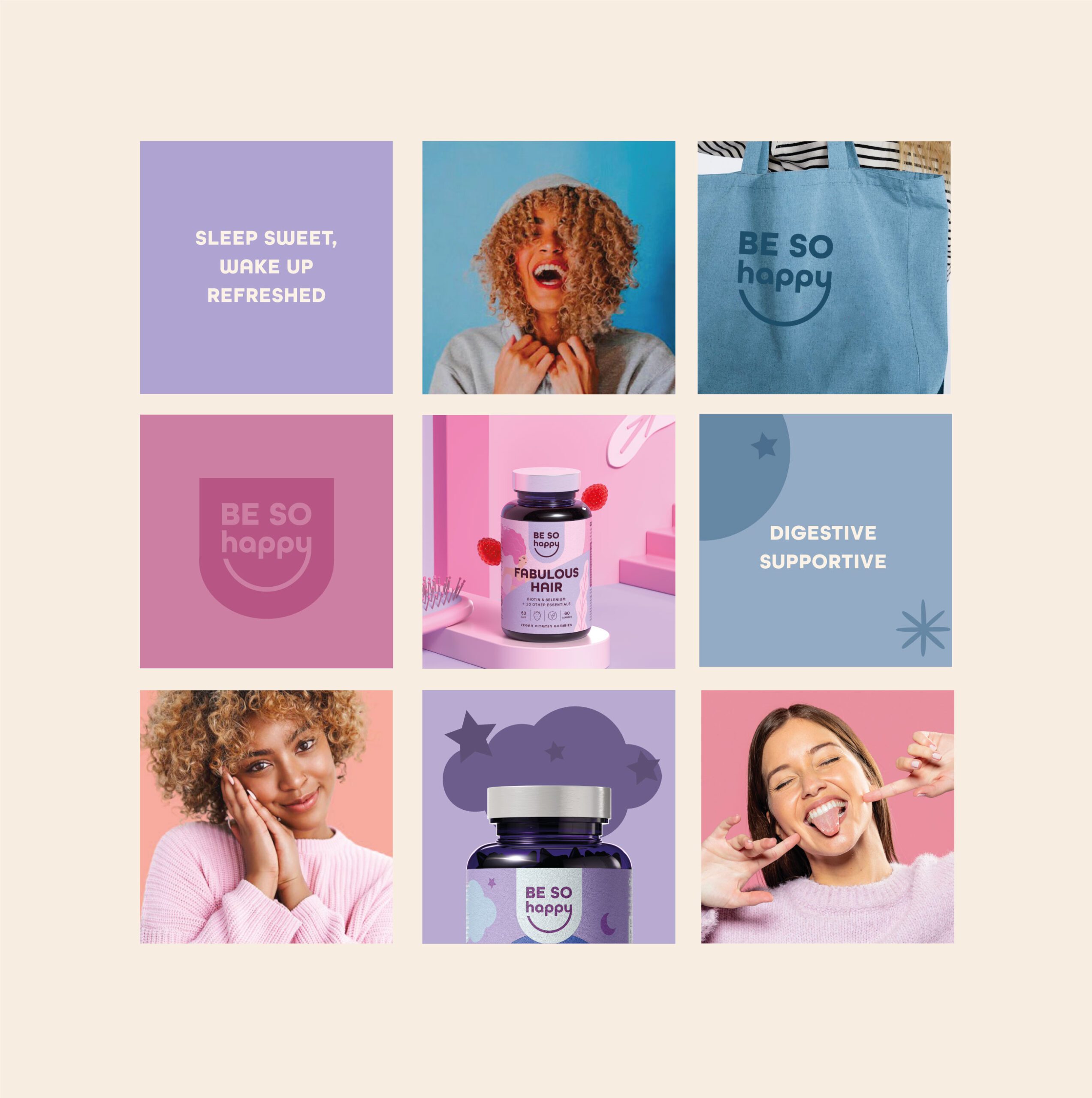
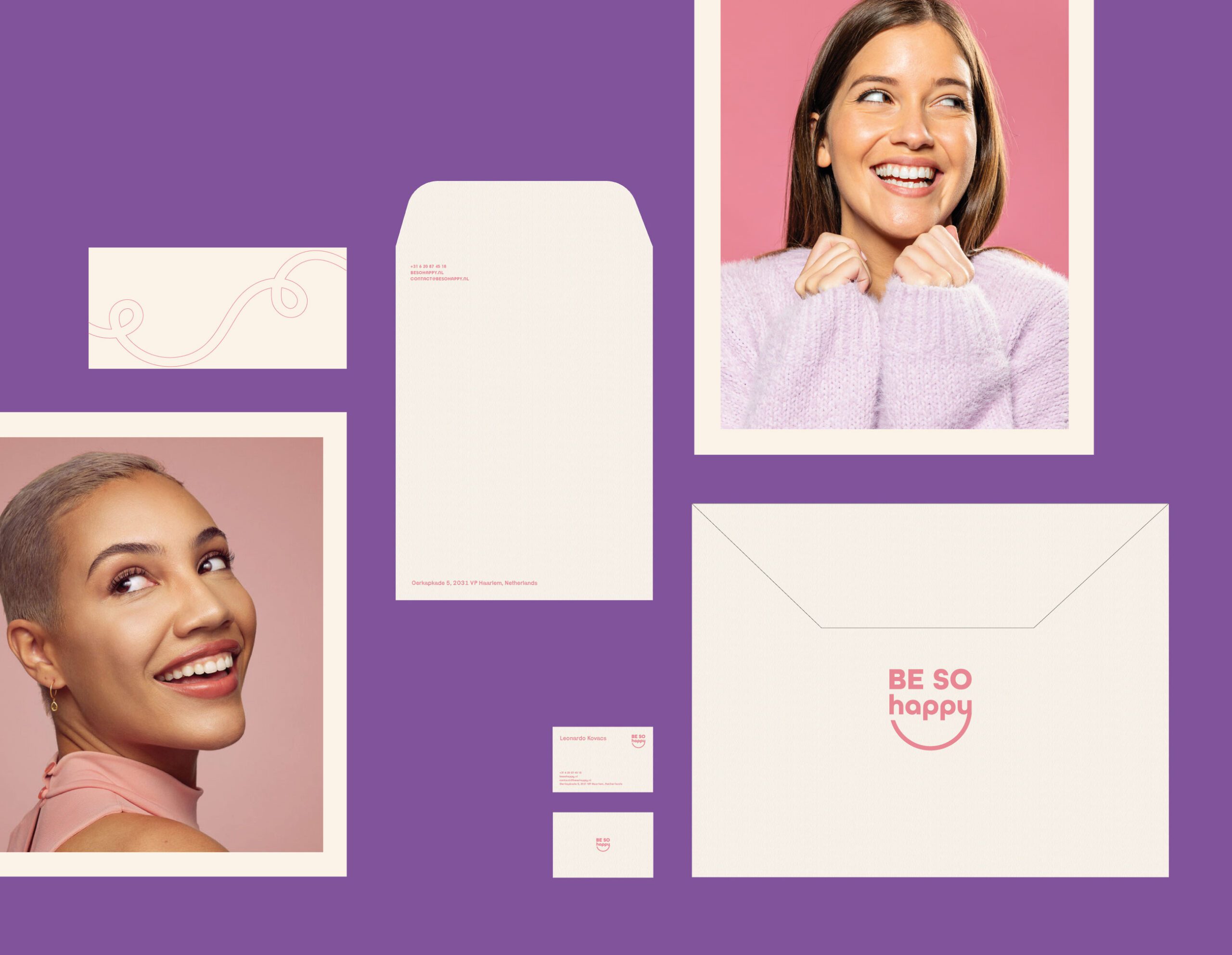
The visual identity for Be So Happy was developed to reflect its focus on mood support and wellbeing. We created a design language grounded in simplicity and clear communication, supporting rapid understanding of product purpose and benefits without visual clutter.
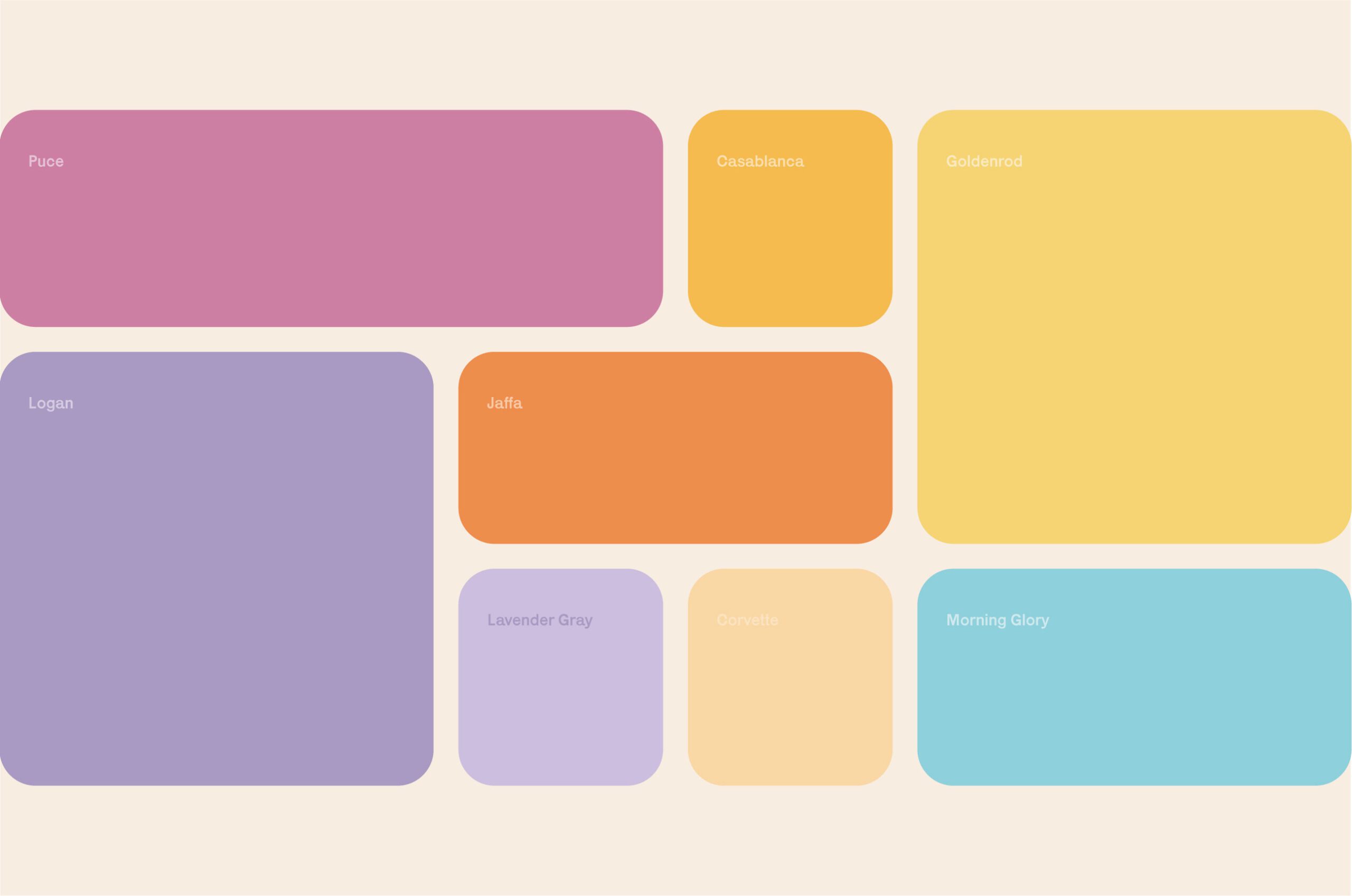
Typography was chosen to support readability and hierarchy, enabling key information to be accessible at a glance. The color palette uses a combination of tones selected to signify wellbeing, energy, and balance while maintaining coherence across product variants.
Graphic elements were applied with restraint and intention, supporting communication needs rather than decoration. This structured approach allows each product in the range to be visually distinct while functioning within a unified brand system.
Packaging Design and Product Differentiation
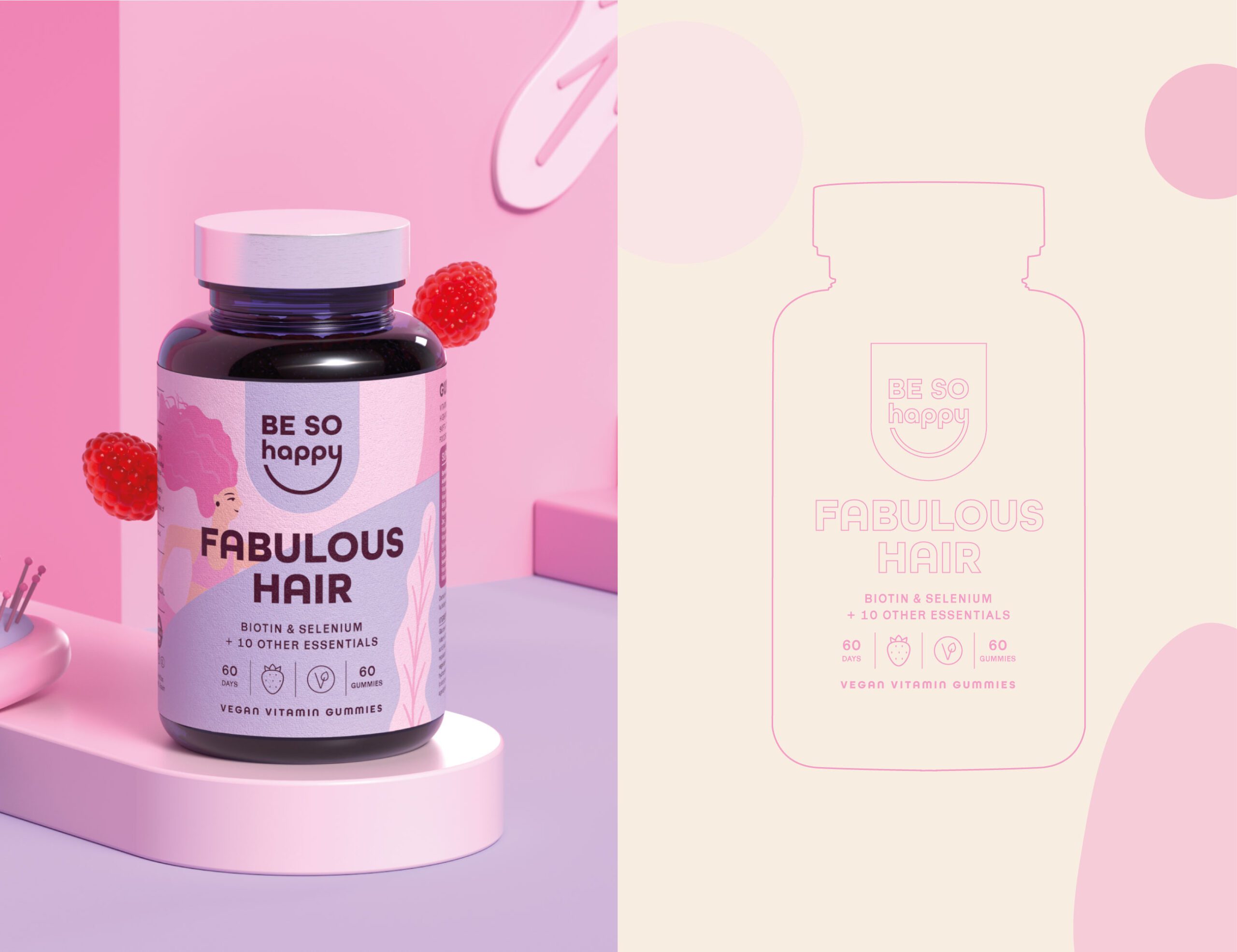
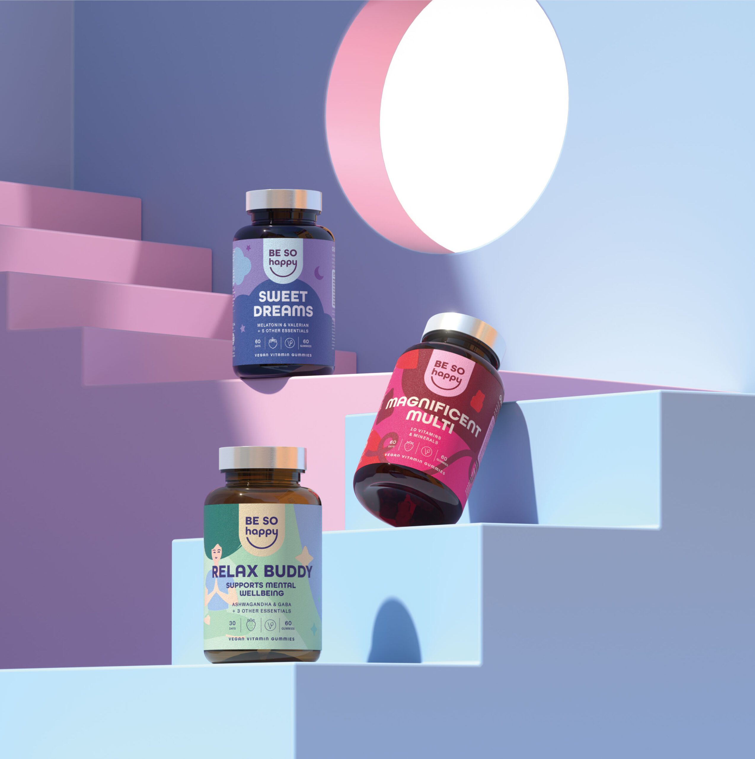
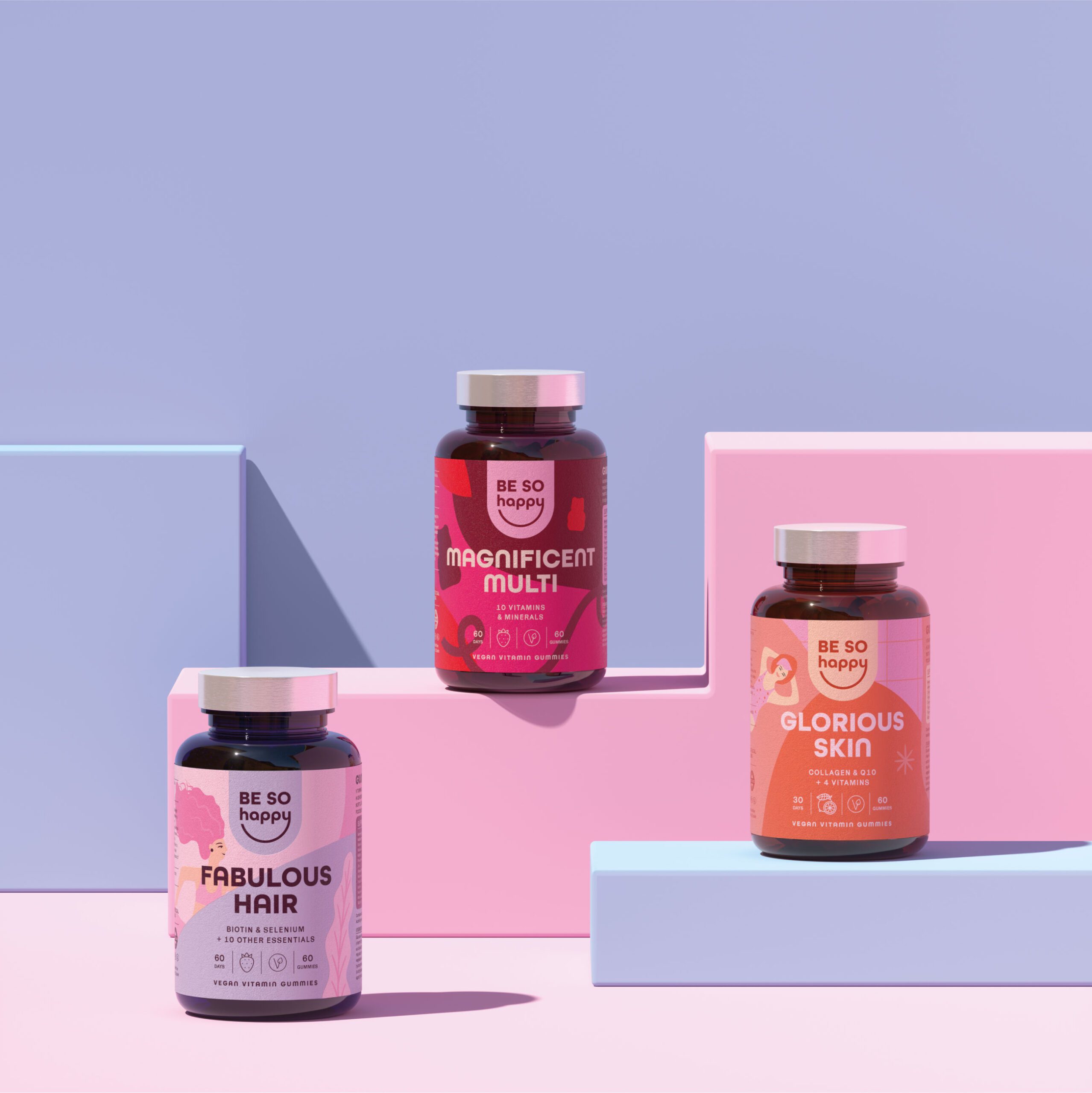
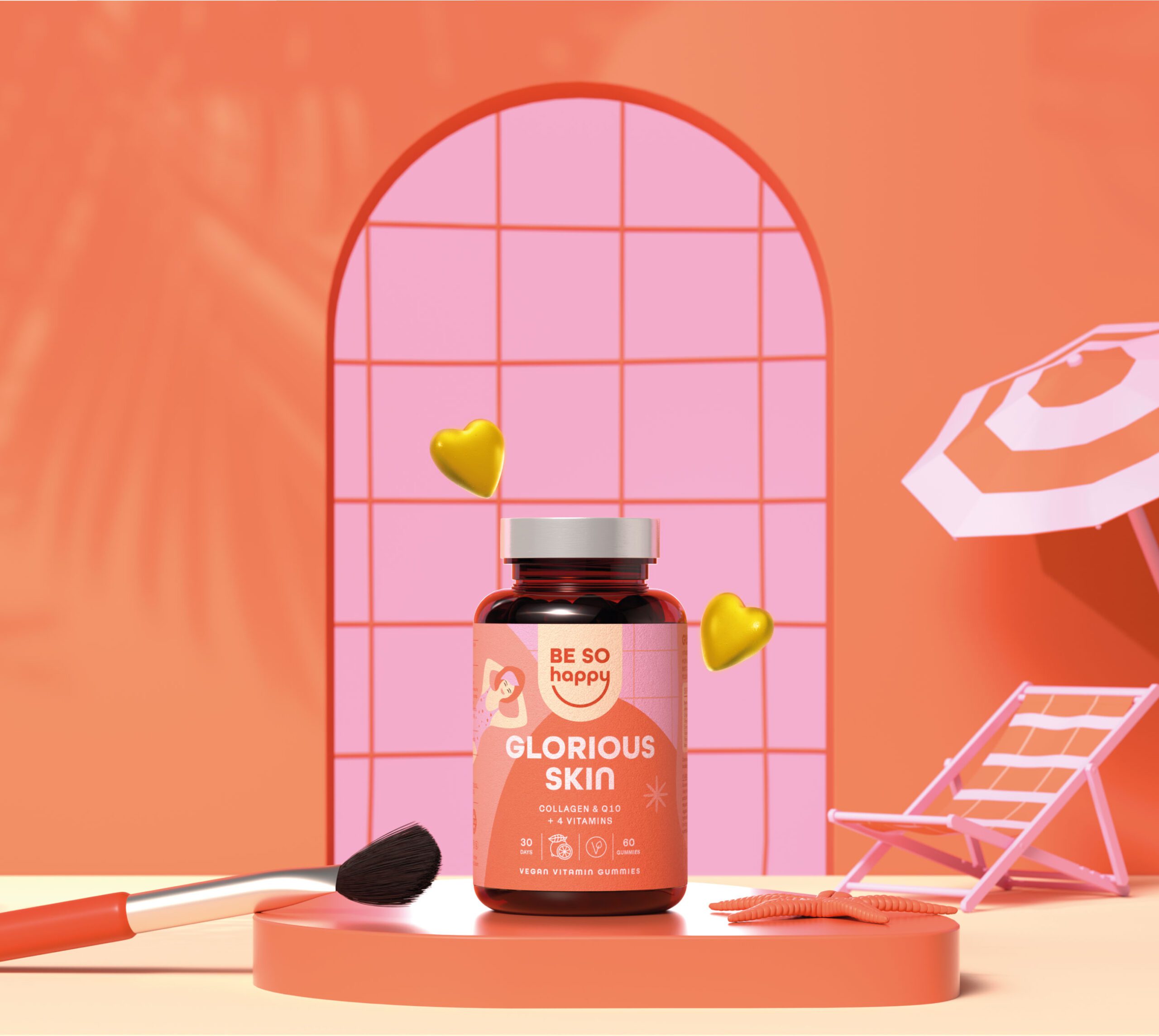
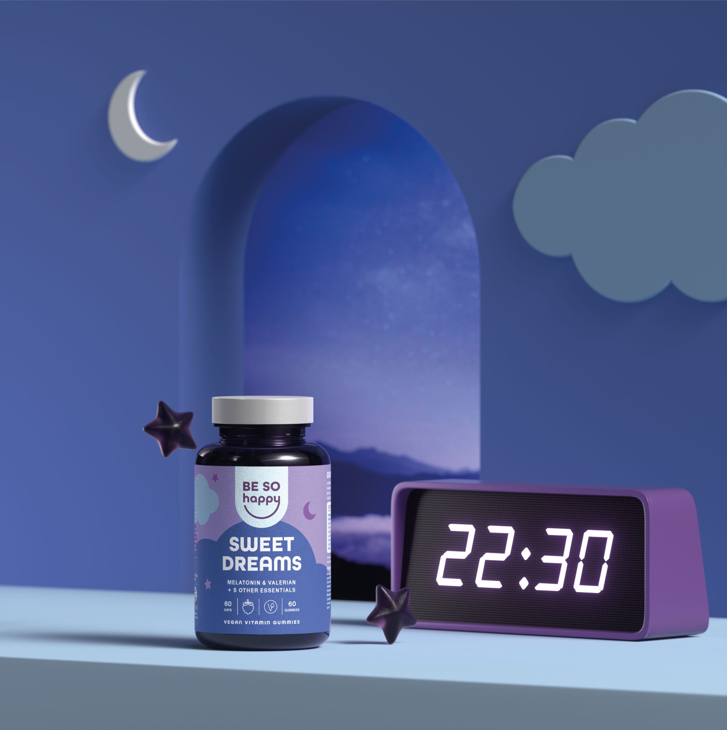
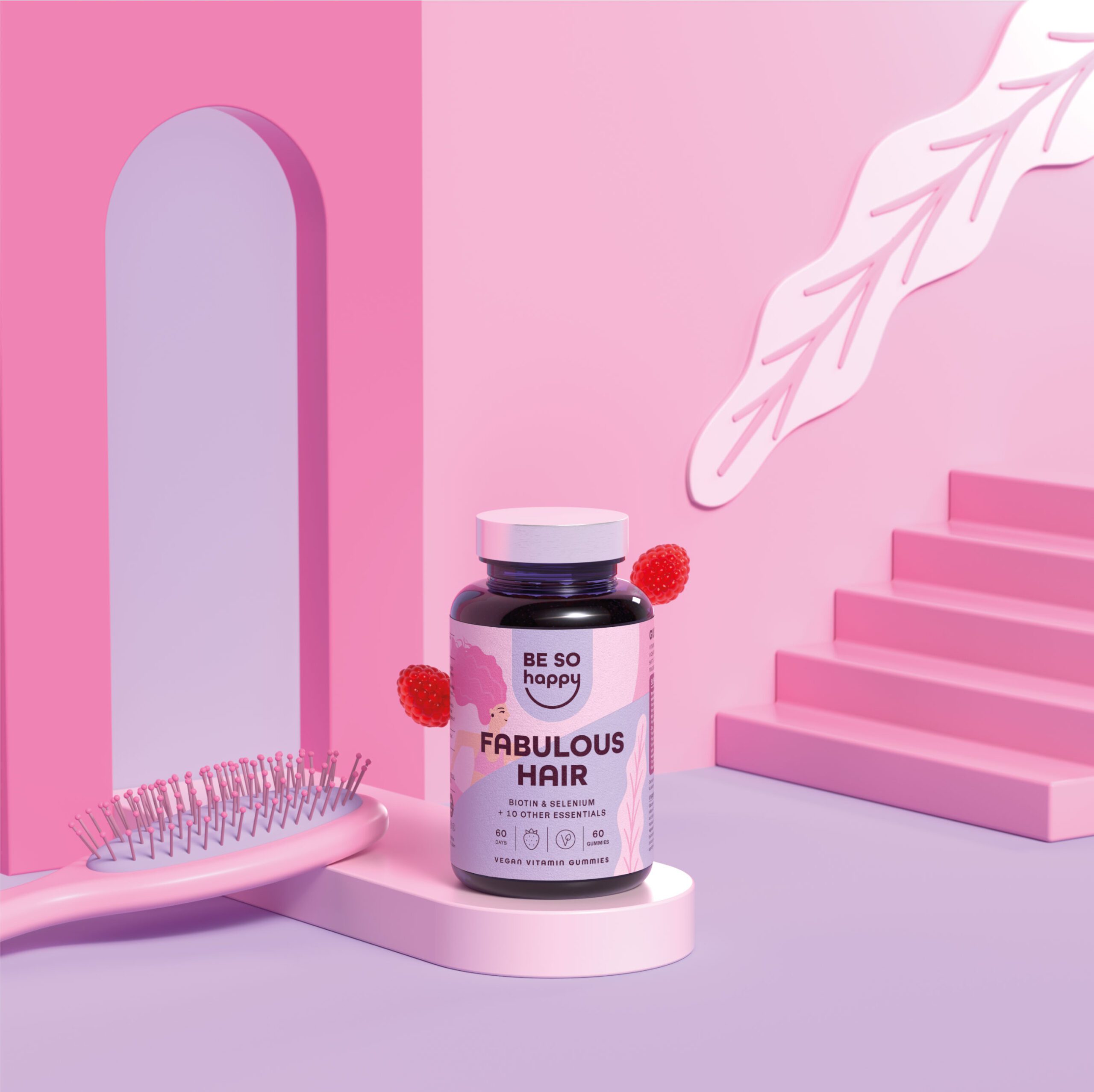
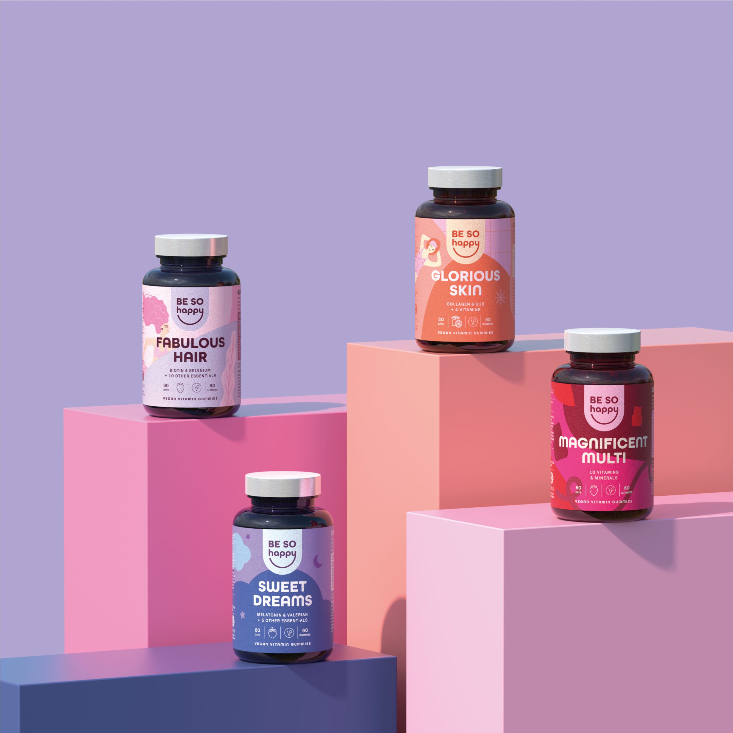
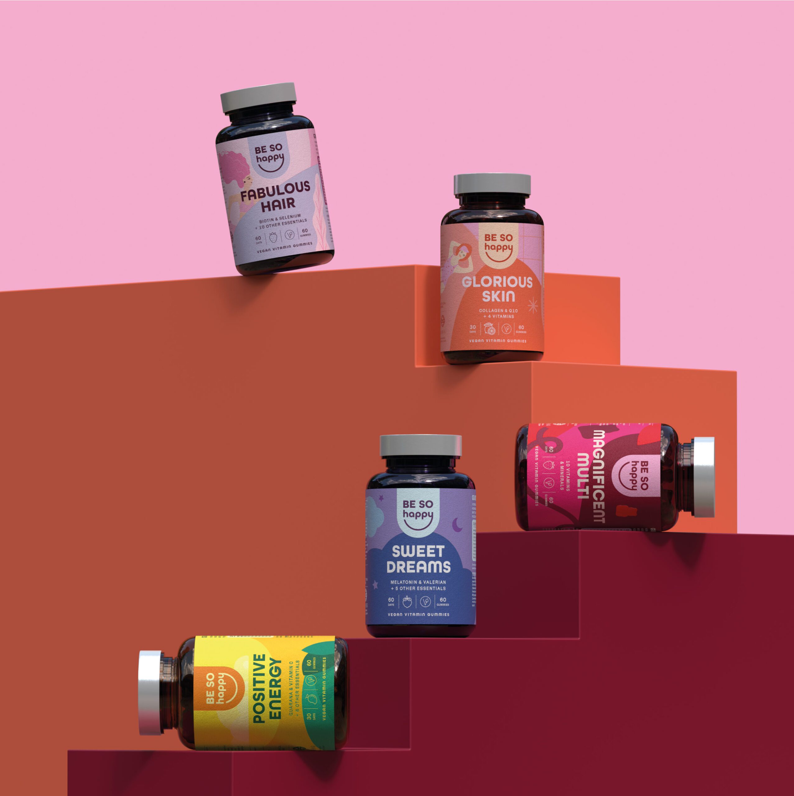
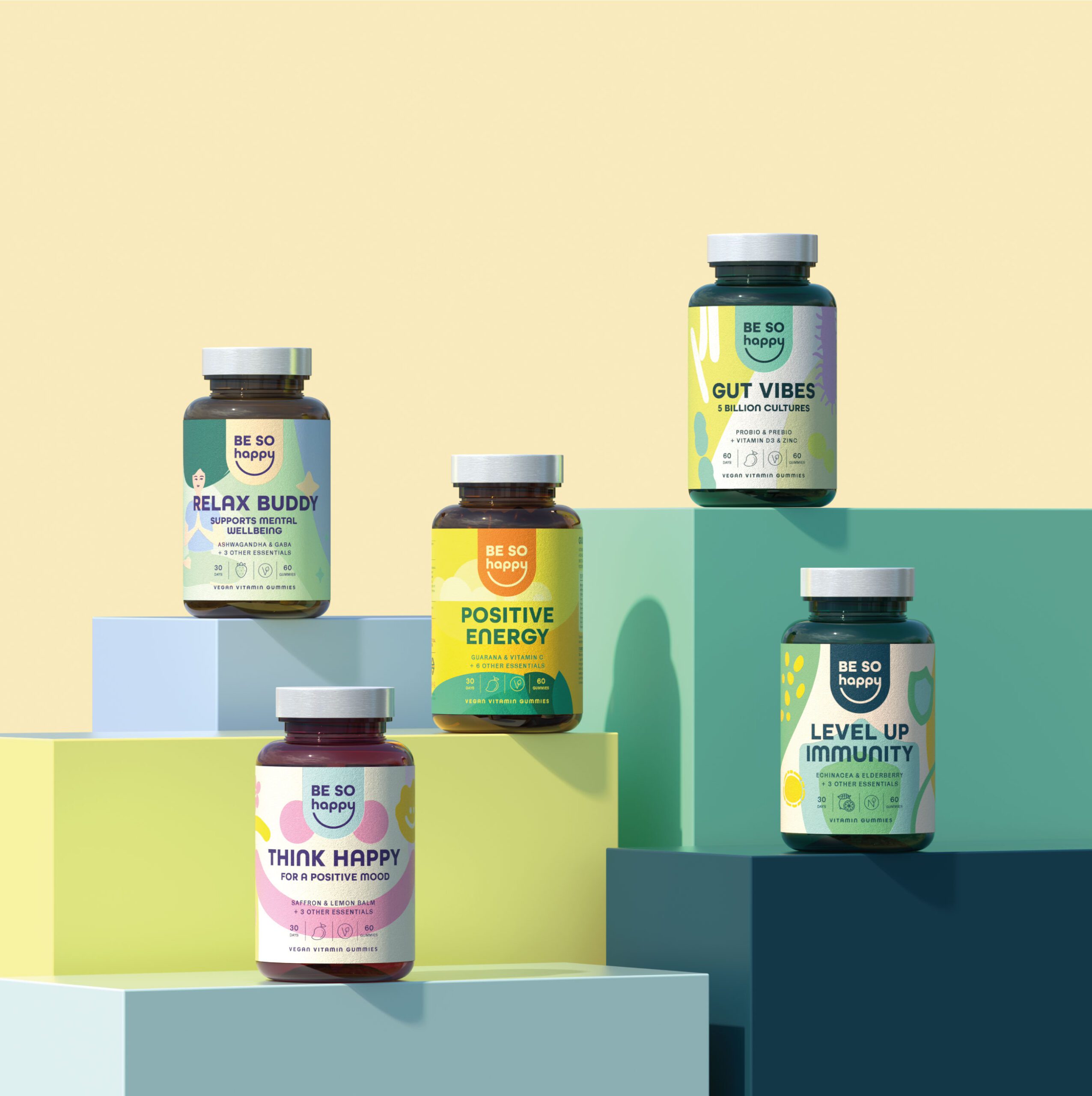
Packaging design for Be So Happy emphasizes readability and information clarity, allowing consumers to quickly identify product benefits, usage, and key attributes. Label layouts are organized to guide the viewer through the most important details first, supporting better decision making at the point of purchase.
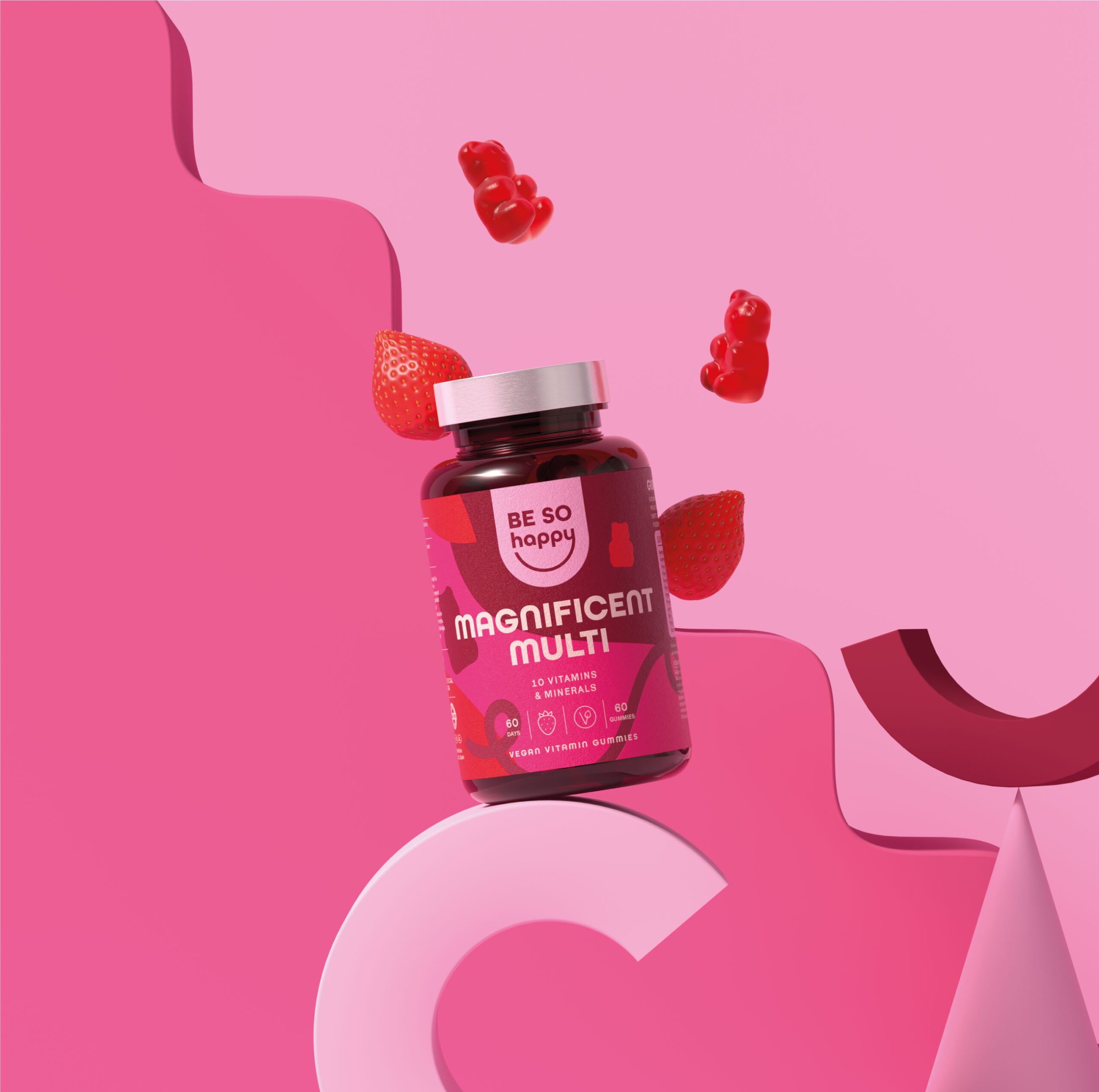
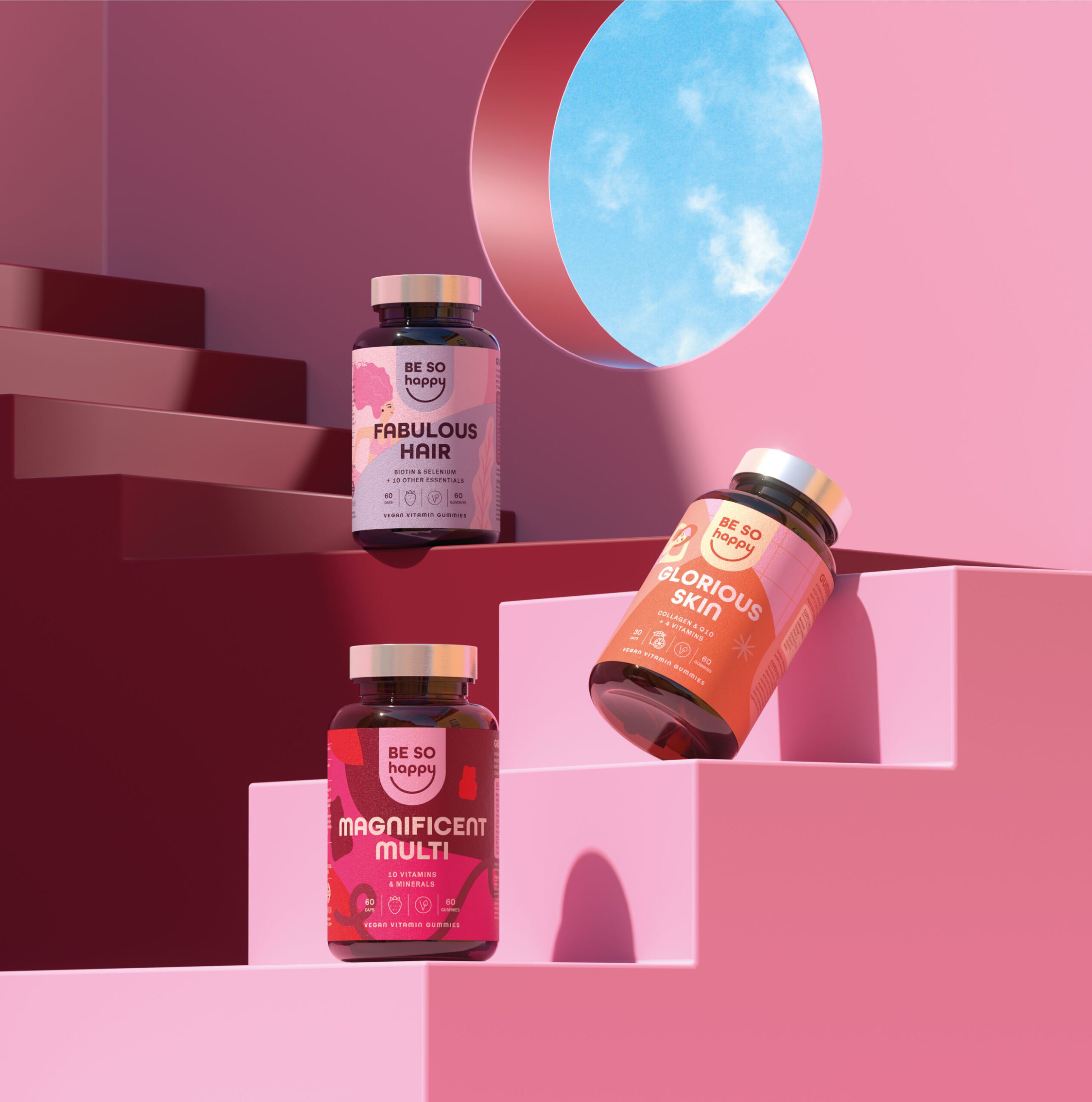
Each product variant is differentiated through specific color applications and visual cues within the broader brand framework. These distinctions help guide consumer choice while maintaining a consistent visual identity that spans the entire range.
The overall packaging system balances functional presentation with purposeful design, strengthening shelf presence and supporting consumer confidence in product efficacy.


Brand Application and Market Presence
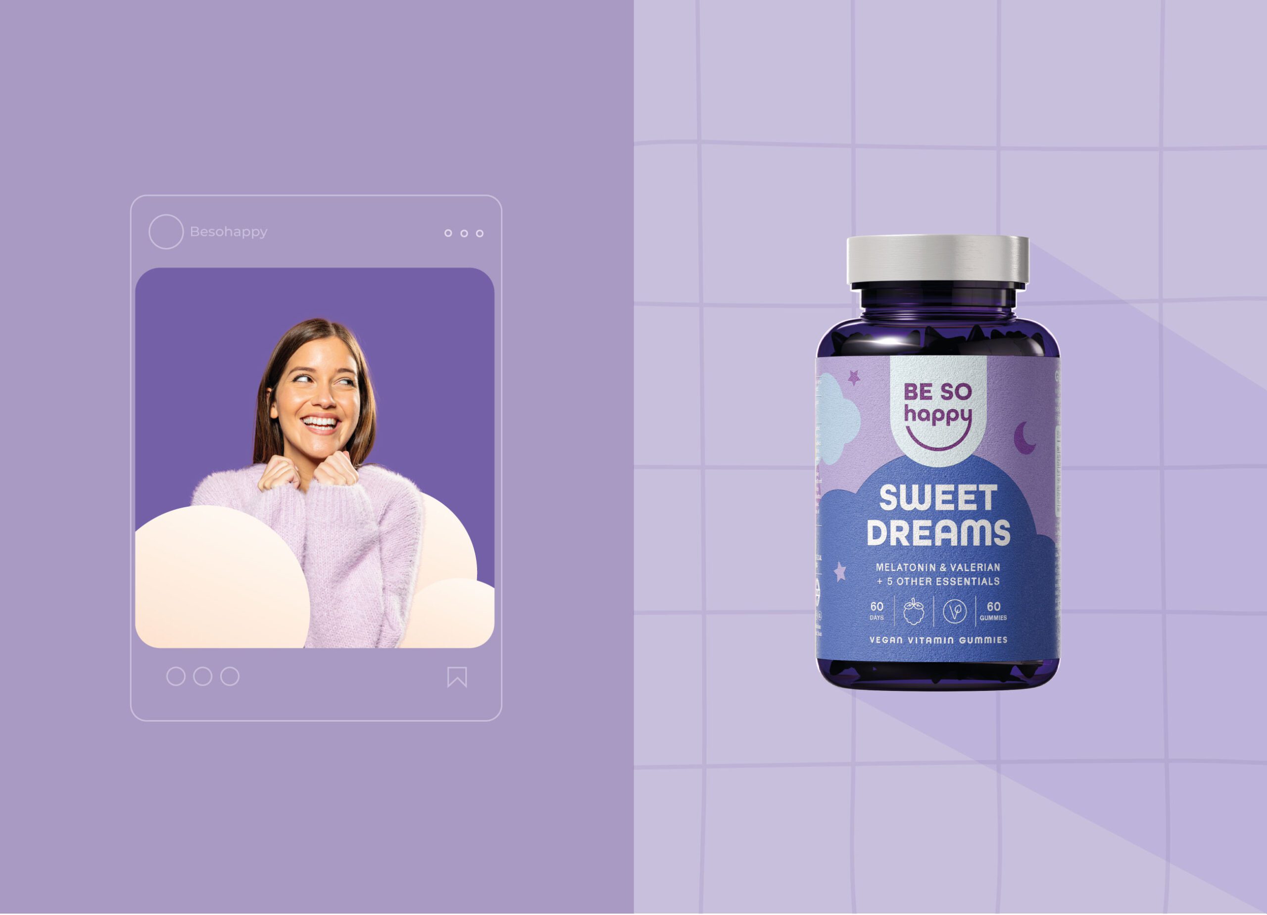
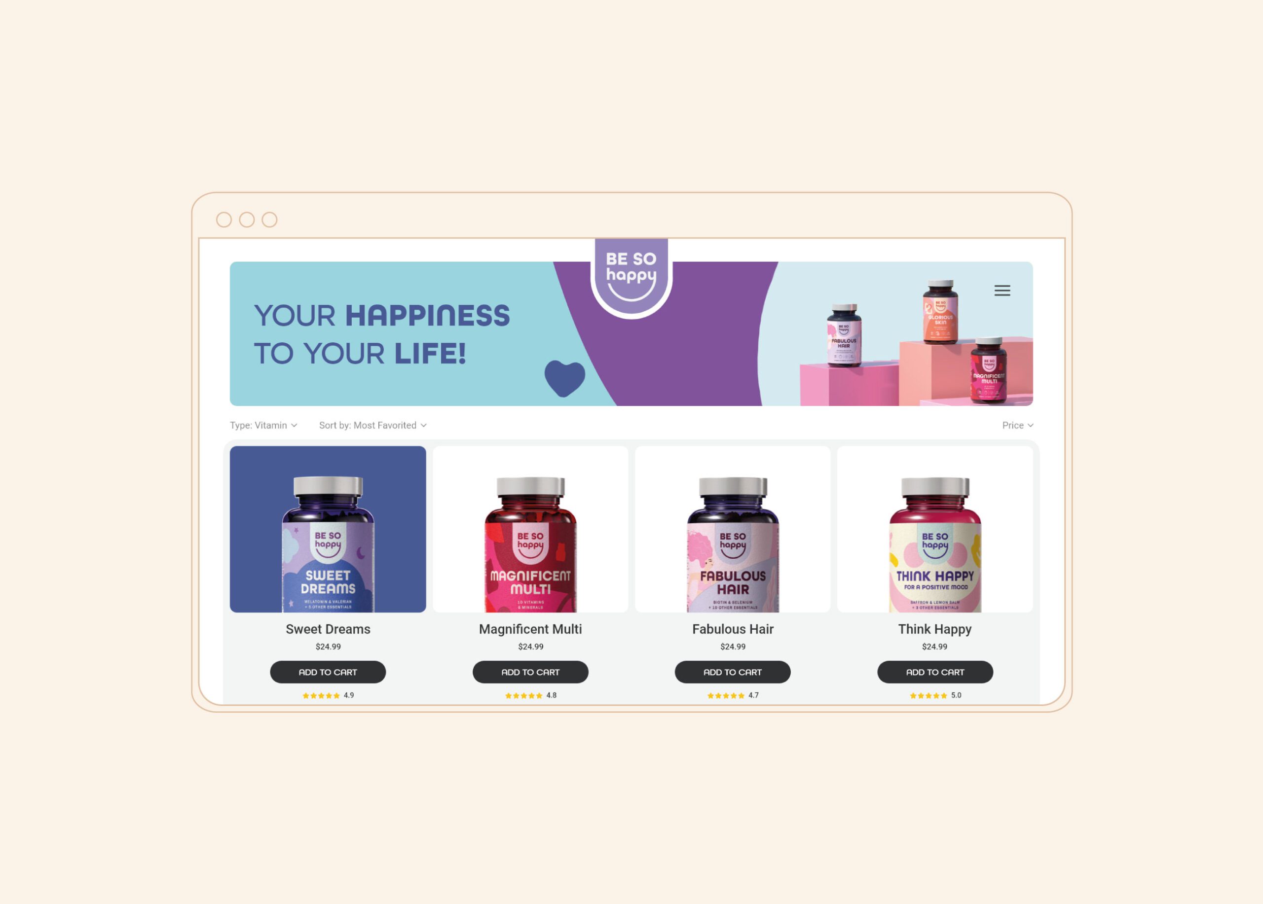
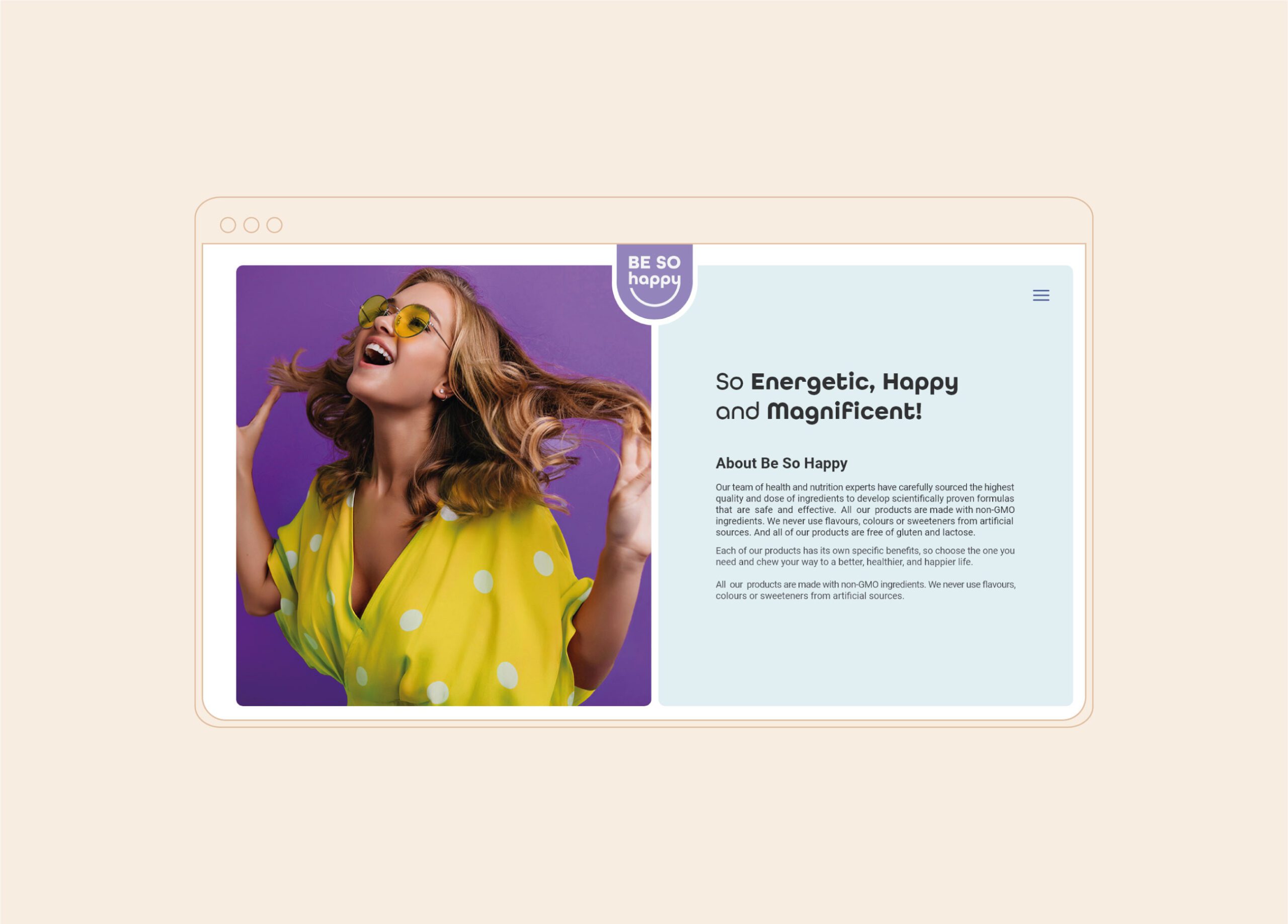
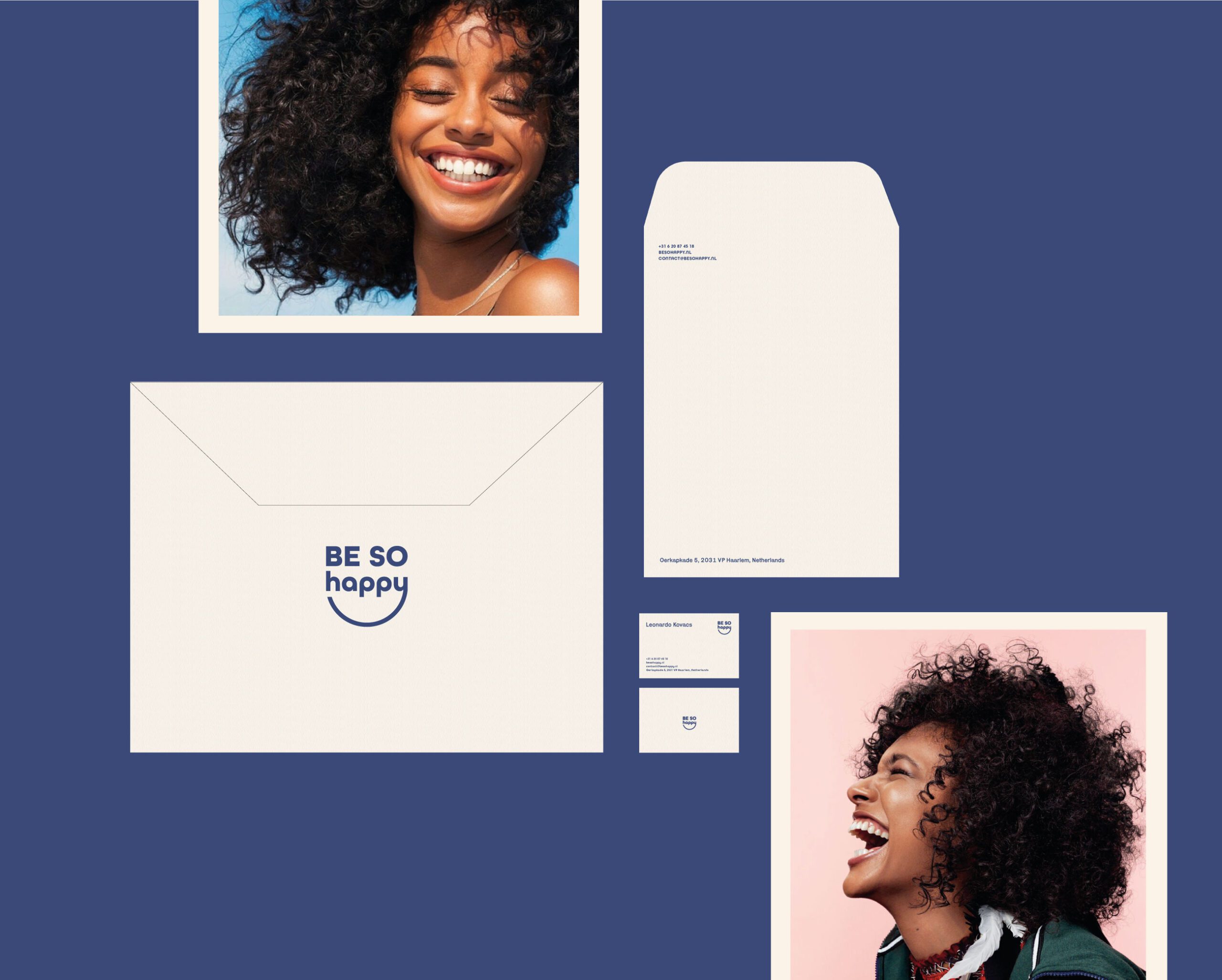
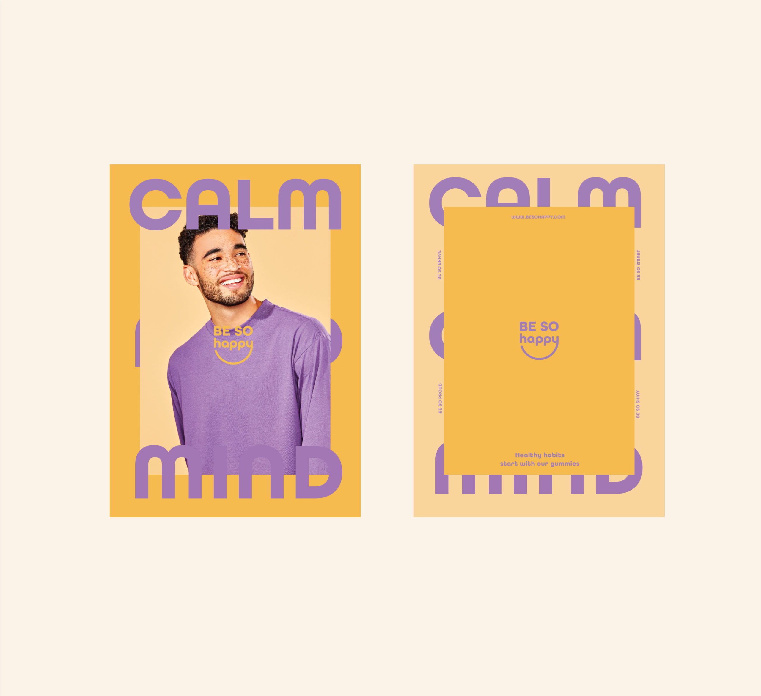
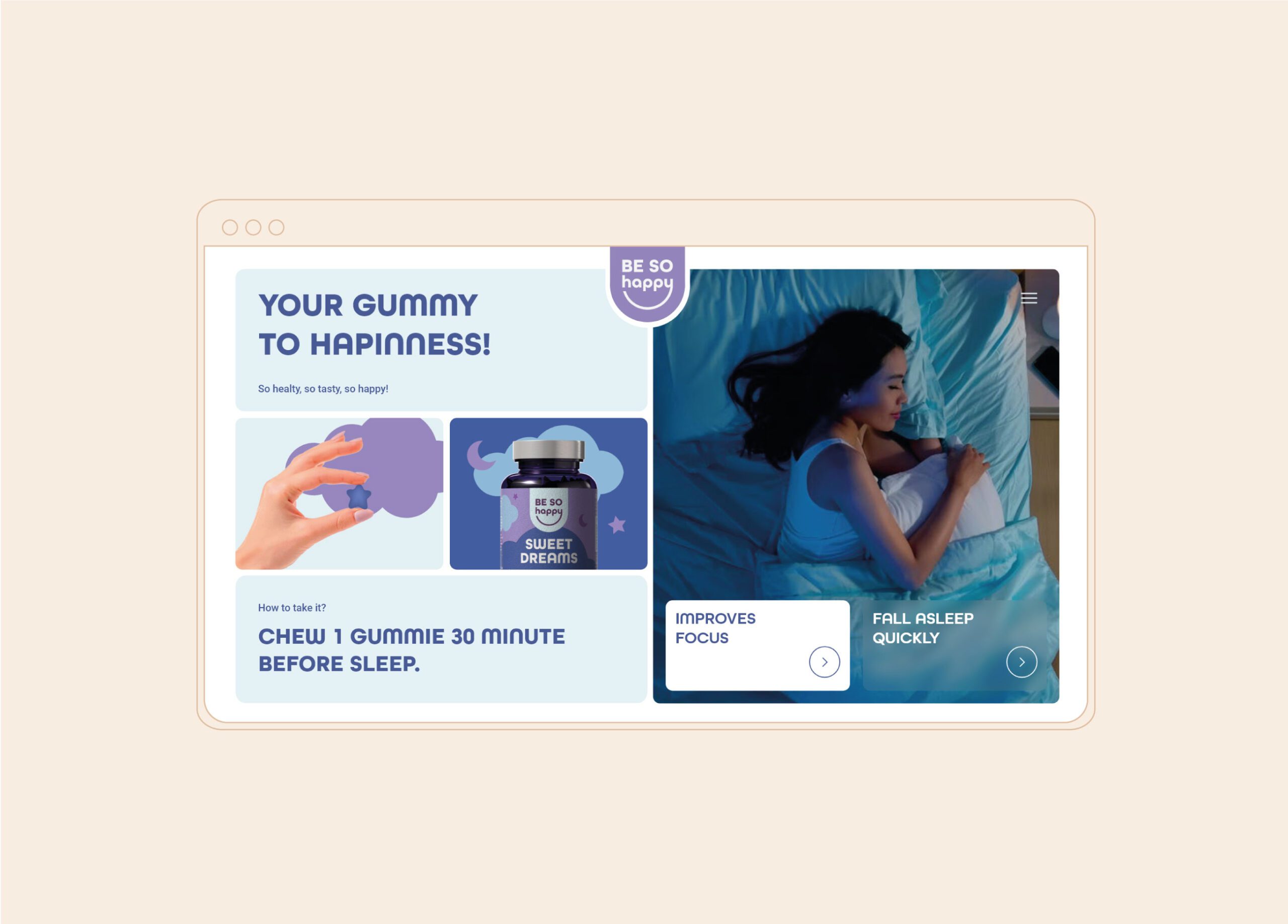
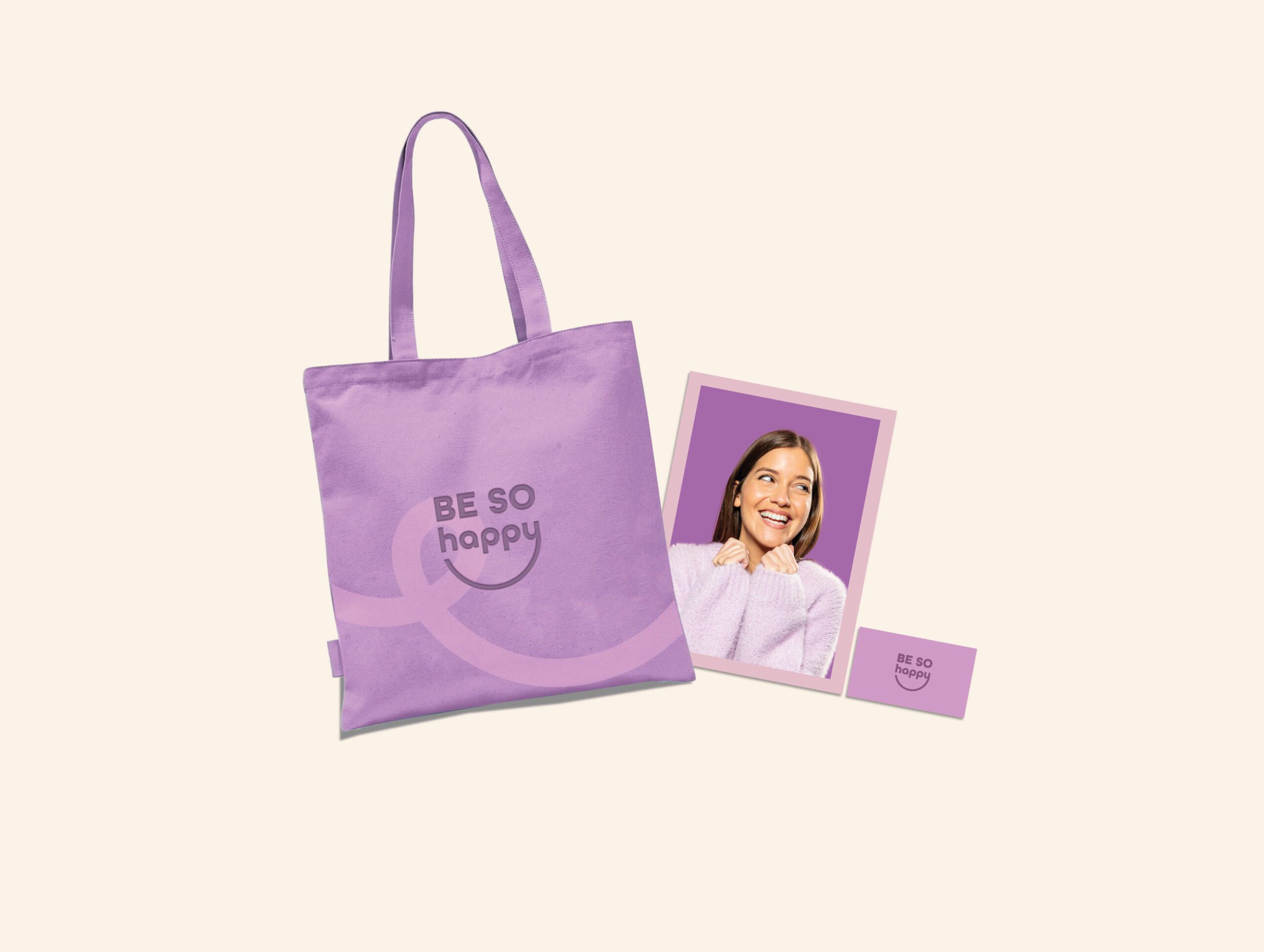
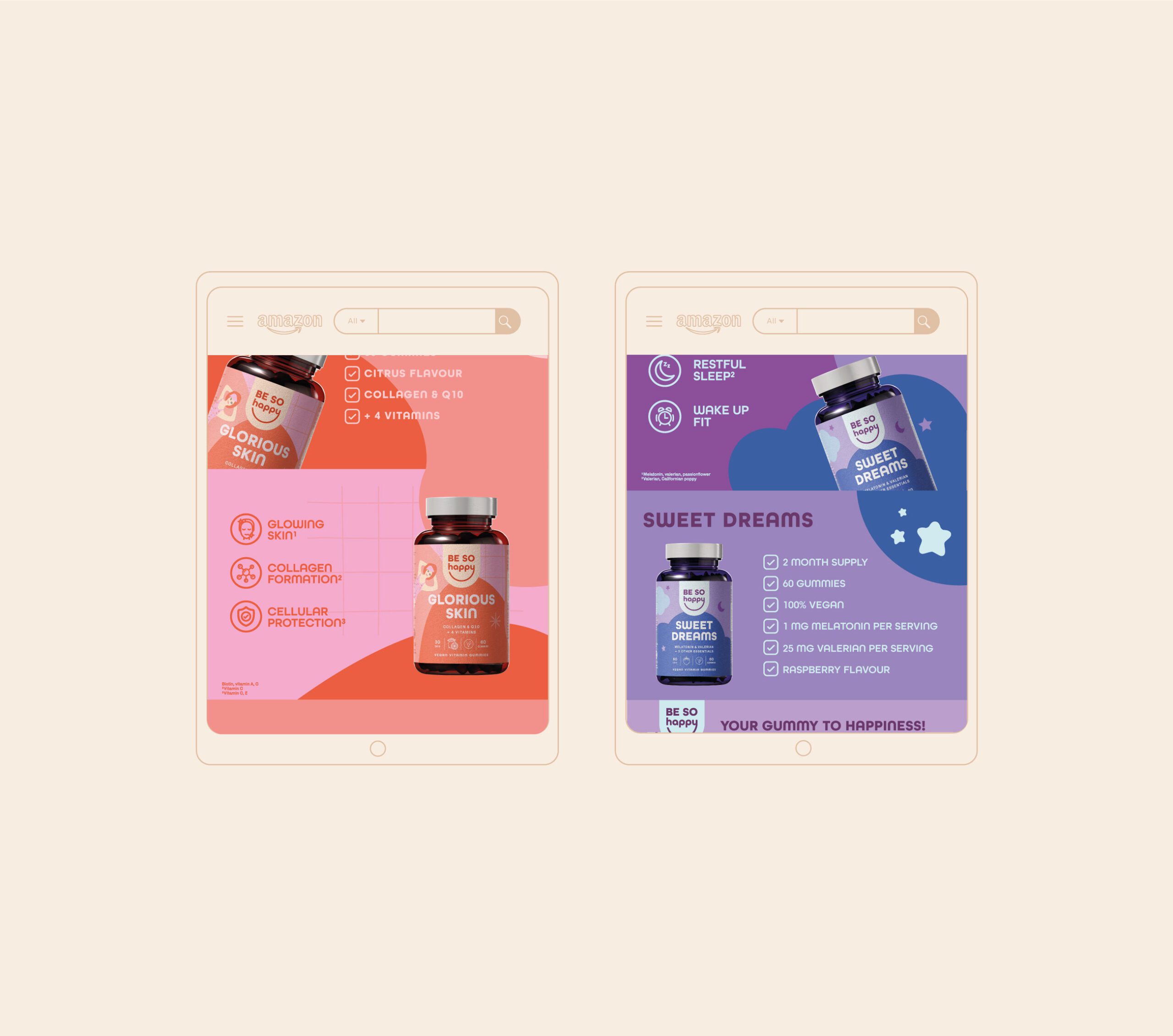
The Be So Happy identity extends into online platforms and marketing environments where the visual system supports consistent presentation and clear communication. Visual assets for digital use maintain the same information hierarchy and structured approach as the packaging, supporting recognition and engagement across channels.
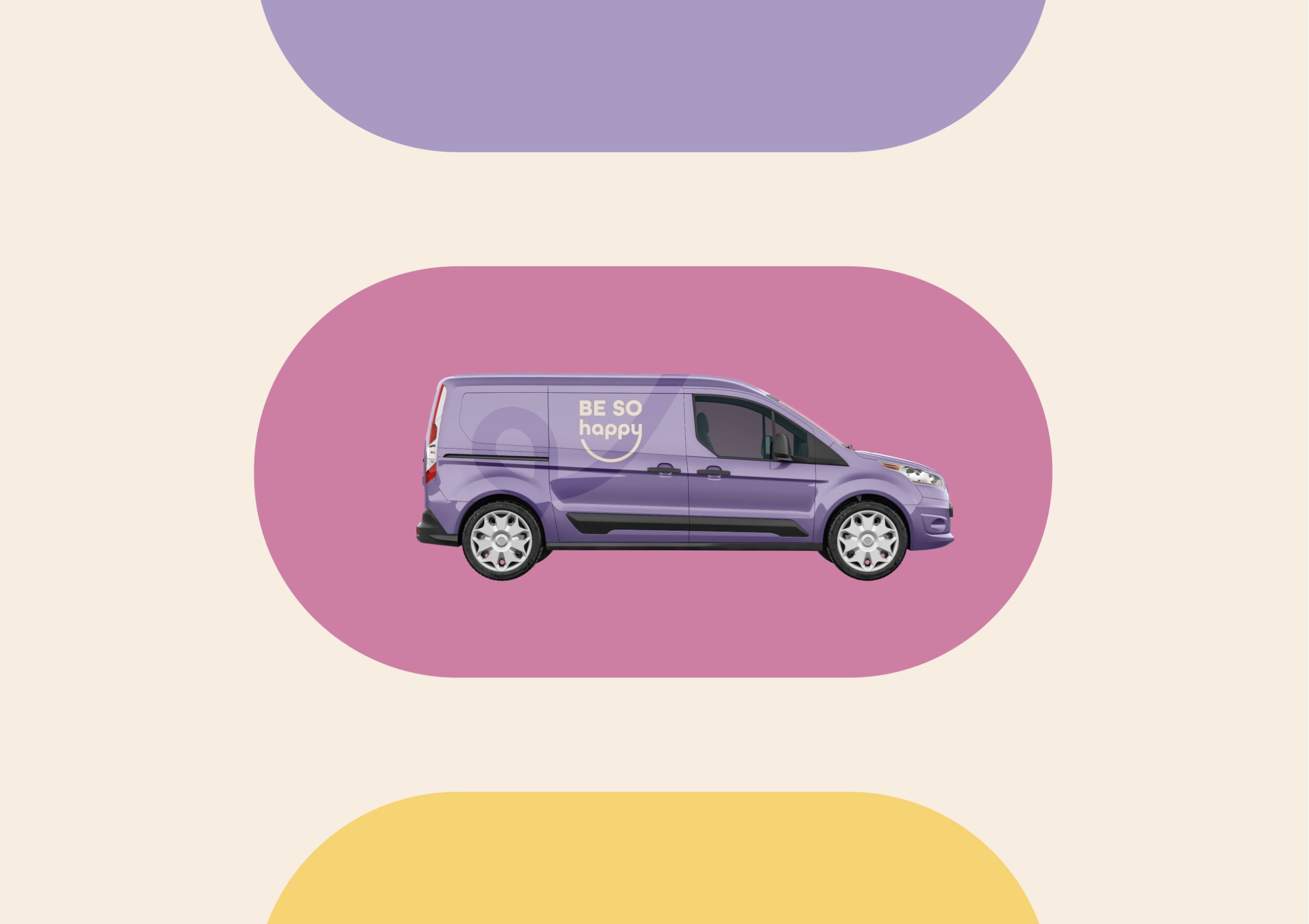
Through this design approach, Be So Happy presents itself as a supplement brand that prioritizes clear communication of wellbeing benefits and consistent brand expression across touchpoints. The identity supports product visibility, user navigation, and a unified brand experience in both physical and digital contexts.



Let’s make the work they’ll copy.
Talk to an expert now
Work with a 38 team of the
industry’s top 1% talent.



