When we started designing HappyMynd, our goal was clear: to create a brand that feels as refreshing and effortless as mental clarity itself. The challenge was to translate a complex science-backed product into a simple, approachable, and inspiring visual language.
Design Approach
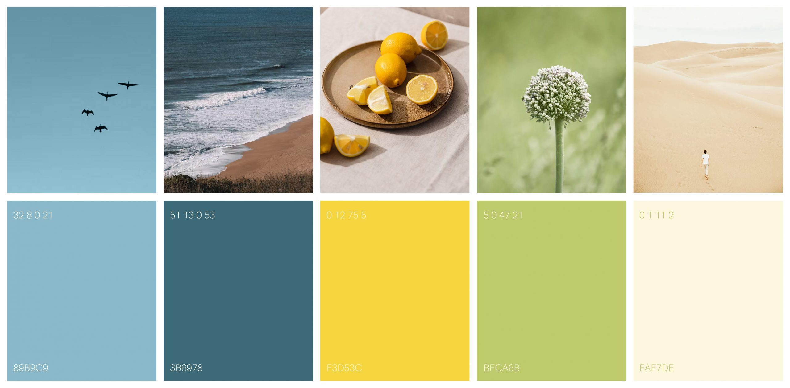
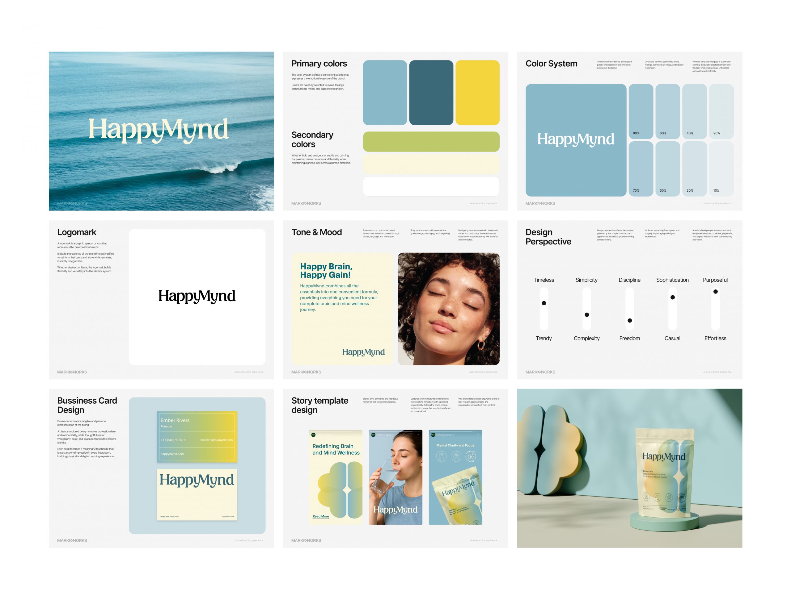
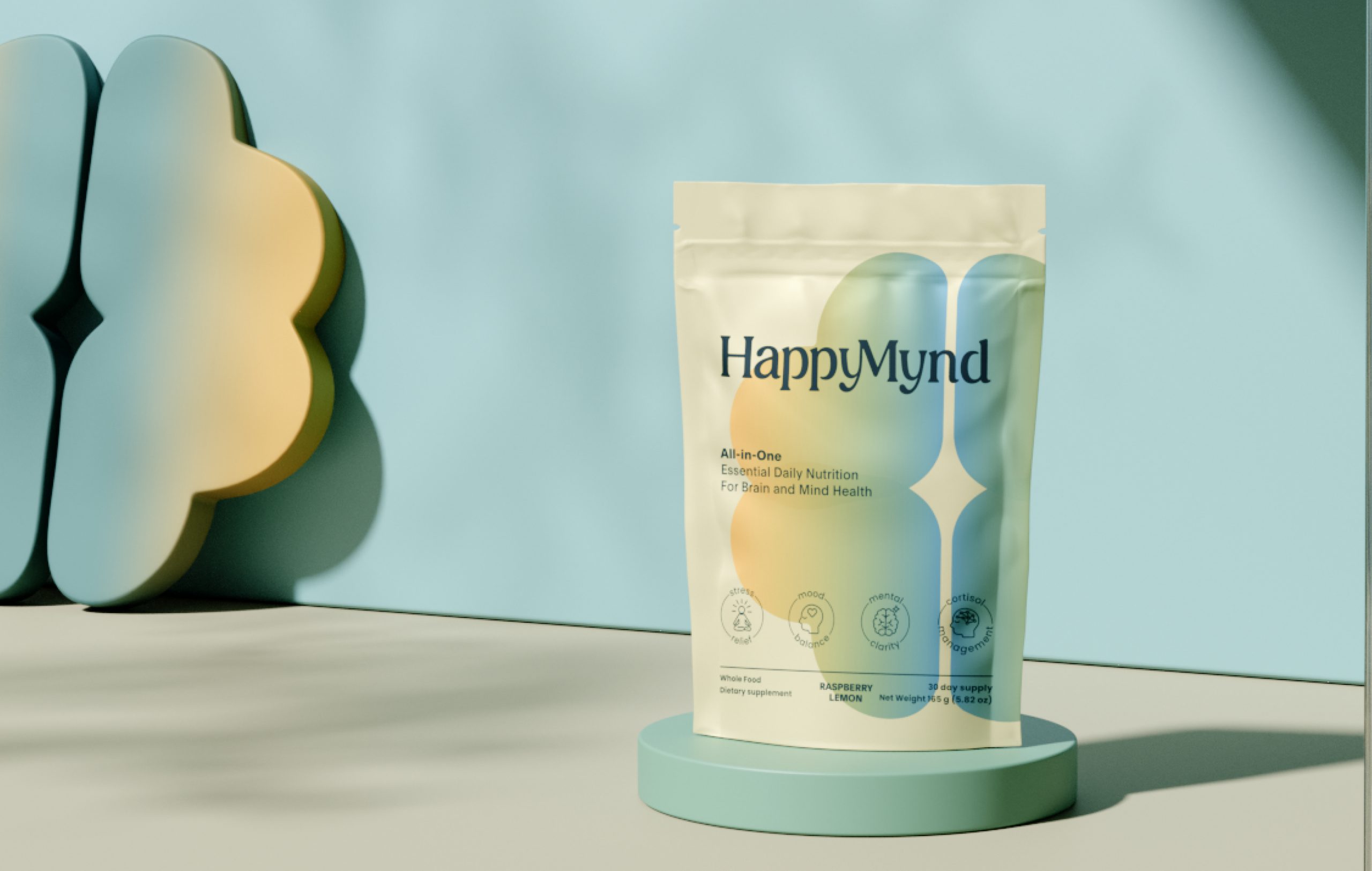
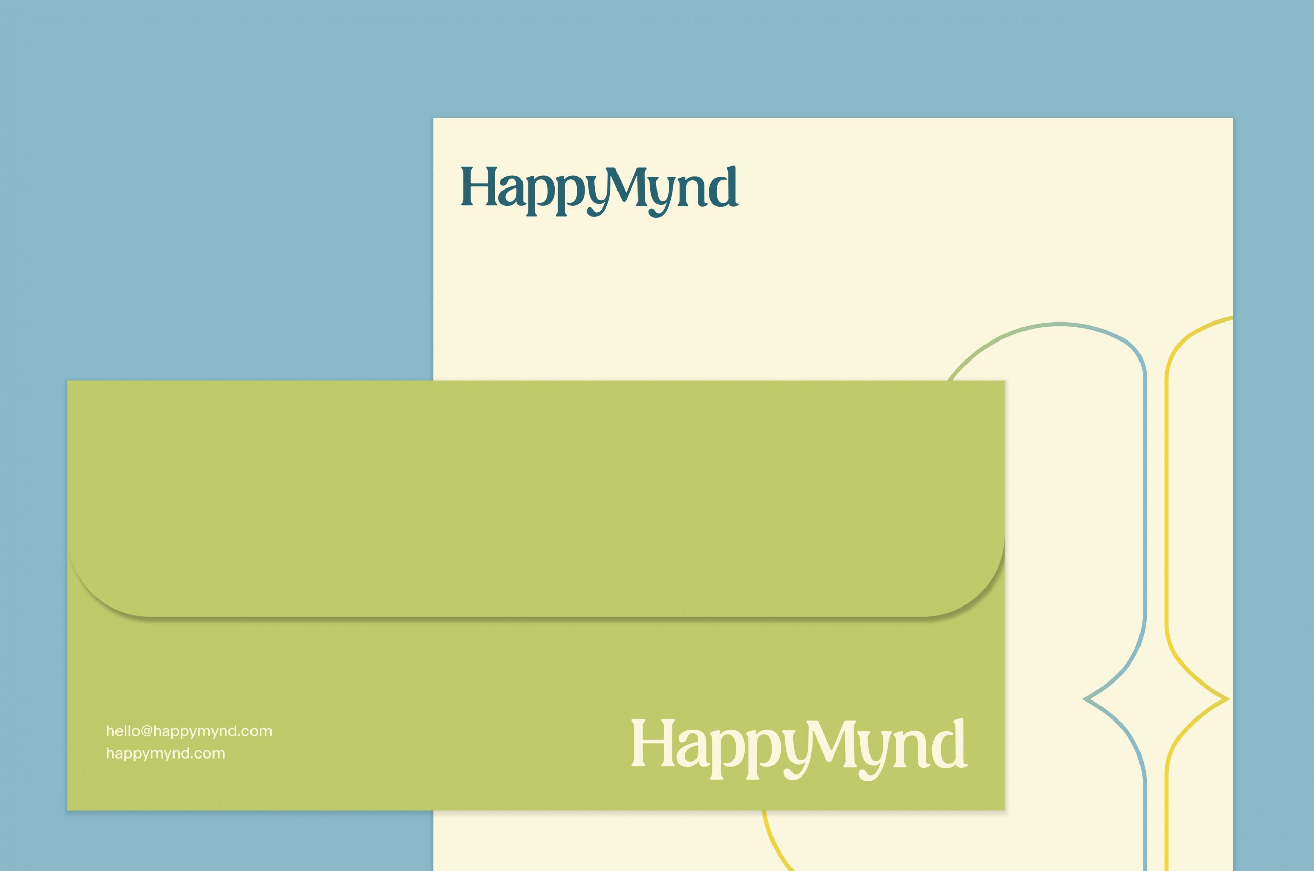
We chose a soft yet vibrant color palette inspired by nature – fresh blues, warm yellows, and calming greens – to reflect balance, energy, and clarity. The typography was carefully selected to feel timeless yet approachable, with subtle curves that bring human warmth into a science-driven category.
We chose a soft yet vibrant color palette inspired by nature – fresh blues, warm yellows, and calming greens – to reflect balance, energy, and clarity. The typography was carefully selected to feel timeless yet approachable, with subtle curves that bring human warmth into a science-driven category.
Identity System
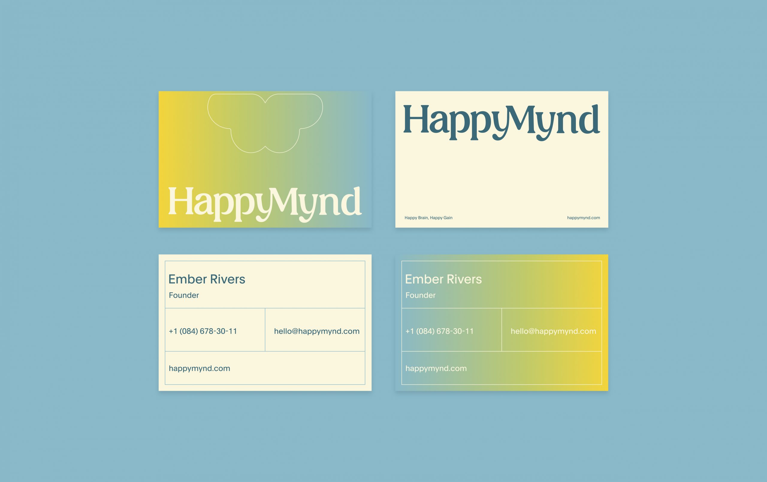
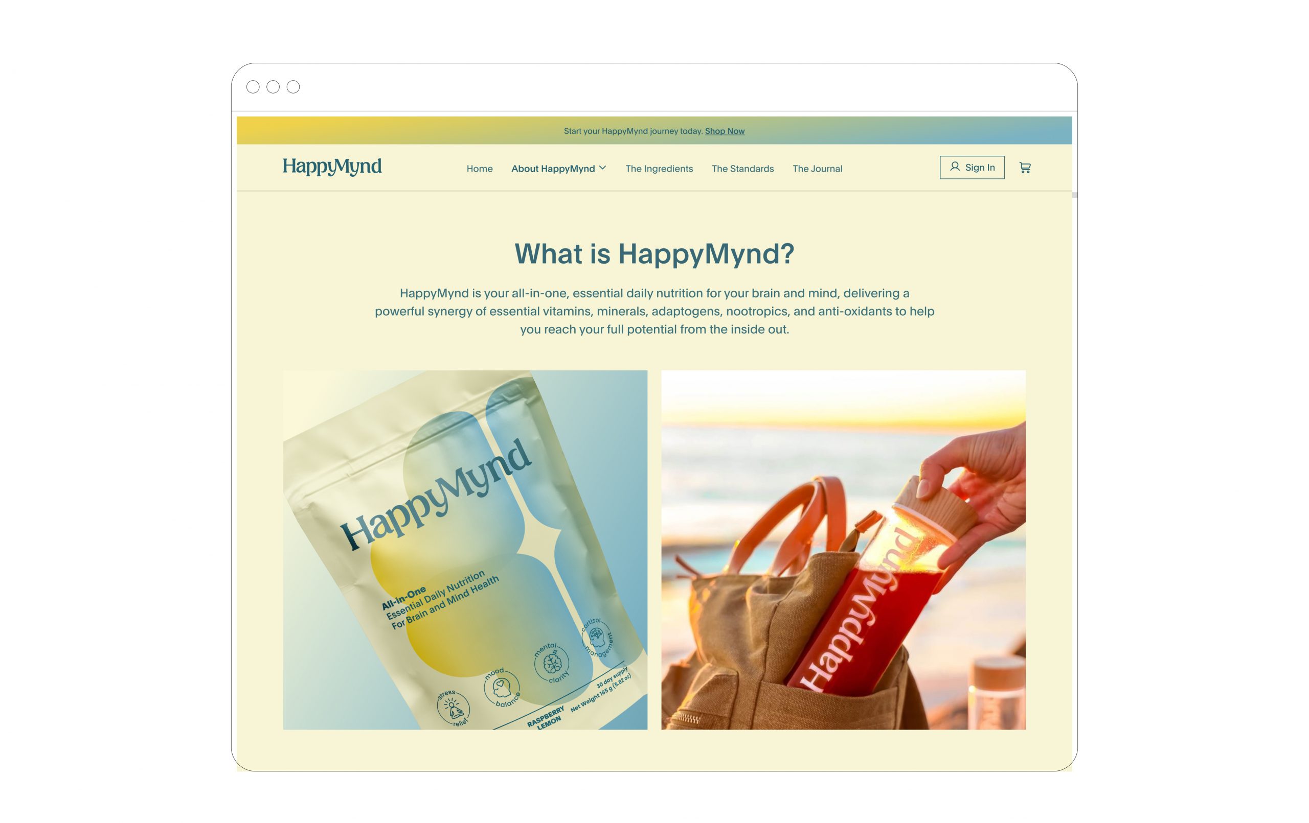
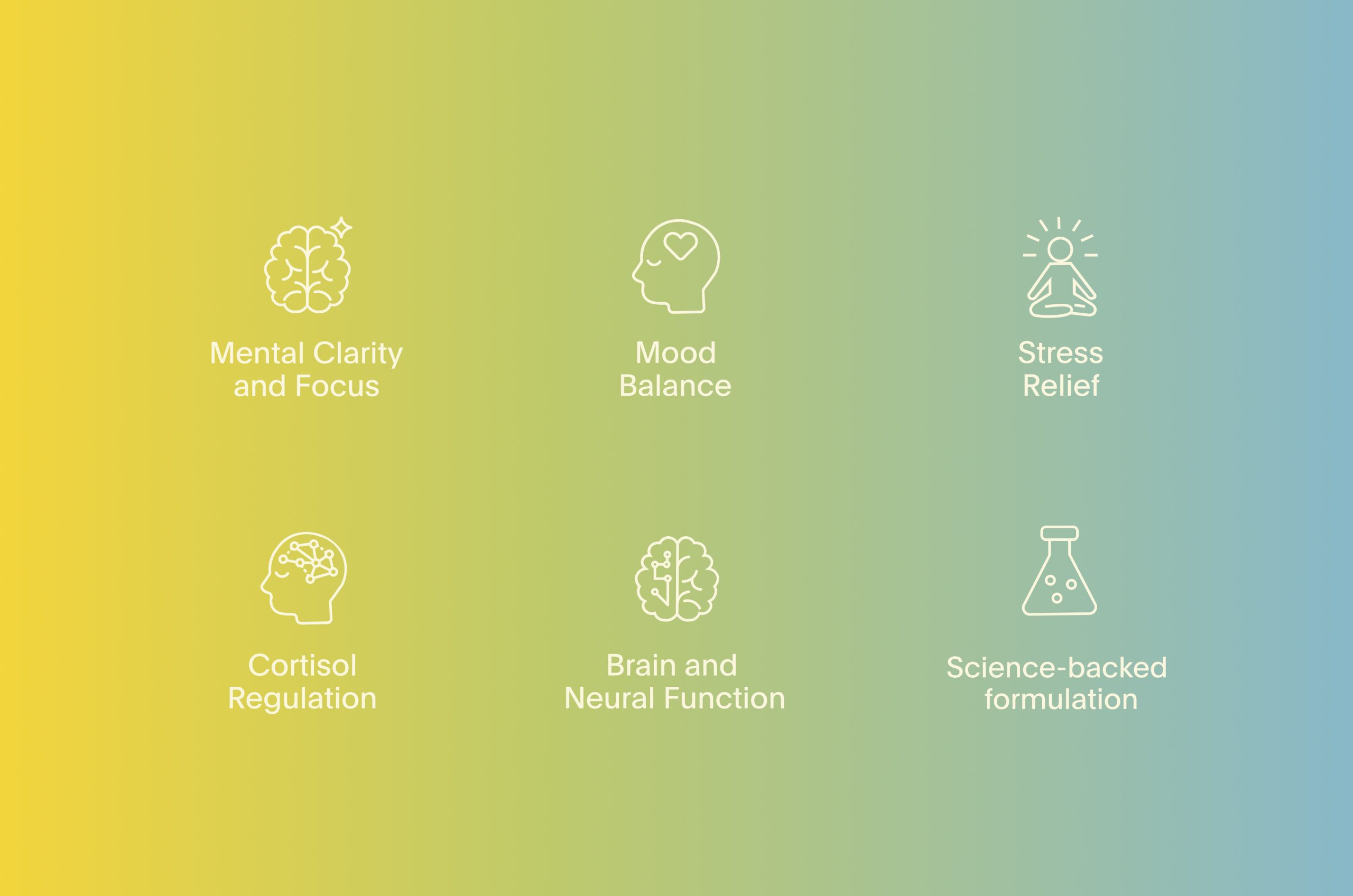
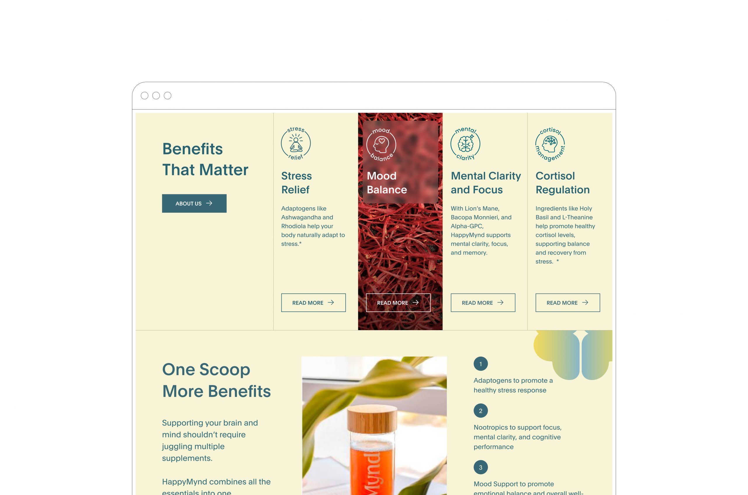
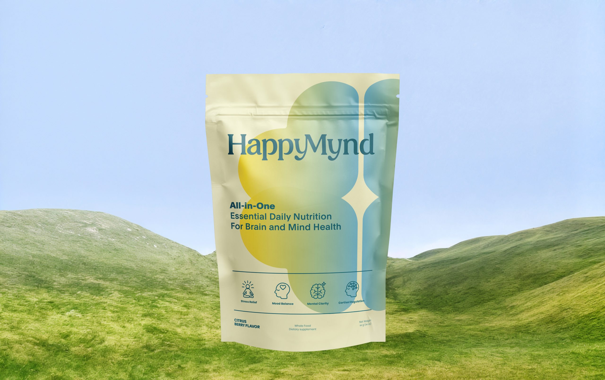
From packaging to digital presence, the system was designed to feel consistent and flexible. Shapes inspired by the human brain became recurring visual motifs, reinforcing the connection to mind and wellness. Iconography highlights key product benefits such as focus, stress relief, and mood balance, ensuring clarity of communication.
From packaging to digital presence, the system was designed to feel consistent and flexible. Shapes inspired by the human brain became recurring visual motifs, reinforcing the connection to mind and wellness. Iconography highlights key product benefits such as focus, stress relief, and mood balance, ensuring clarity of communication.
Tone & Mood
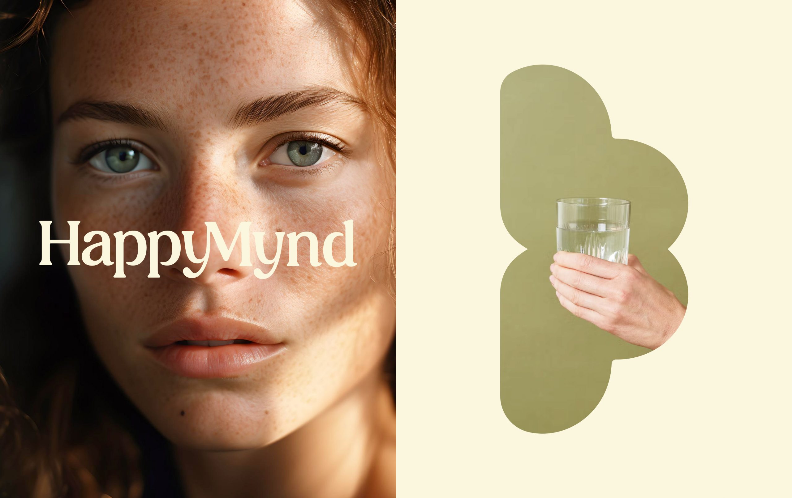
HappyMynd’s tone is optimistic and effortless. Photography emphasizes natural light, authentic expressions, and everyday rituals, placing wellness into a real, relatable context.
HappyMynd’s tone is optimistic and effortless. Photography emphasizes natural light, authentic expressions, and everyday rituals, placing wellness into a real, relatable context.
Outcome
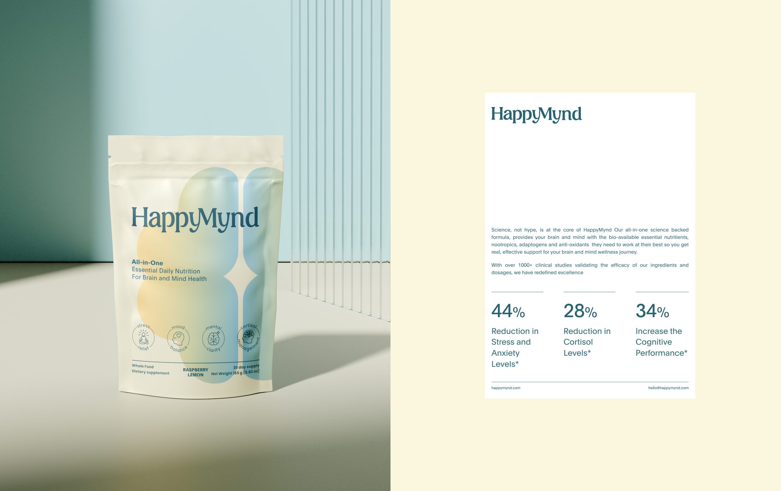
The result is a brand identity that not only communicates trust and scientific credibility but also sparks an emotional connection — making mental wellness feel simple, positive, and accessible.
The result is a brand identity that not only communicates trust and scientific credibility but also sparks an emotional connection — making mental wellness feel simple, positive, and accessible.
