
Toybox
storage that sparks imagination
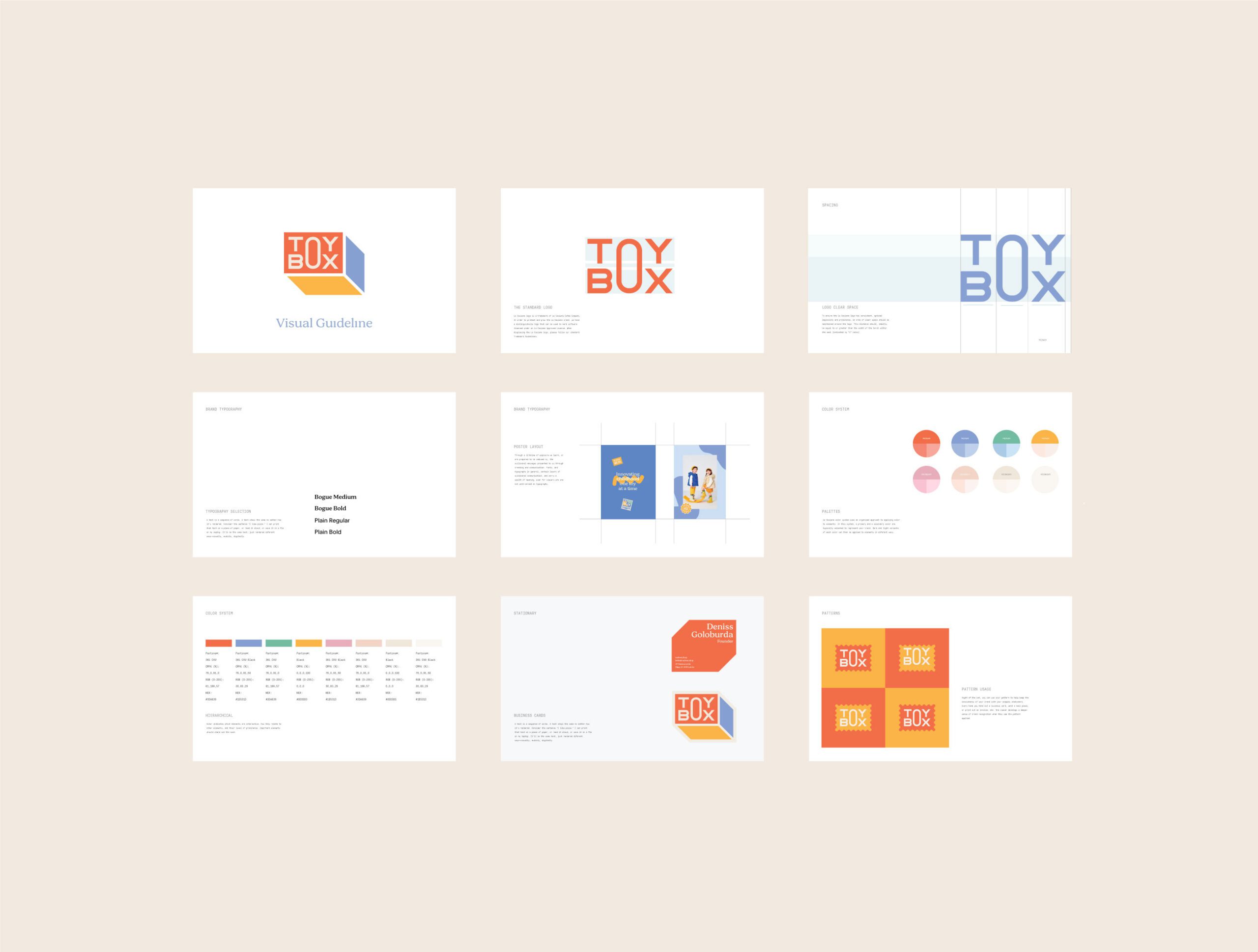
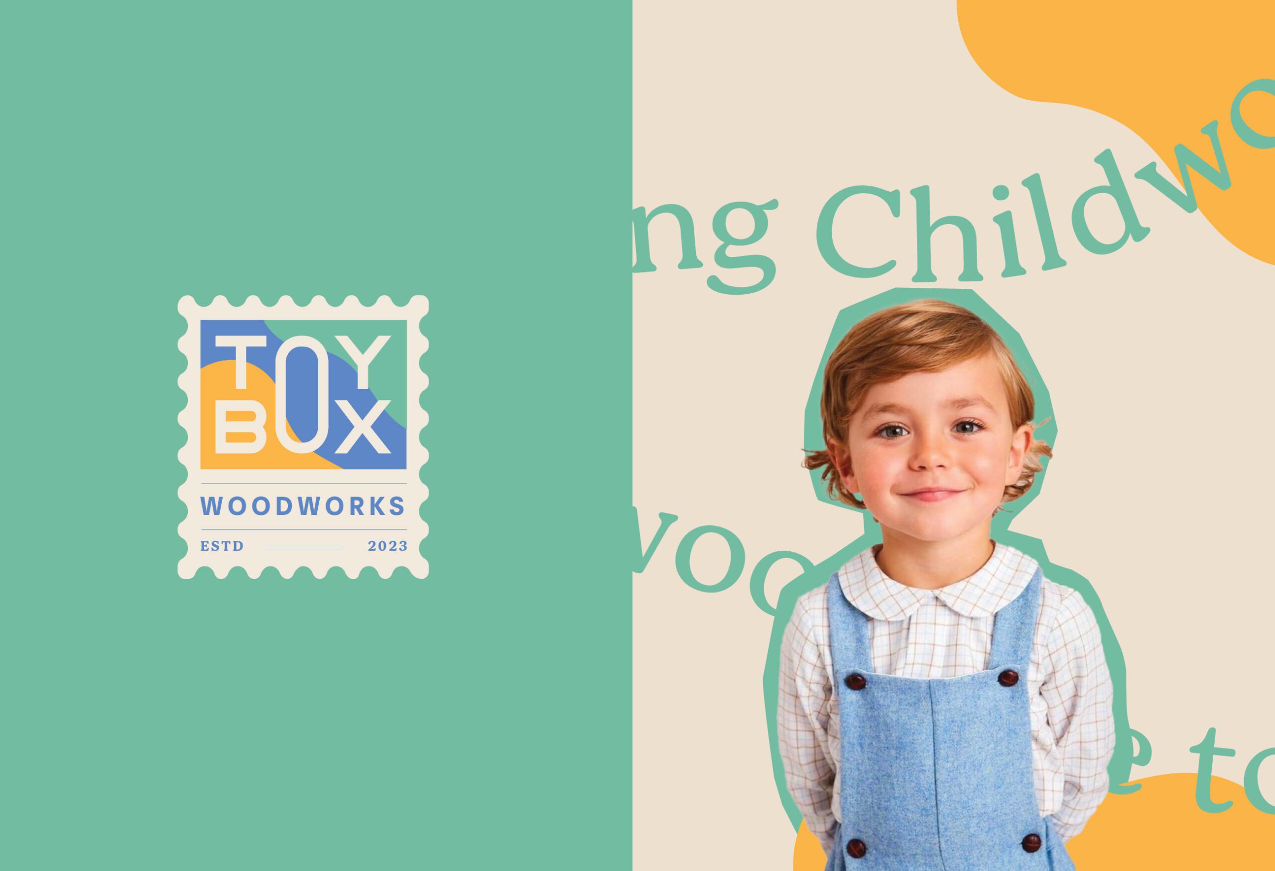
Toybox by MARKAWORKS is a brand designed to ignite children’s creativity through playful and intuitive design. Its vibrant palette and engaging typography transform storage into an exciting gateway for learning and joyful discovery.

Nurturing Creativity Through Playful Design
Storage brands rarely attempt what the Toybox brief asked for: make the box itself part of the play rather than the place play ends.
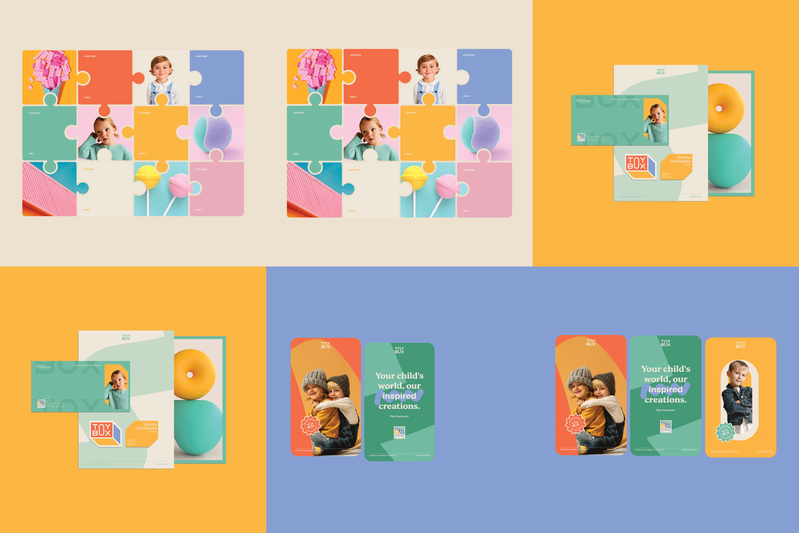
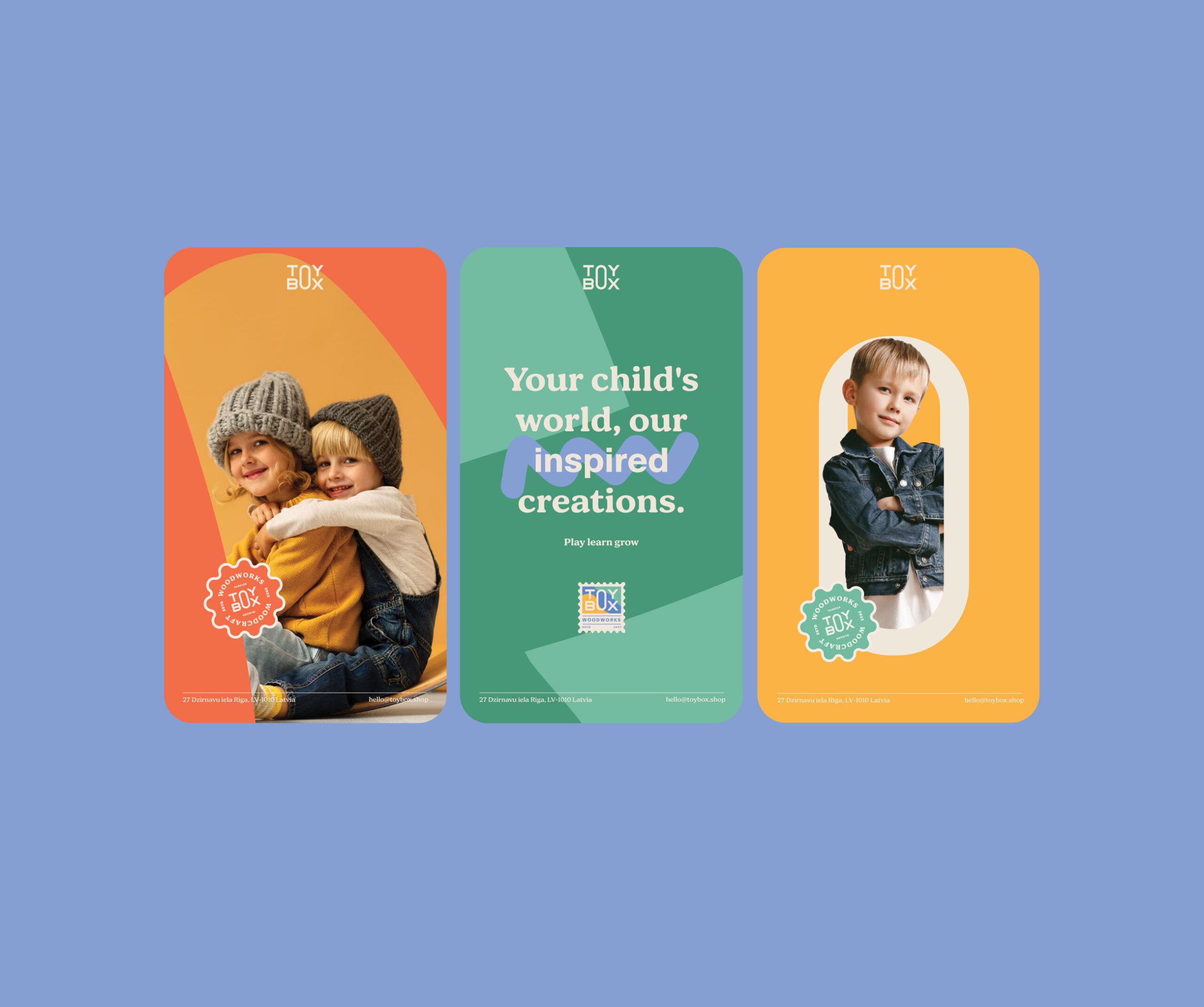
A Vibrant Palette for Joy and Curiosity
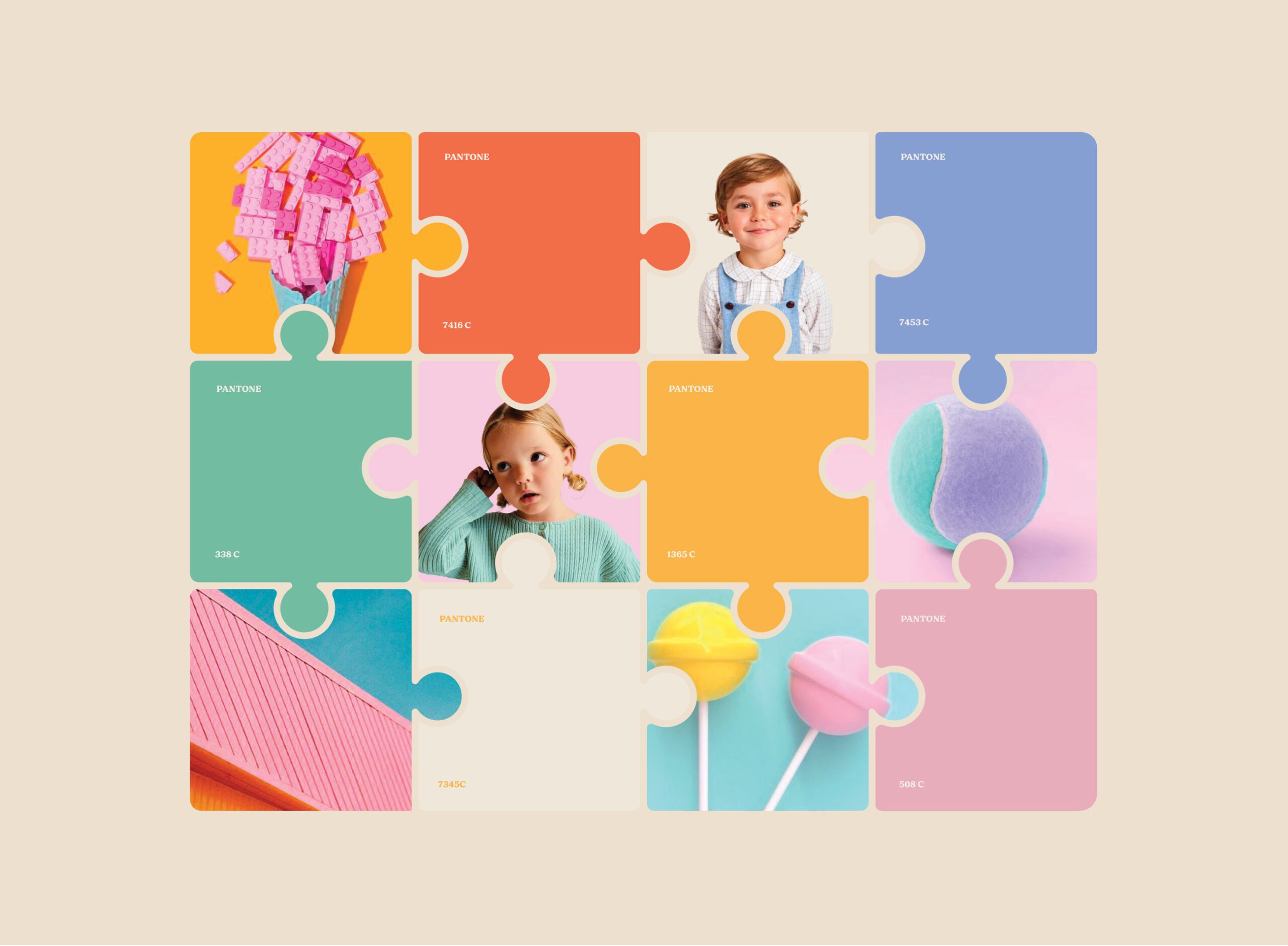
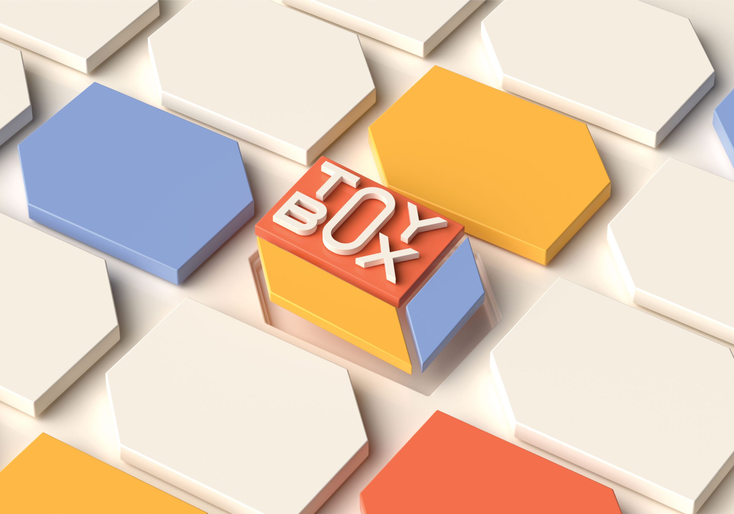
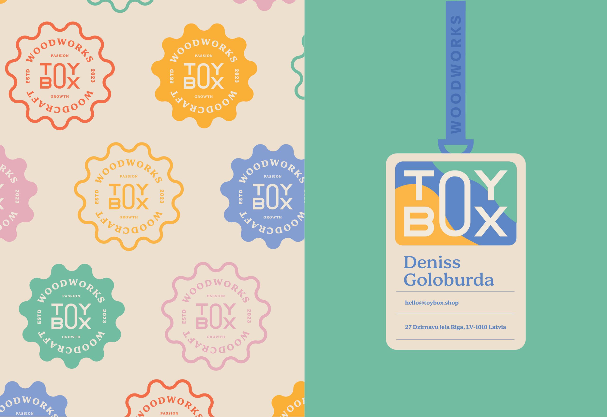
Toybox is a storage brand for children’s rooms, and the palette came first. Bright tones are combined with pastels, which gives the range energy without the harshness that pure primary colors bring to a room a child sleeps in. That combination runs from the website through to the packaging, so the brand a parent meets online is the one that arrives at the door.
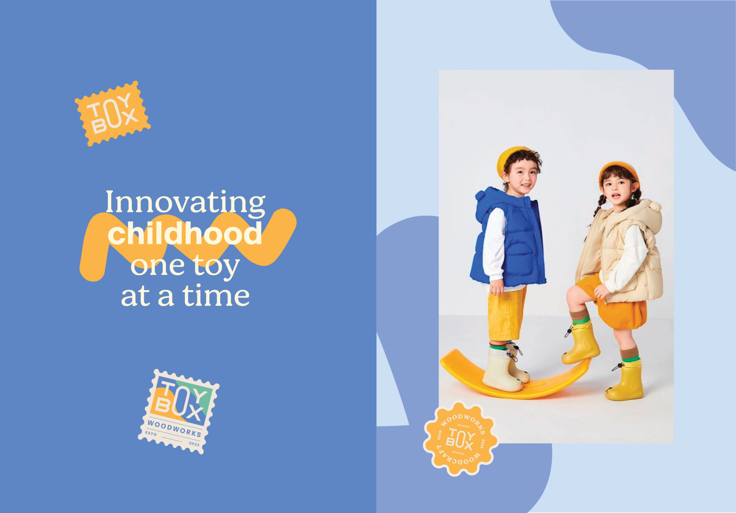
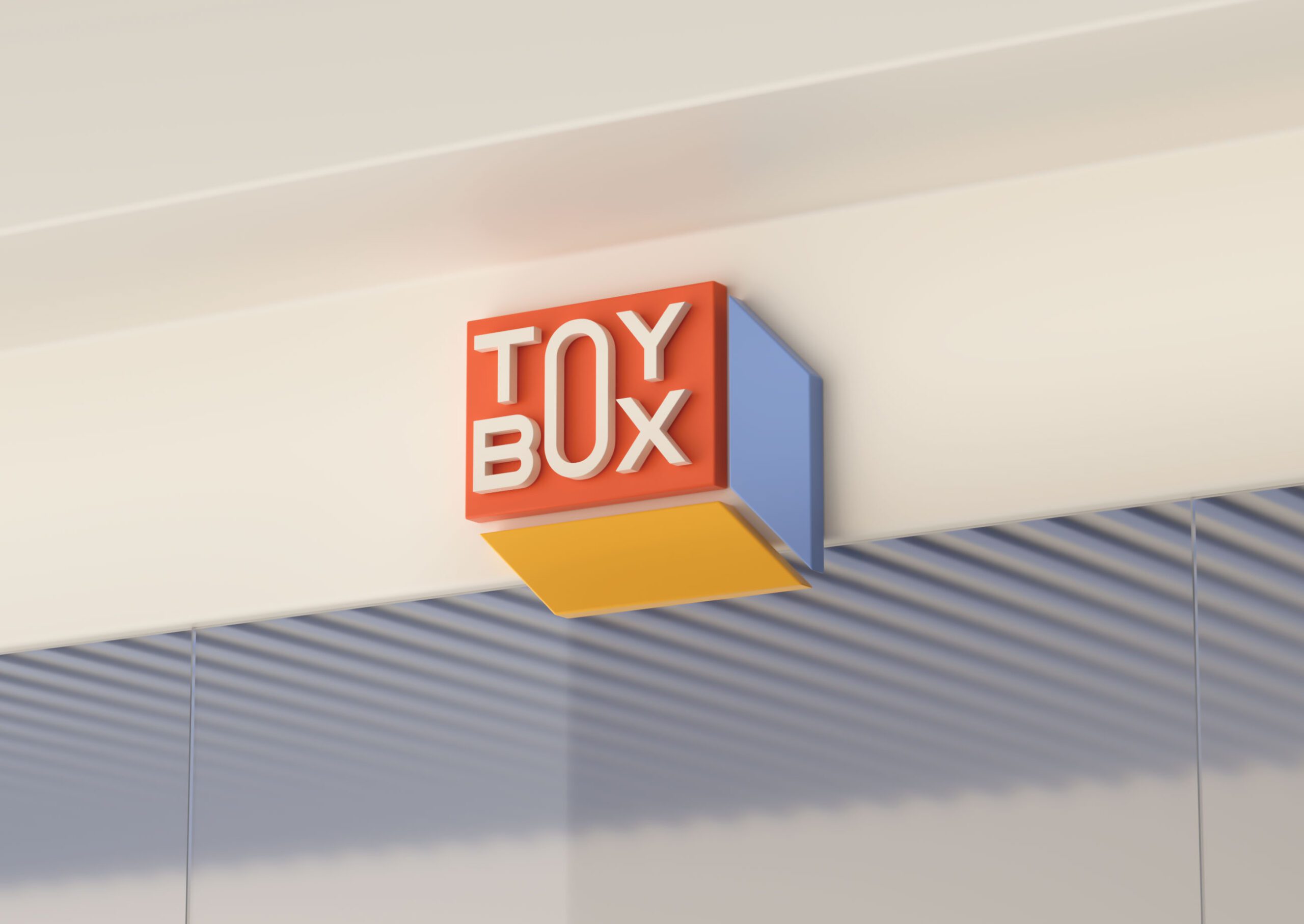
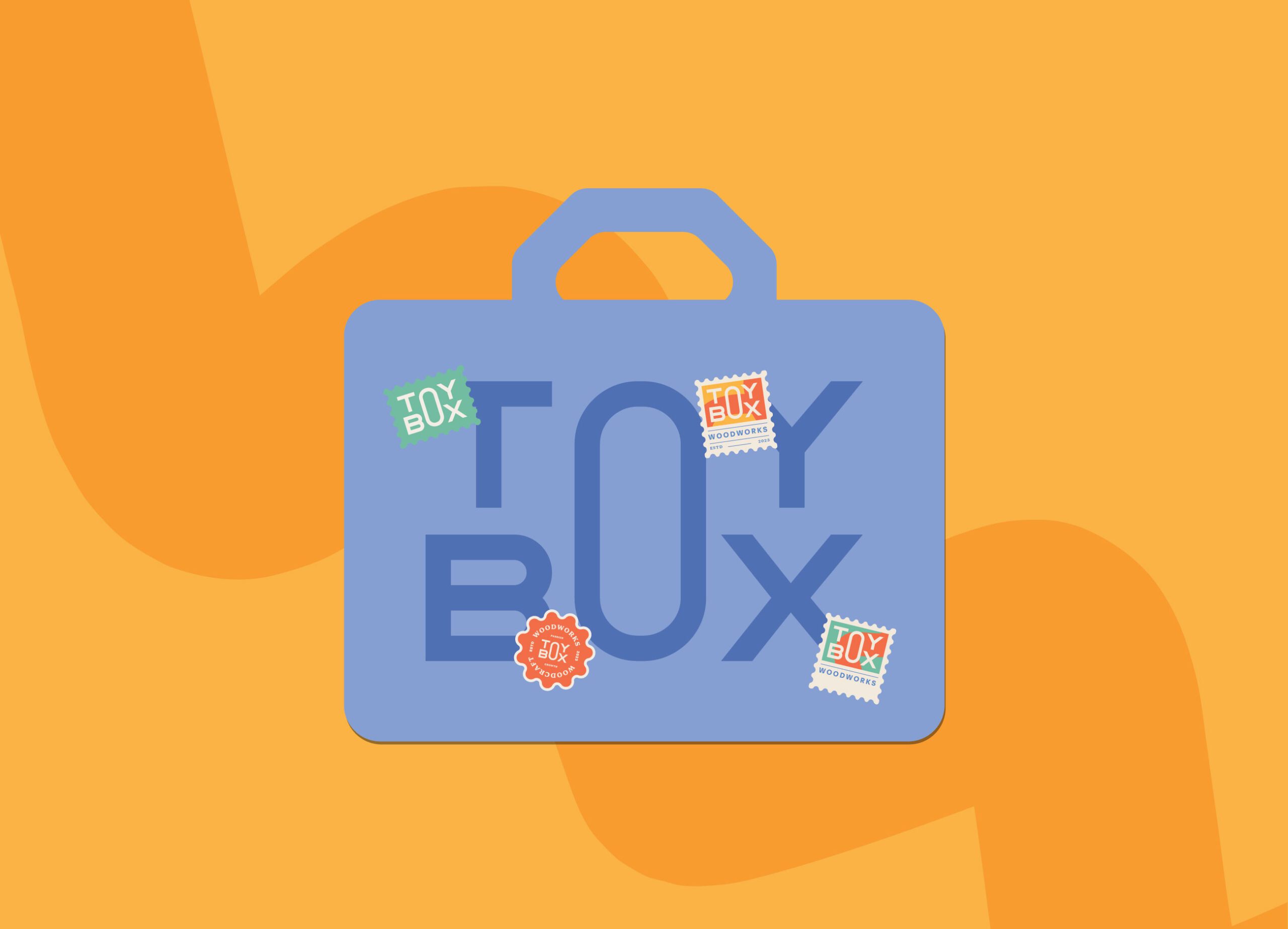
Engaging Typography and Playful Shapes
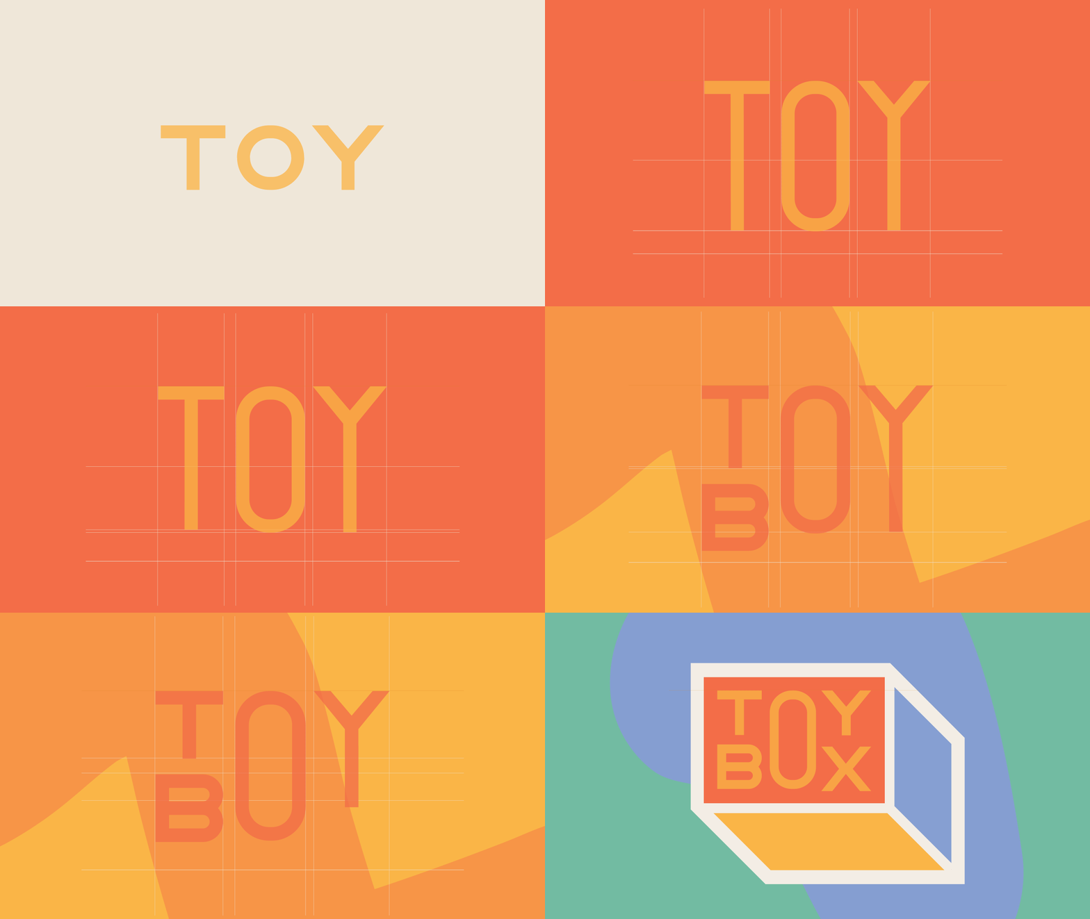
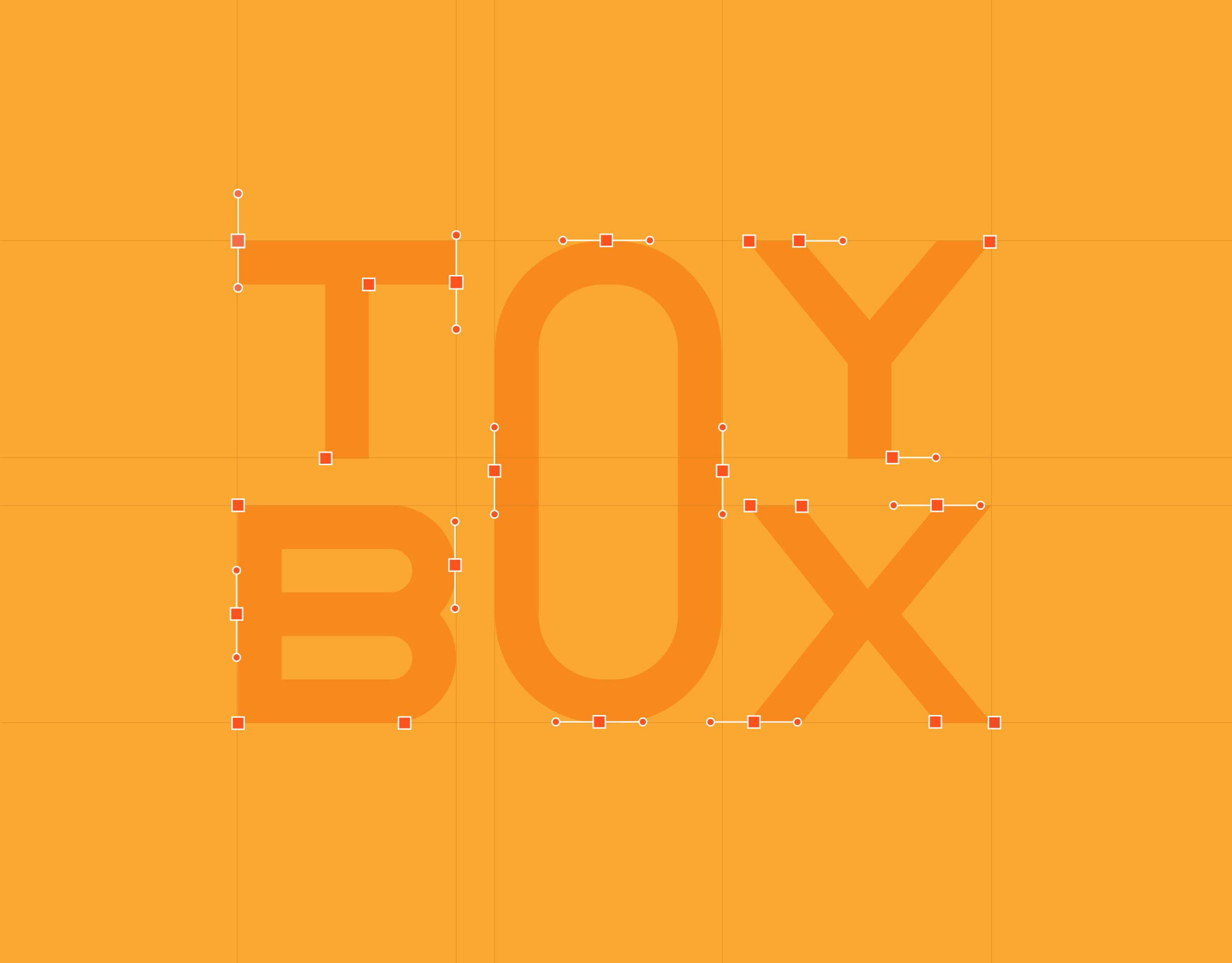
Typography and shape work carry the same intent. Both are drawn to feel active rather than decorative, and the shapes are simple enough that a child recognizes them before reading anything.
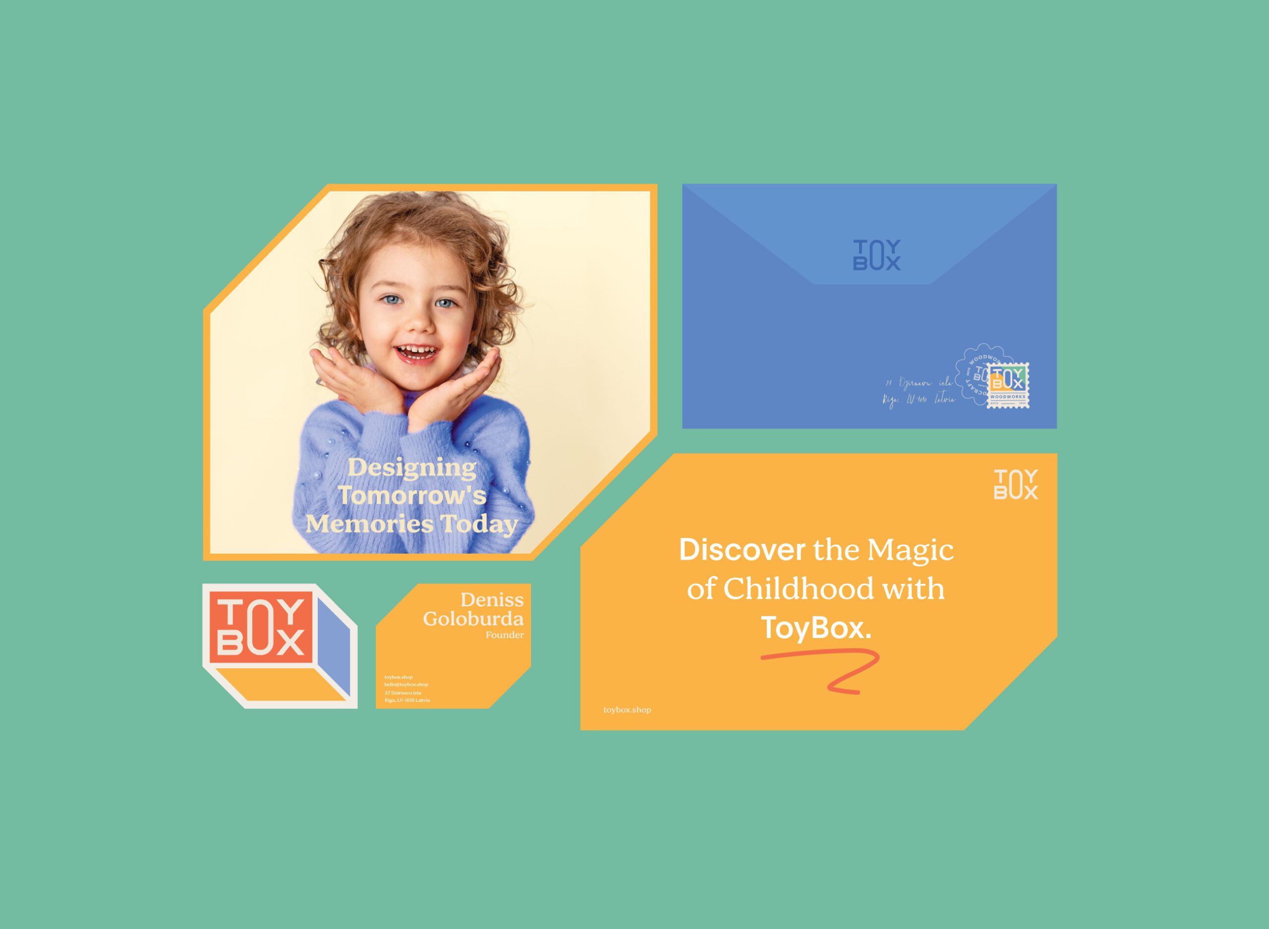
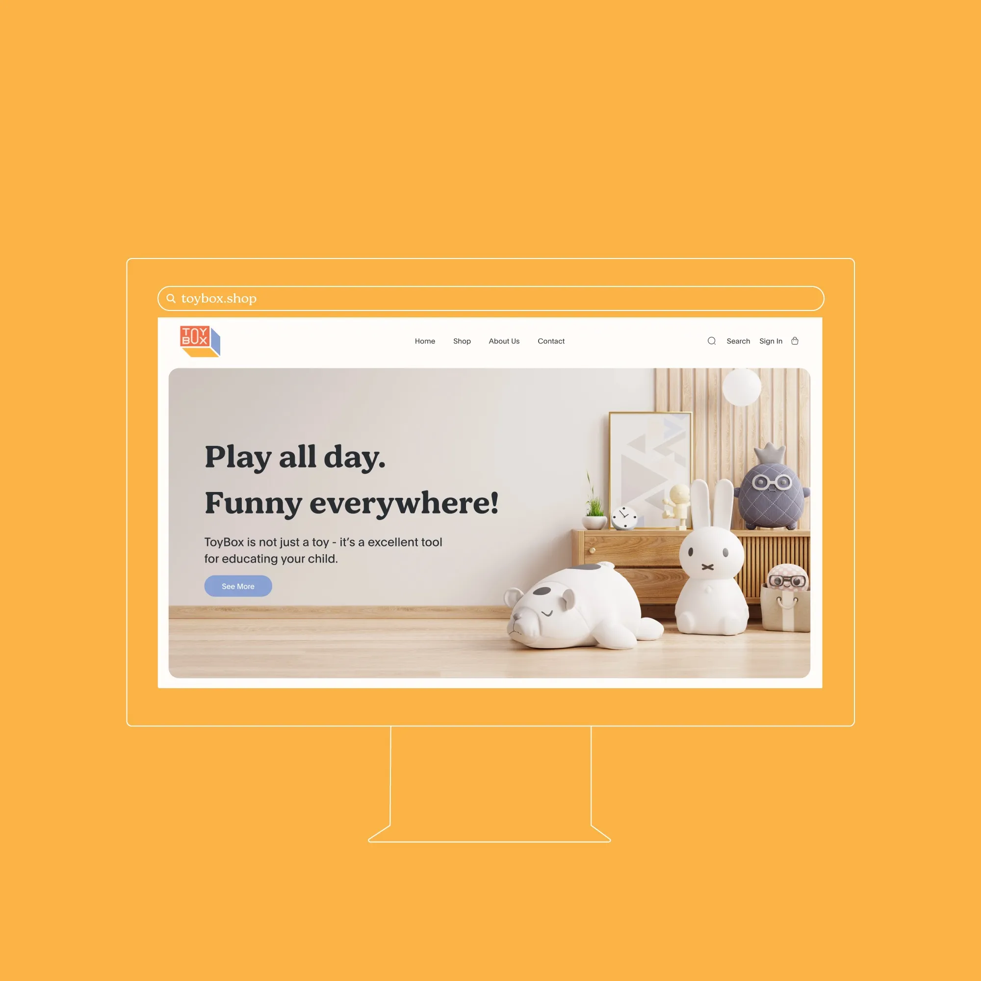

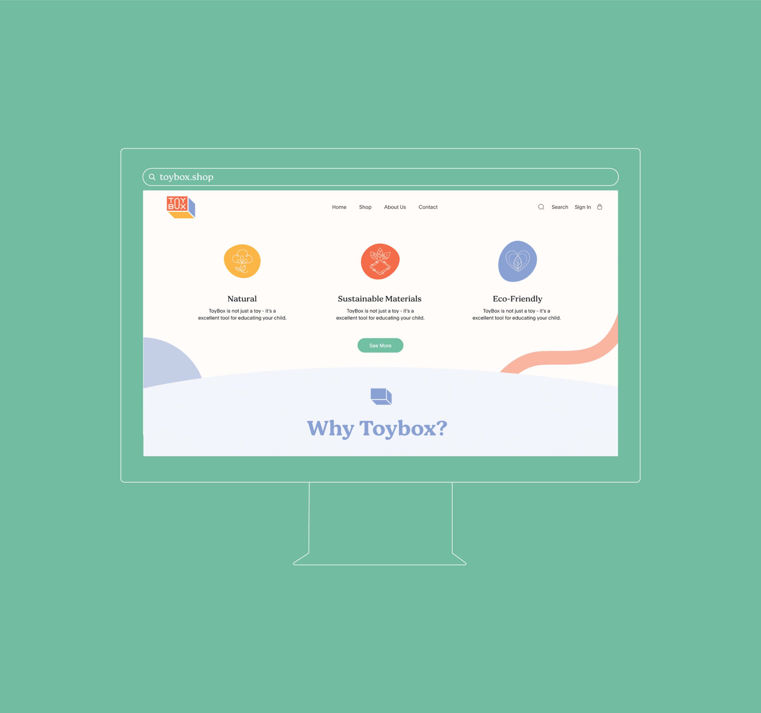
Intuitive Website and Functional Branding
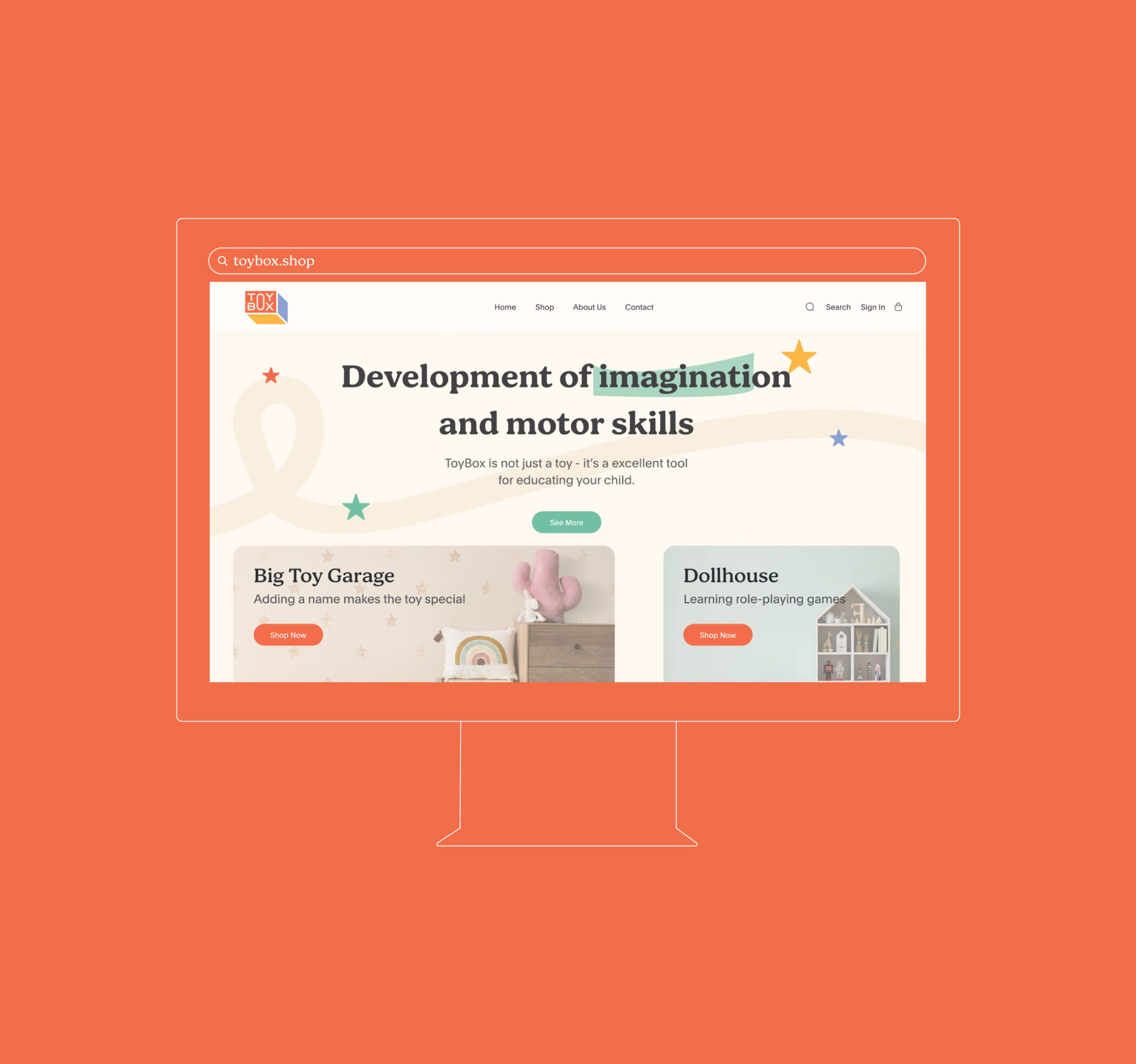
At MarkaWorks we laid the website out for the person who actually buys: a parent, usually in a hurry, comparing options. Navigation is direct and the product range is easy to move through, which is a different requirement from the playfulness the brand promises and had to be solved separately rather than styled over.
Celebrating Learning Through Play
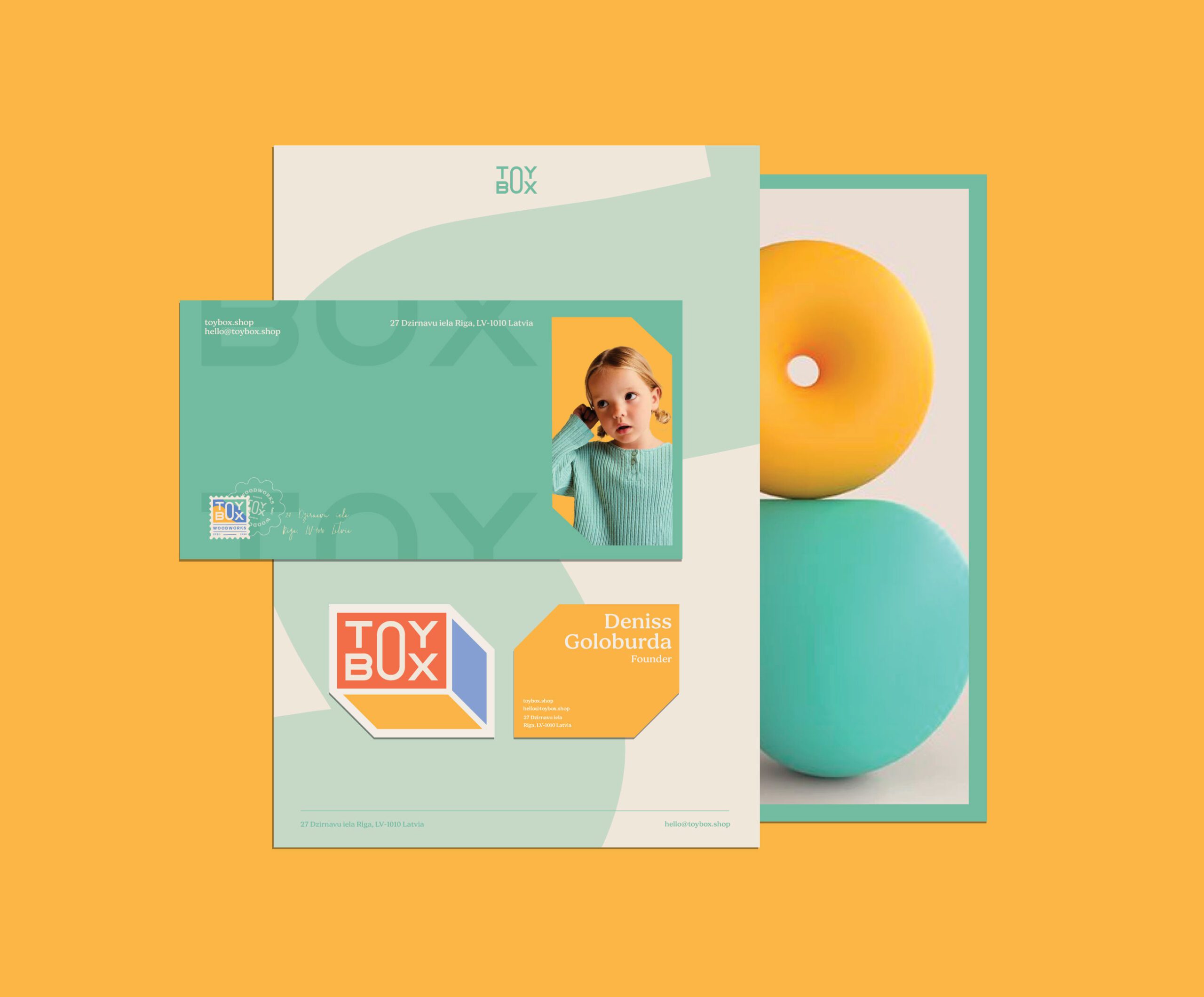
What holds the two sides together is that the design follows the product’s function. A storage box is used every day by someone learning to sort, reach, and put away, and we aligned the brand to that use rather than to a general idea of childhood. That is what positions Toybox as more than a container: the design supports what the product is for.


Let’s make the work they’ll copy.
Talk to an expert now
Work with a 38 team of the
industry’s top 1% talent.



