
Pilky
Designing a Refined and Compassionate Plant Based Milk Brand
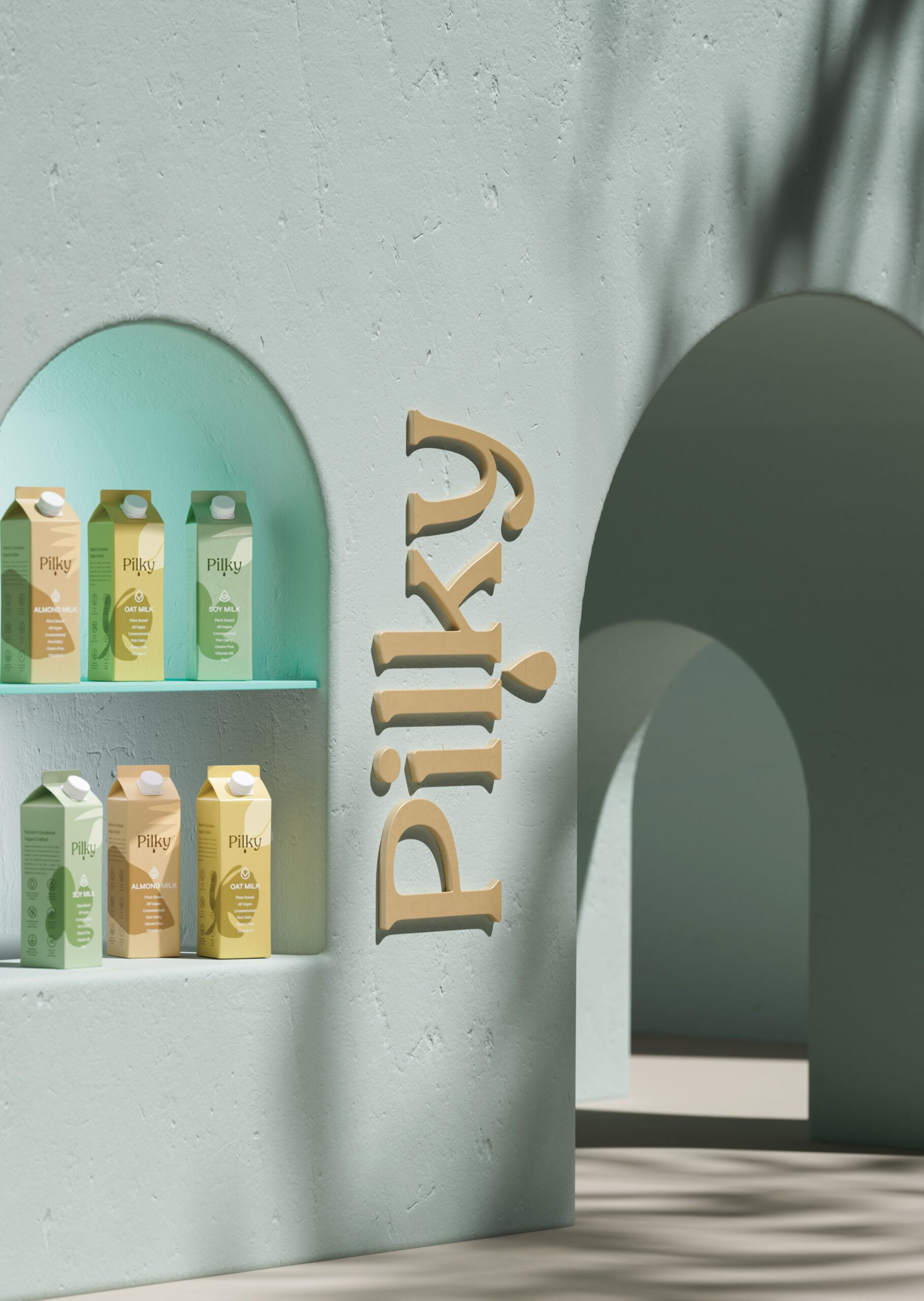
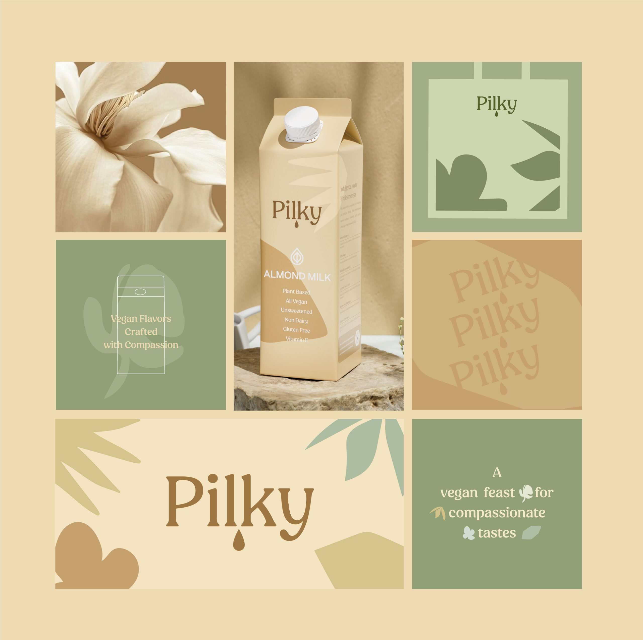
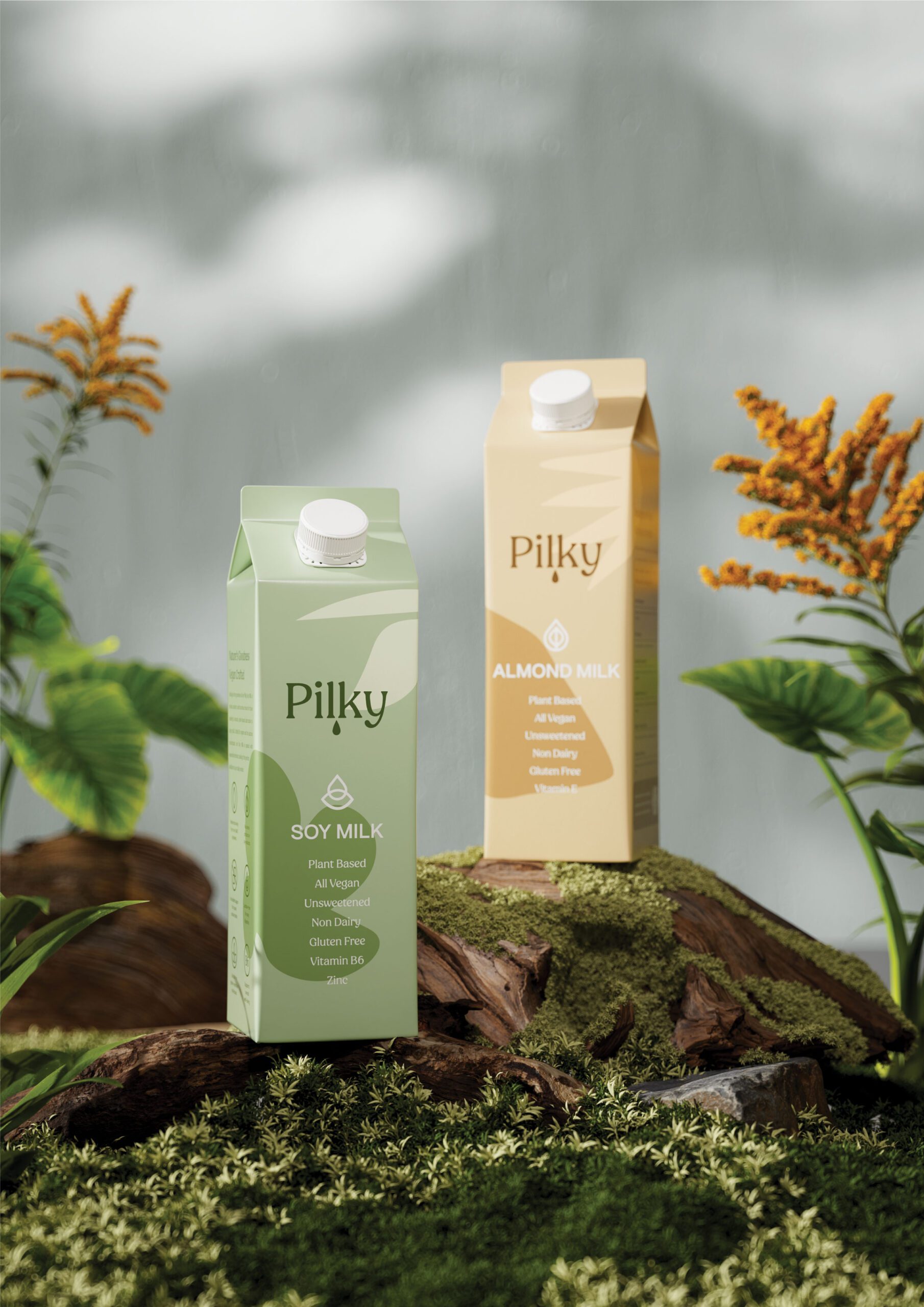
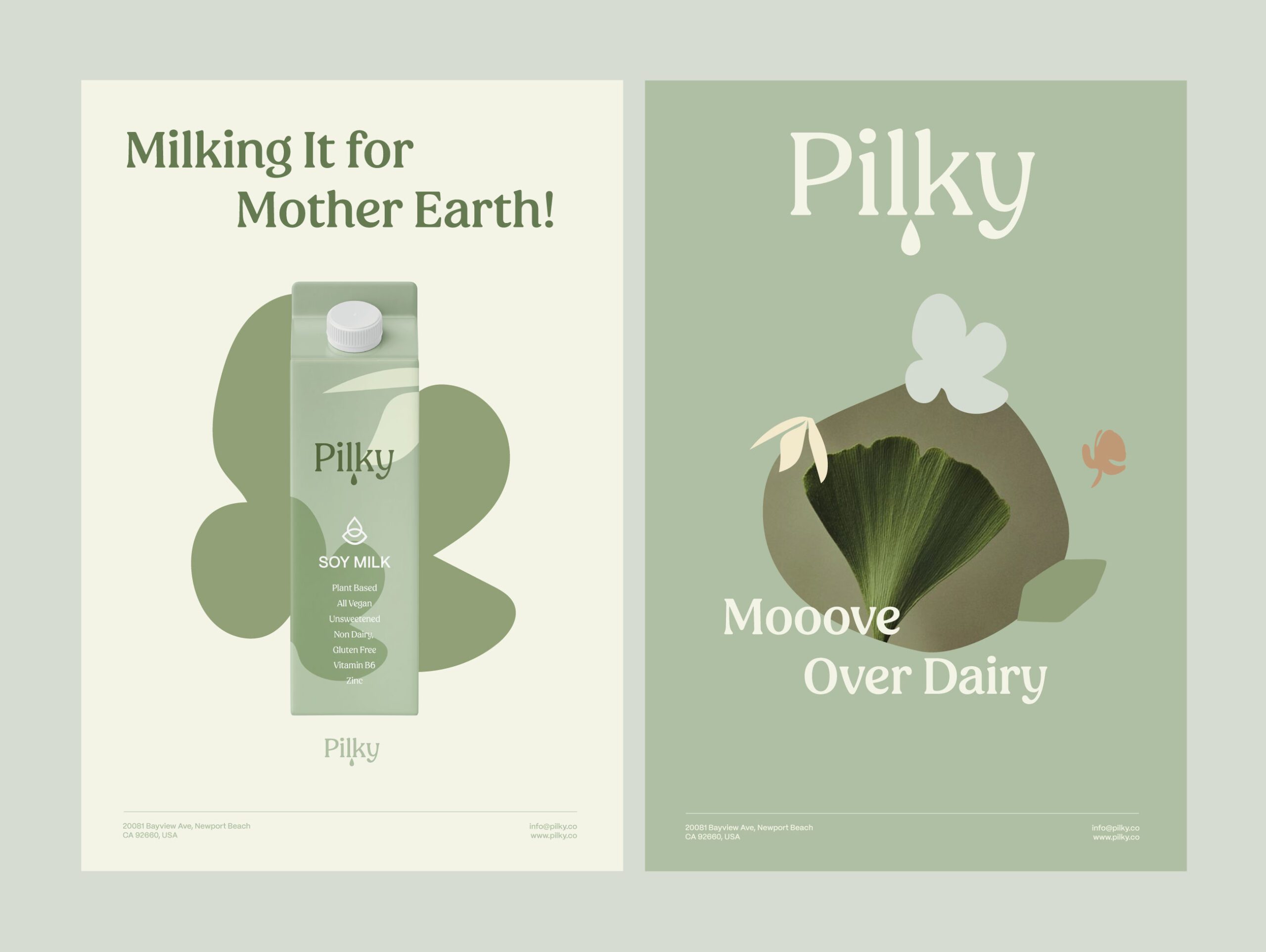
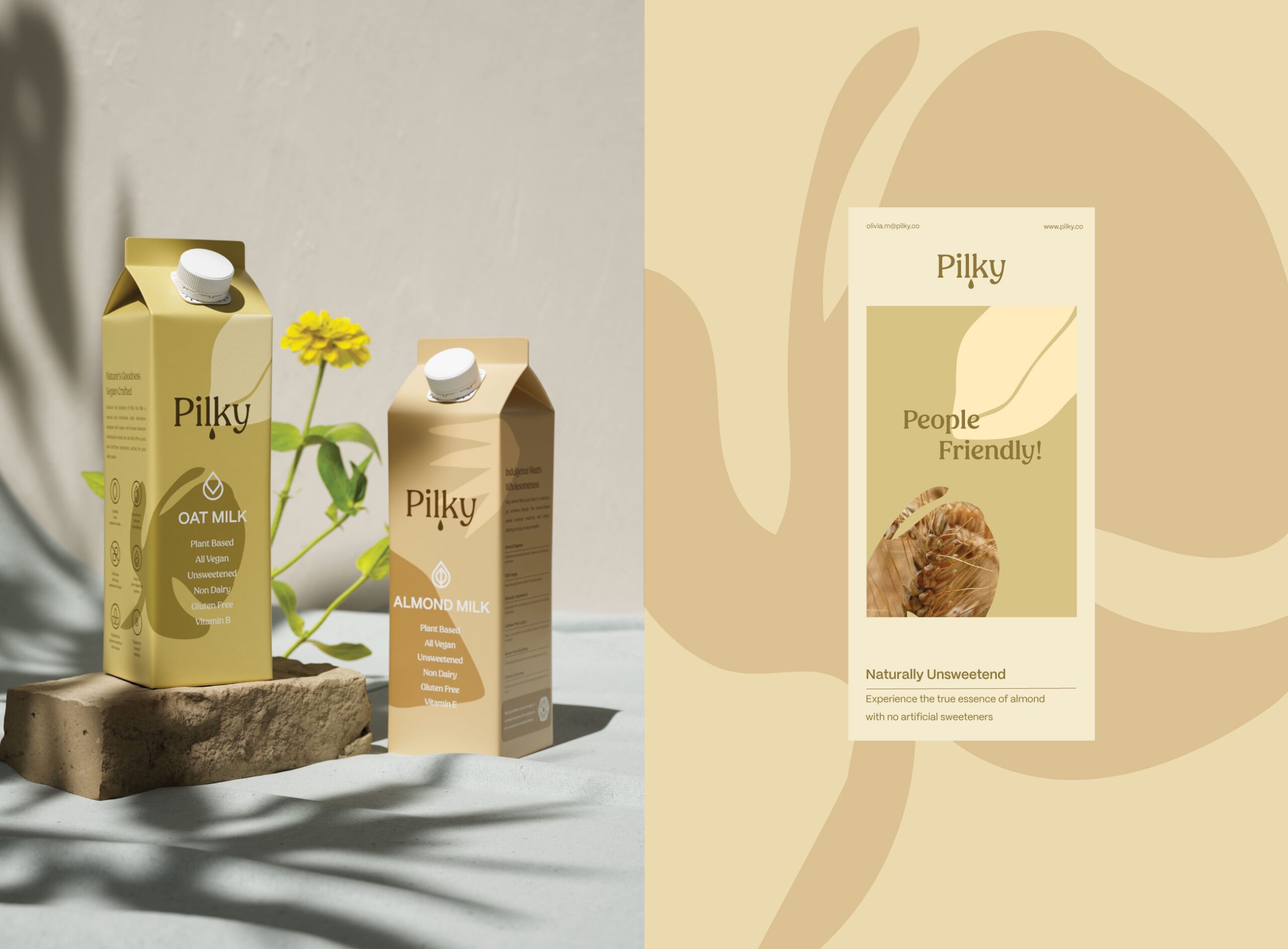
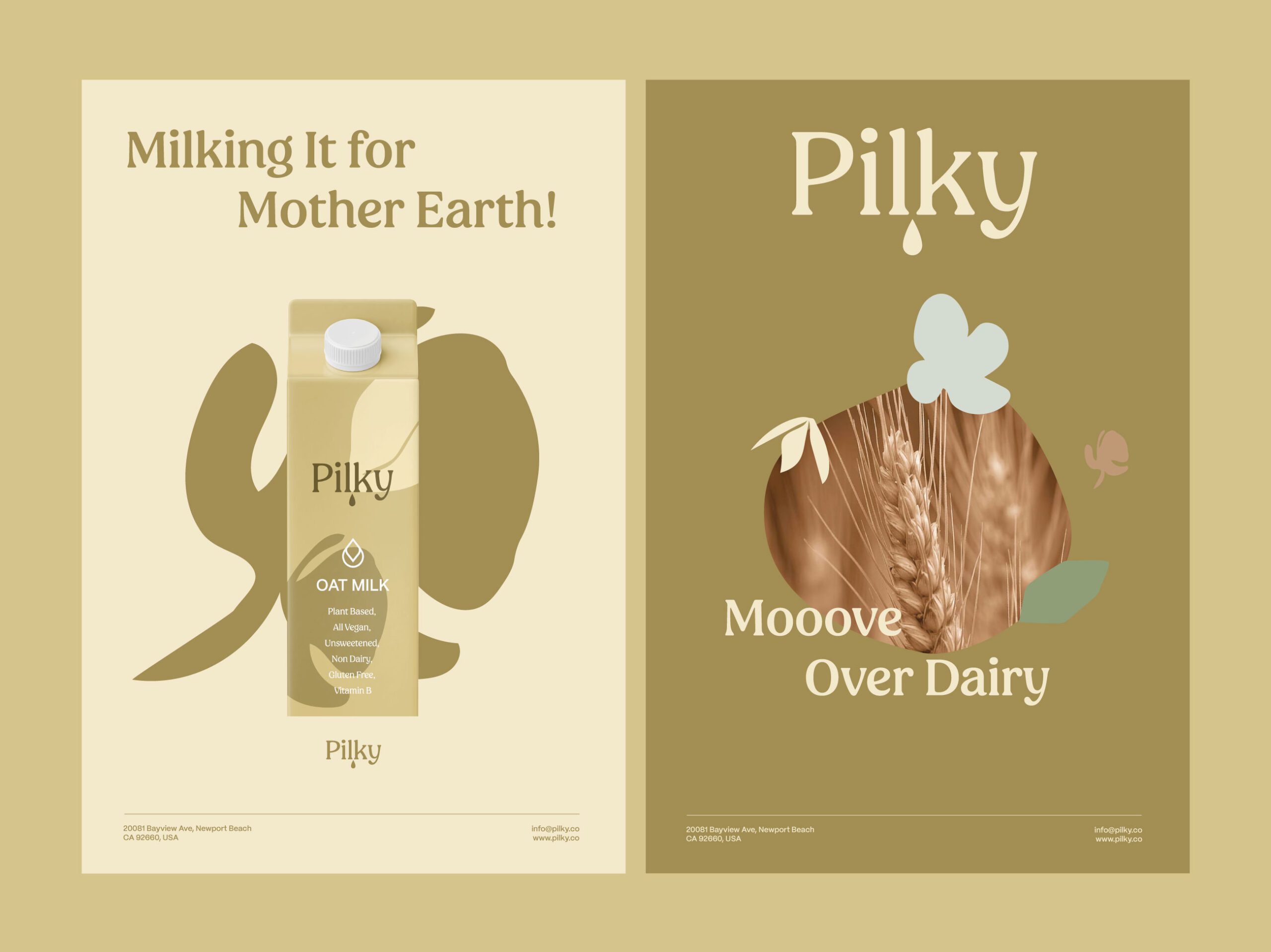
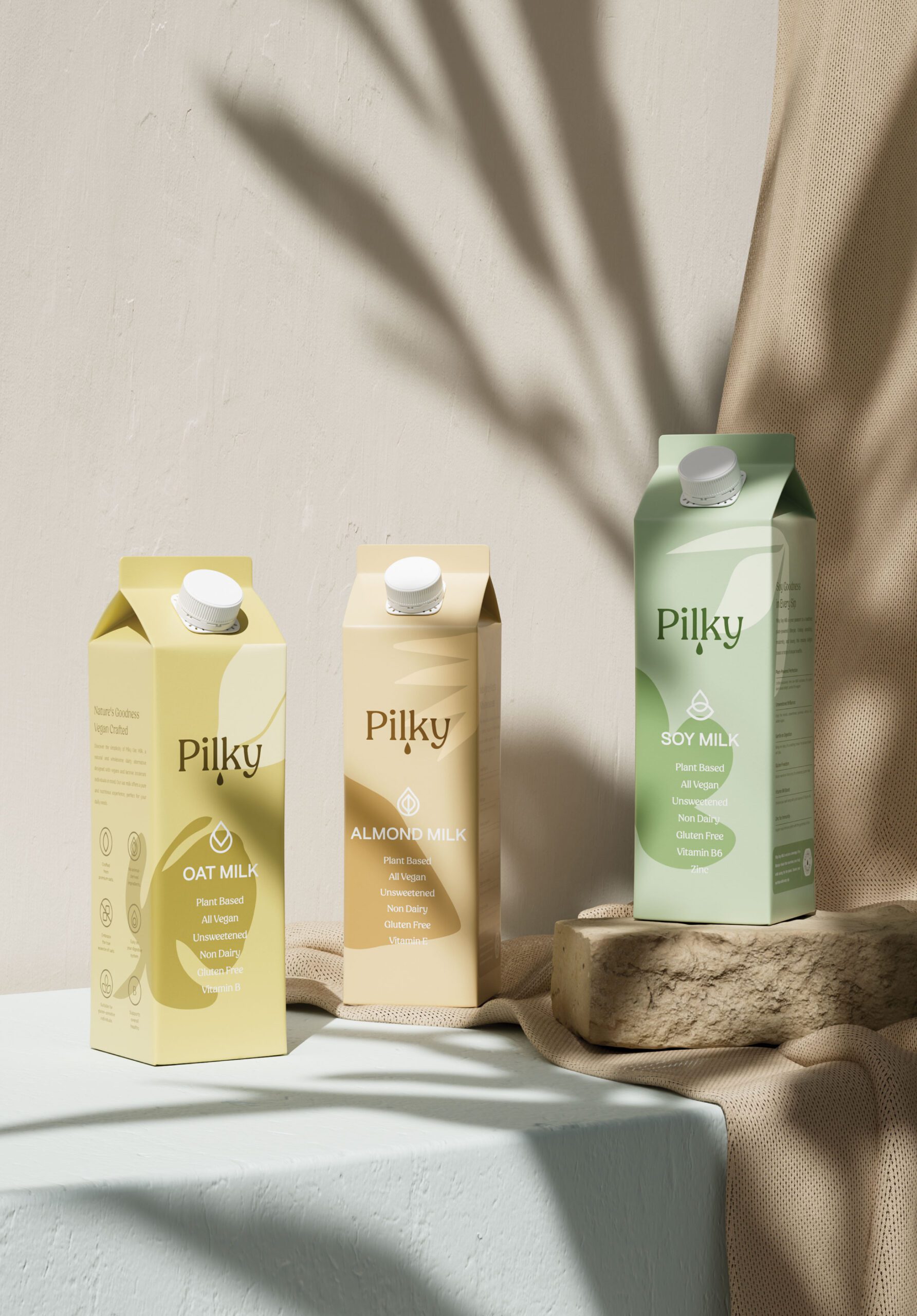
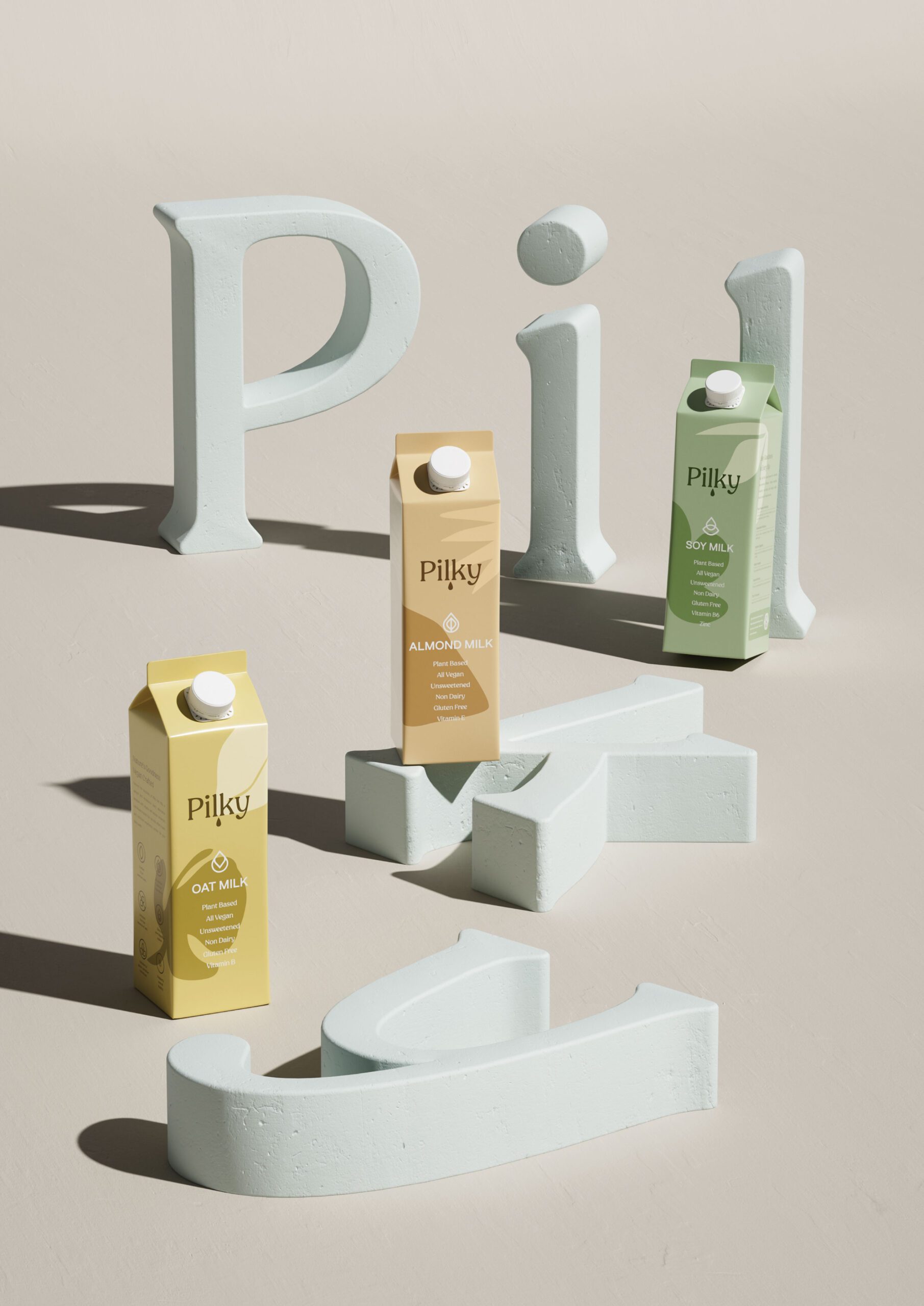
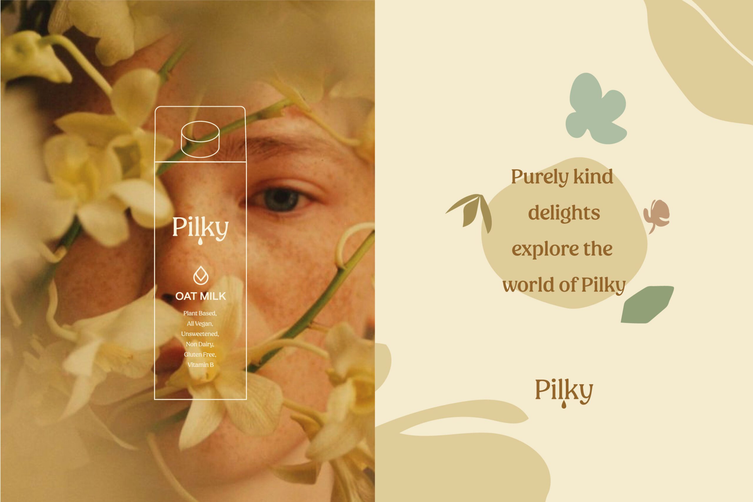
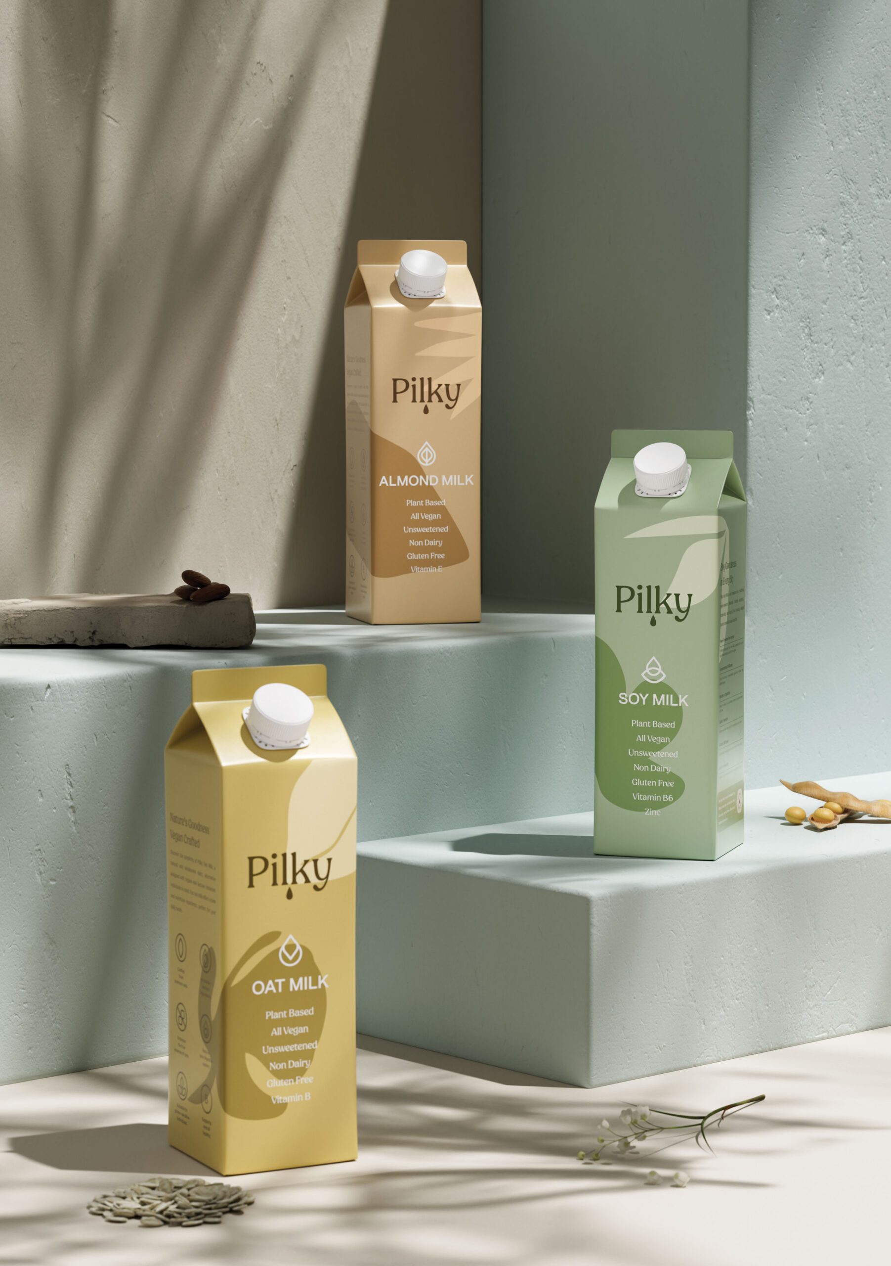
Pilky is a plant based milk brand created for those who value simplicity, quality, and conscious living. Designed specifically for a vegan lifestyle, Pilky offers dairy free alternatives that feel natural, indulgent, and thoughtfully crafted. The brand was shaped to reflect a sense of quiet luxury, where ethical choices and refined taste coexist effortlessly.
The name Pilky was chosen for its softness and memorability rather than a direct meaning, allowing the brand to build its own identity rooted in feeling rather than definition.

Brand Direction
Pilky is a productivity and wellbeing application, and the work here was digital product design rather than brand design. The goal was an app people reach for daily, which sets a different bar: a screen that impresses once but slows a person down on the twentieth use has failed.
The project started with user research rather than with layouts. At MarkaWorks we ran interviews and built personas to identify where people actually lose time and attention in daily routines. Those findings, not visual preference, decided which functions earned a place on the primary screen and which moved one level down.
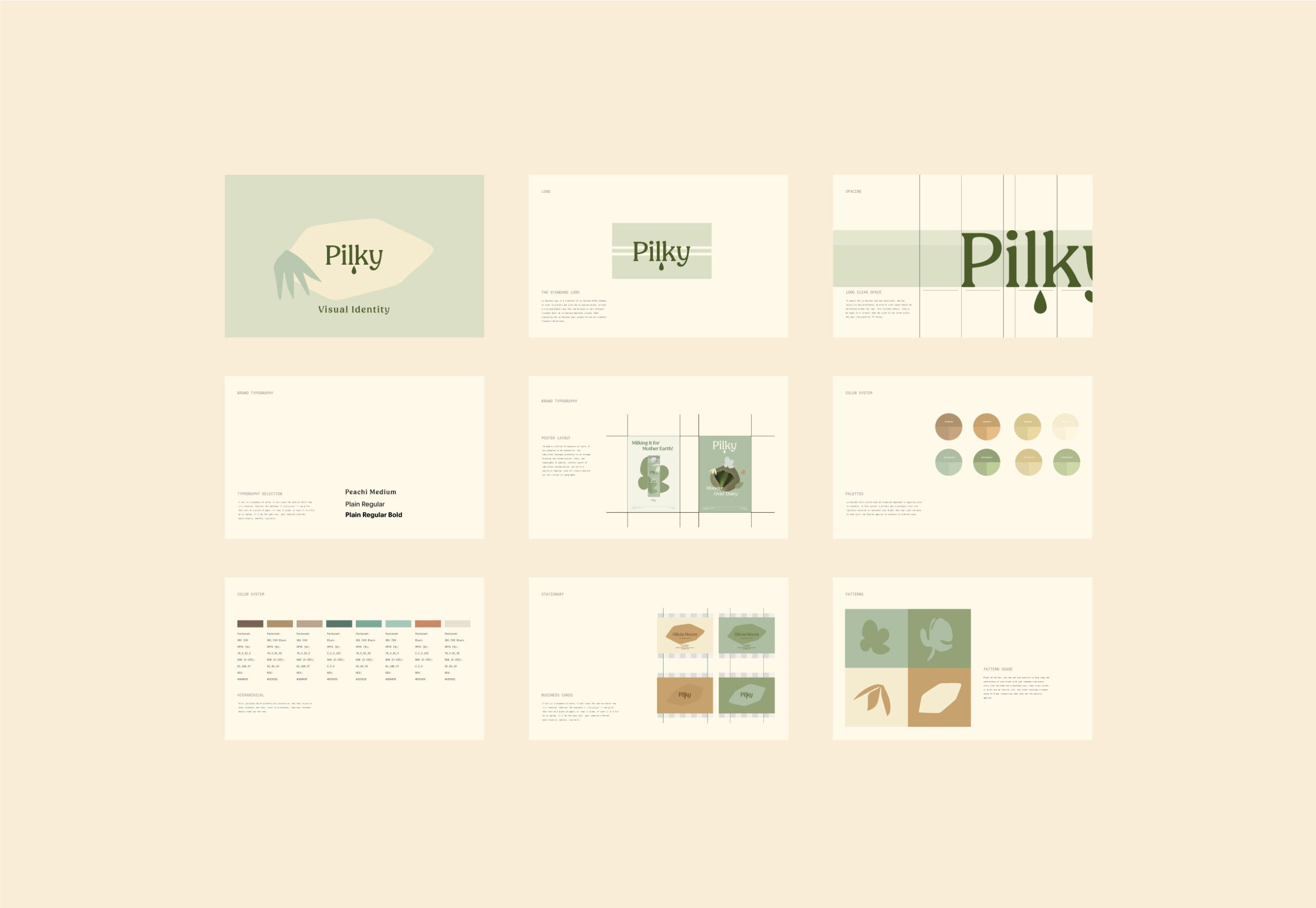
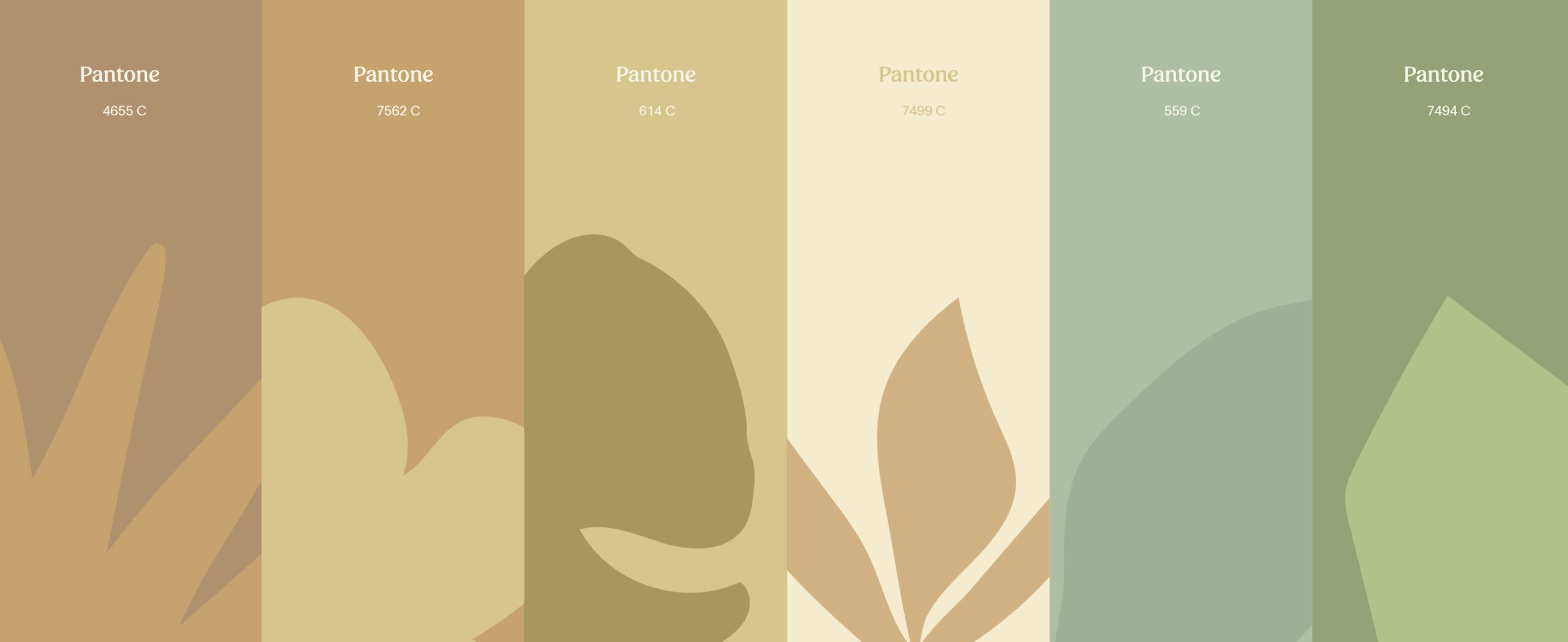
Visual Identity
The Pilky interface is minimal and built around navigation that stays predictable. Every function is reachable without the user holding a map of the app in their head. In a product used several times a day, the cost of a clever but unfamiliar pattern is paid on every visit, so the layout favours the ordinary arrangement wherever the ordinary arrangement works.
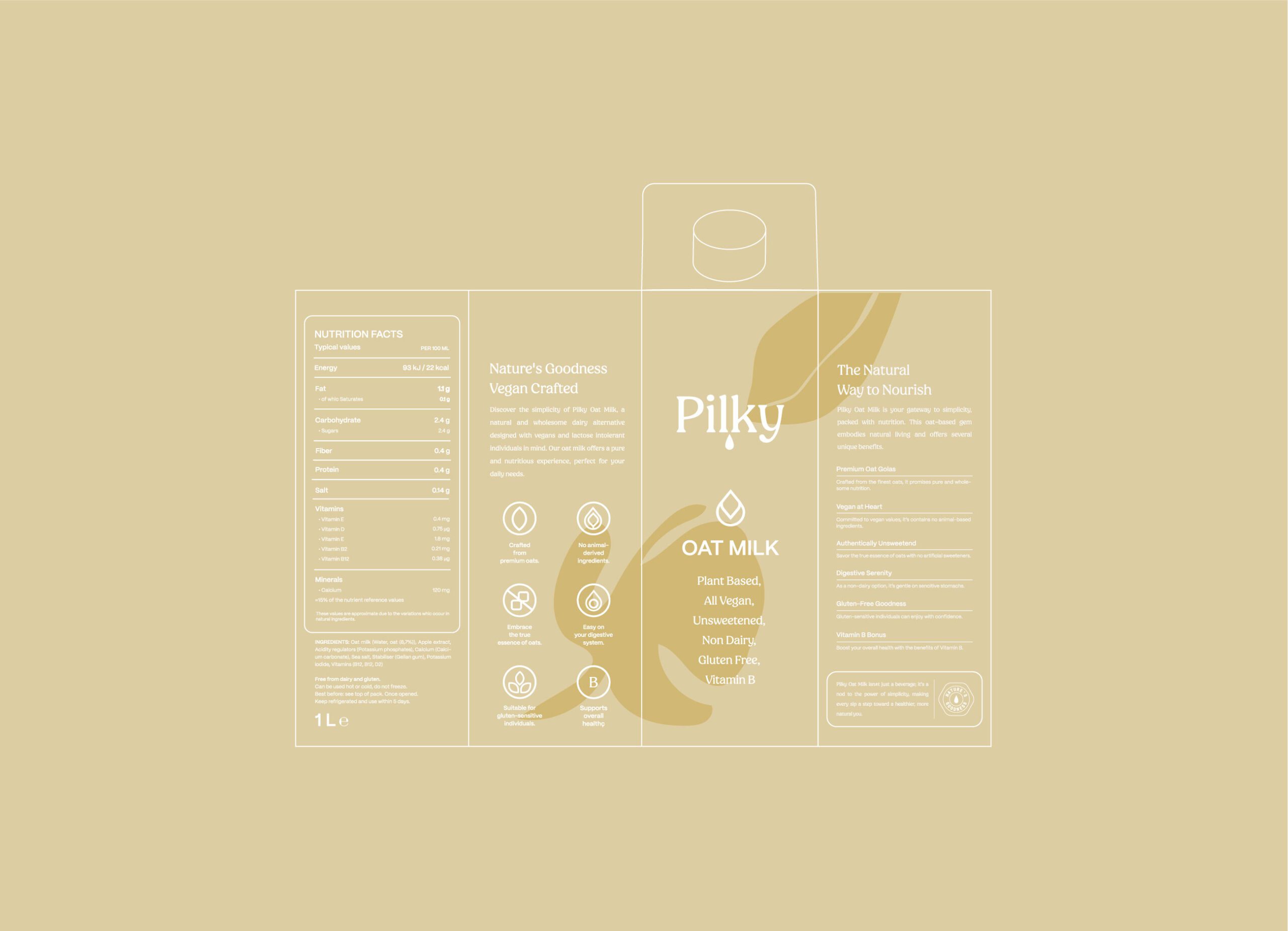
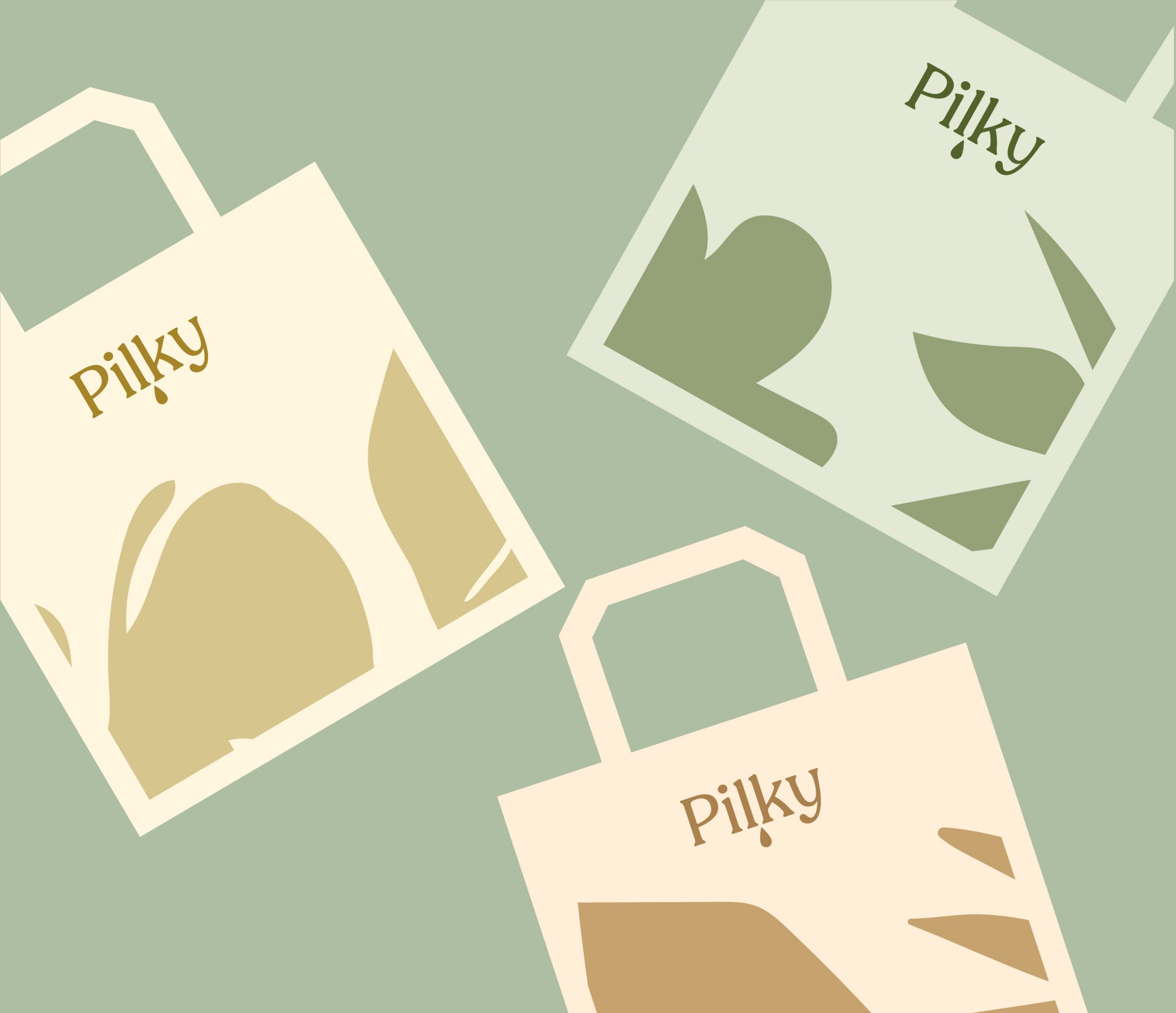
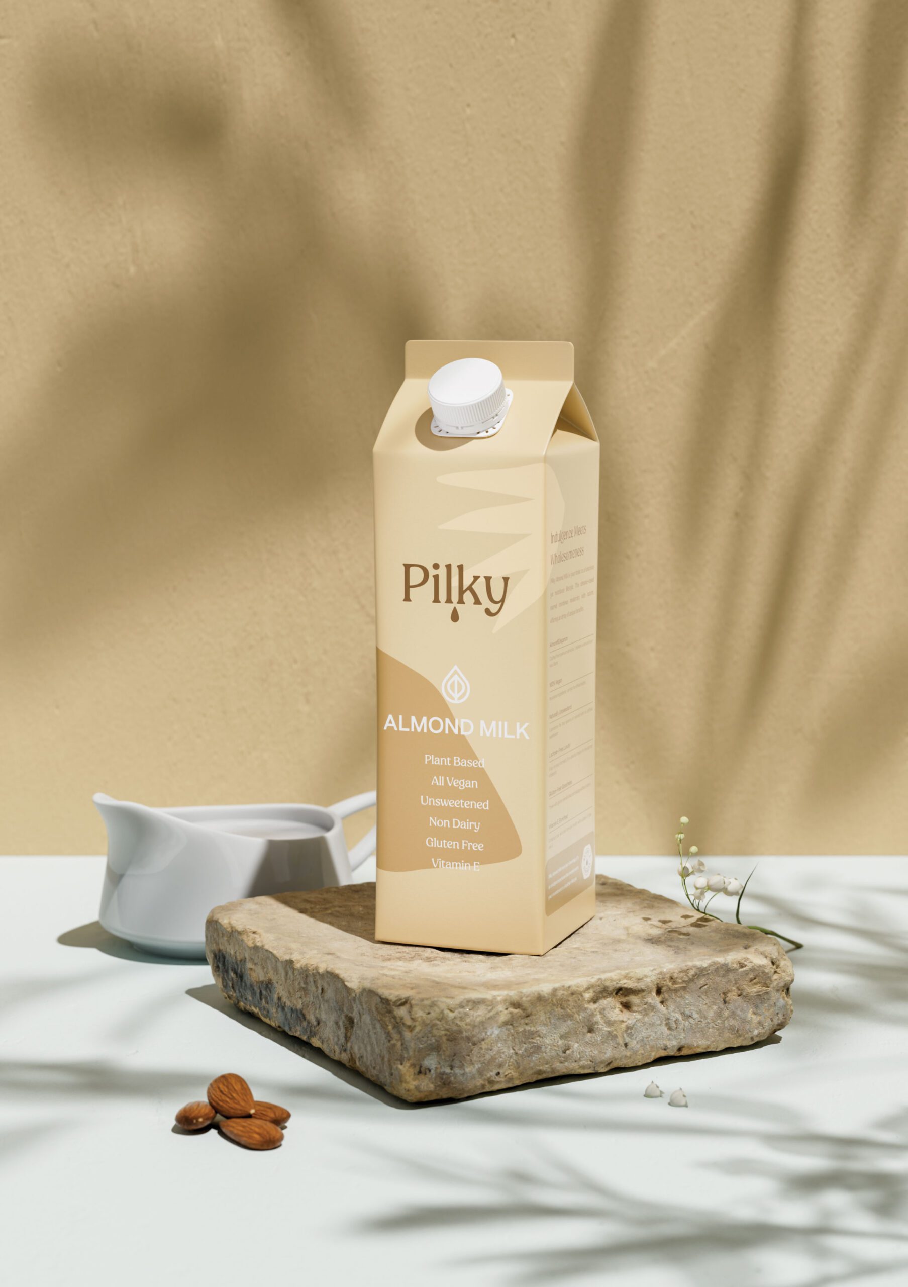
Packaging Design
We selected the color and typography for a calm reading experience. A productivity tool is opened in the middle of other tasks, often at a glance, and high contrast decoration competes with the content it is supposed to frame. The type sizes and spacing were set so the screen can be scanned quickly rather than read carefully.
Outcome
The result is an app whose design argument is restraint: the interface gets out of the way, and what remains is the task the user opened it for.

Let’s make the work they’ll copy.
Talk to an expert now
Work with a 38 team of the
industry’s top 1% talent.



