Natura
Designing a Holistic and Modern Wellness Brand
Natura is a holistic wellness brand dedicated to supporting balance, vitality, and mindful living through nature inspired products. The brand was developed to feel calm, optimistic, and contemporary, positioning wellness as an integrated part of everyday life rather than a distant ideal.

Rooted in authenticity and transparency, Natura brings together premium supplements and wellness products crafted from natural ingredients, encouraging a lifestyle shaped by conscious choices and inner harmony.
Brand Direction
Natura’s philosophy centers on holistic health that supports physical, mental, and emotional wellbeing. The brand approach avoids extremes, focusing instead on balance, consistency, and long term care. Each product is designed to feel approachable and empowering, helping individuals build healthier routines with confidence and clarity.
The brand speaks to a modern audience seeking wellness solutions that are both effective and emotionally reassuring.


Visual Identity
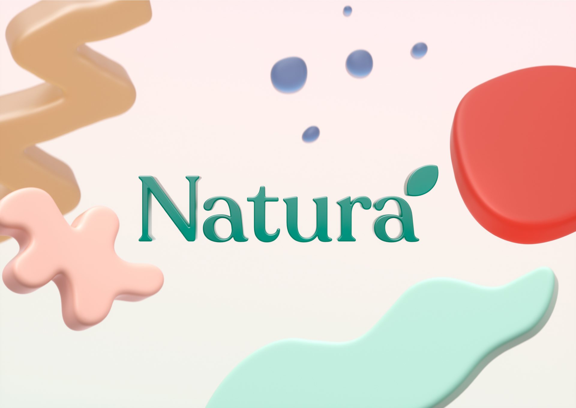
The visual identity reflects softness, movement, and natural energy. A warm and versatile color palette combines earthy neutrals, calming greens, deep blues, and uplifting coral tones, inspired by natural landscapes and organic forms. These colors create a sense of vitality while maintaining balance and visual harmony.
Typography is clean and confident, supporting clarity across packaging and digital applications. Rounded forms and organic shapes introduce warmth and flow, reinforcing the brand’s connection to nature and human wellbeing.
Graphic elements inspired by leaves and natural contours appear throughout the system, creating a visual language that feels fluid, modern, and alive.


Packaging Design
Packaging was designed to feel clean, informative, and optimistic. Clear hierarchy and structured layouts ensure that product benefits and ingredients are easy to understand at a glance. Color variations help differentiate product categories while maintaining a cohesive and recognizable brand presence.
Material finishes and soft gradients enhance the tactile and visual experience, elevating the products while keeping them accessible and friendly.


Let’s make the work they’ll copy.
Talk to an expert now
